


ES-CON JAPAN
visual identity + sign design
scope of works
brand consultingbrand strategy
creative direction
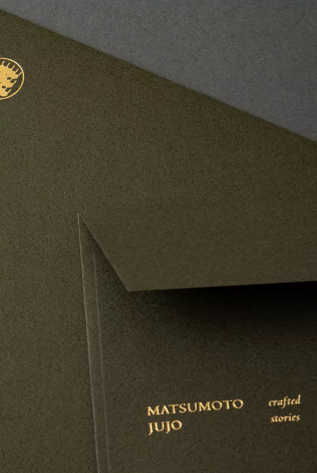
brand identity
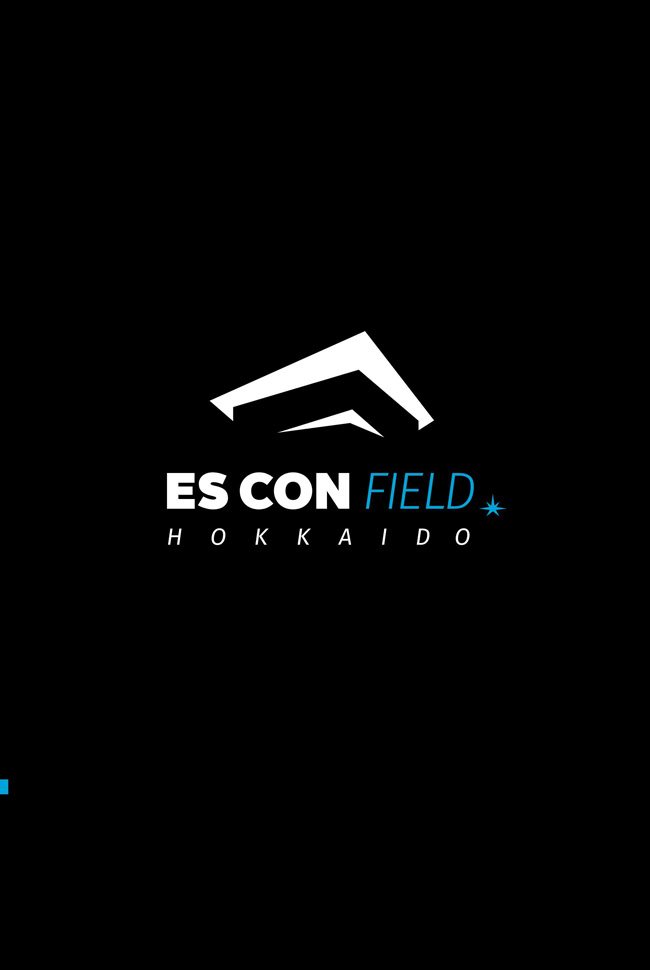
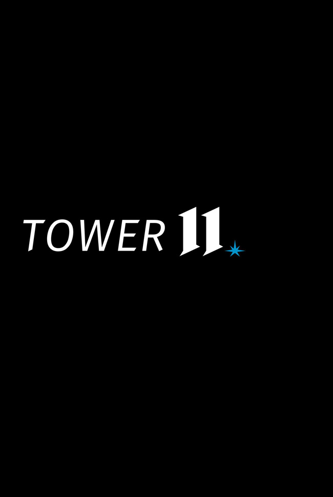
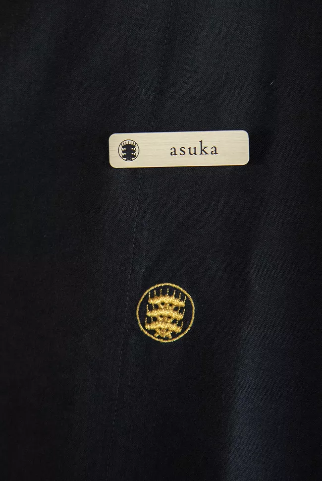
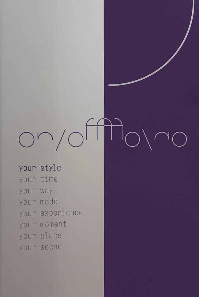
logo + visual identity
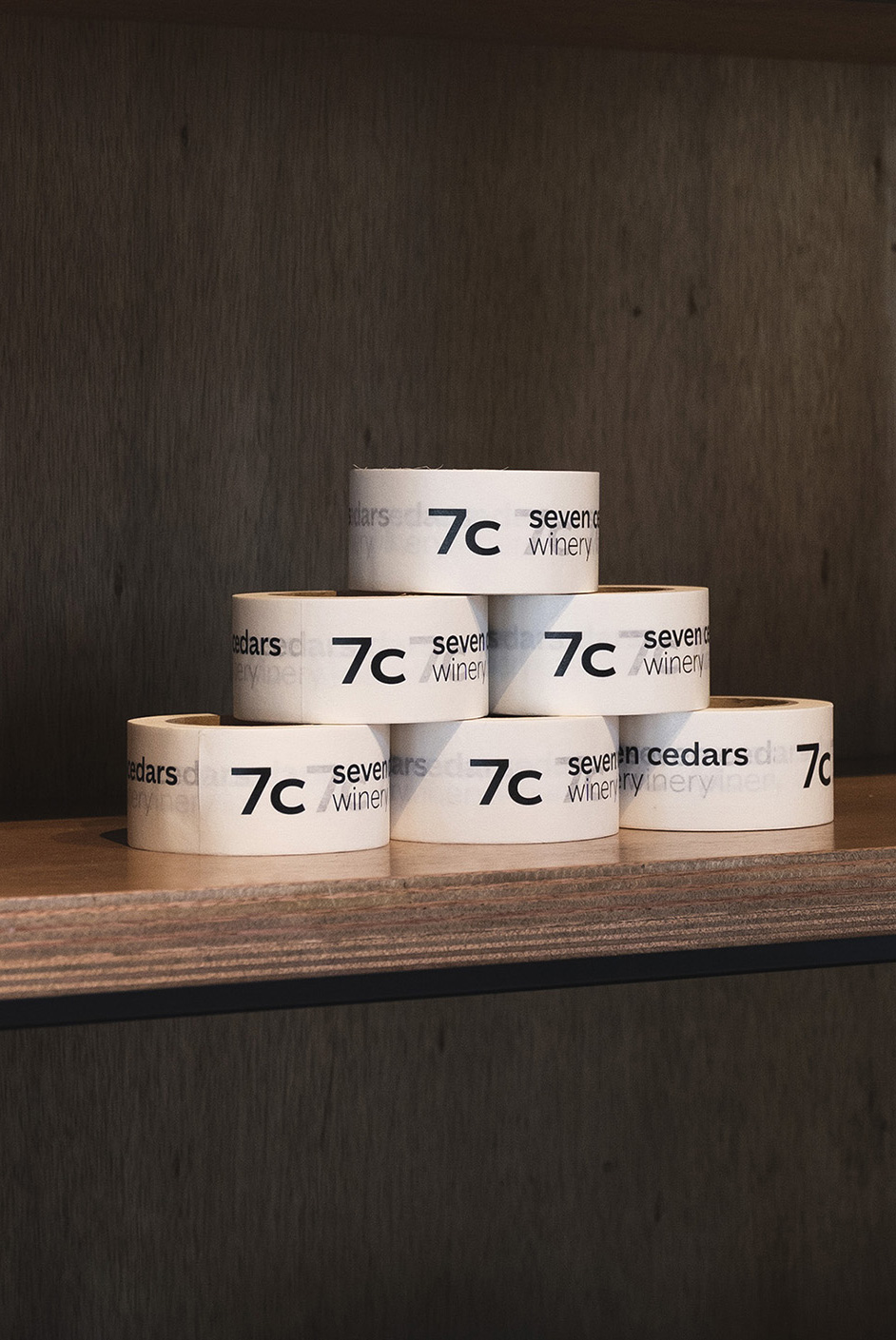
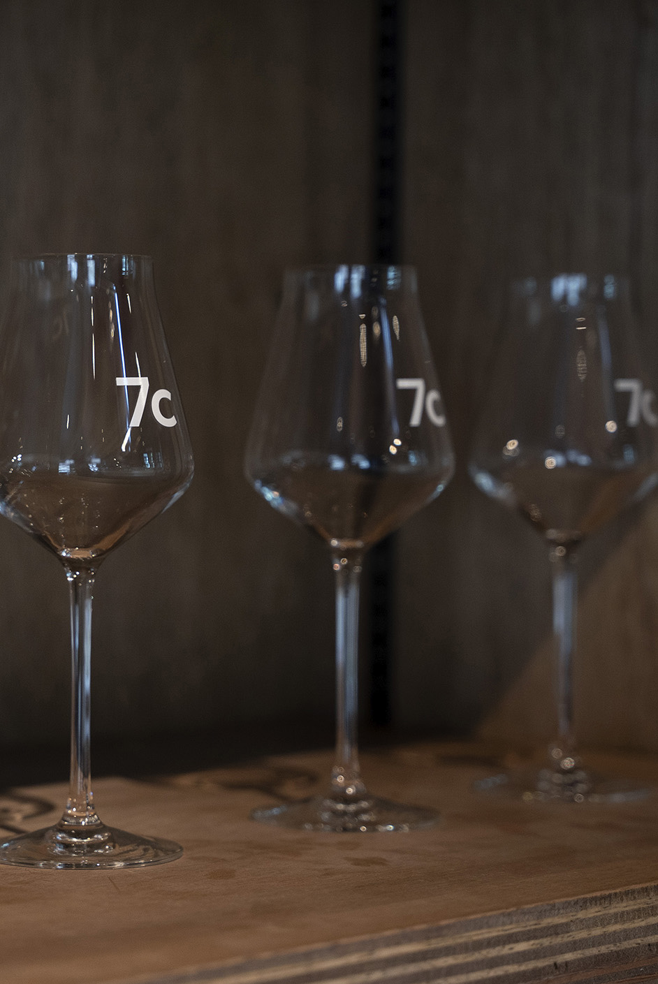
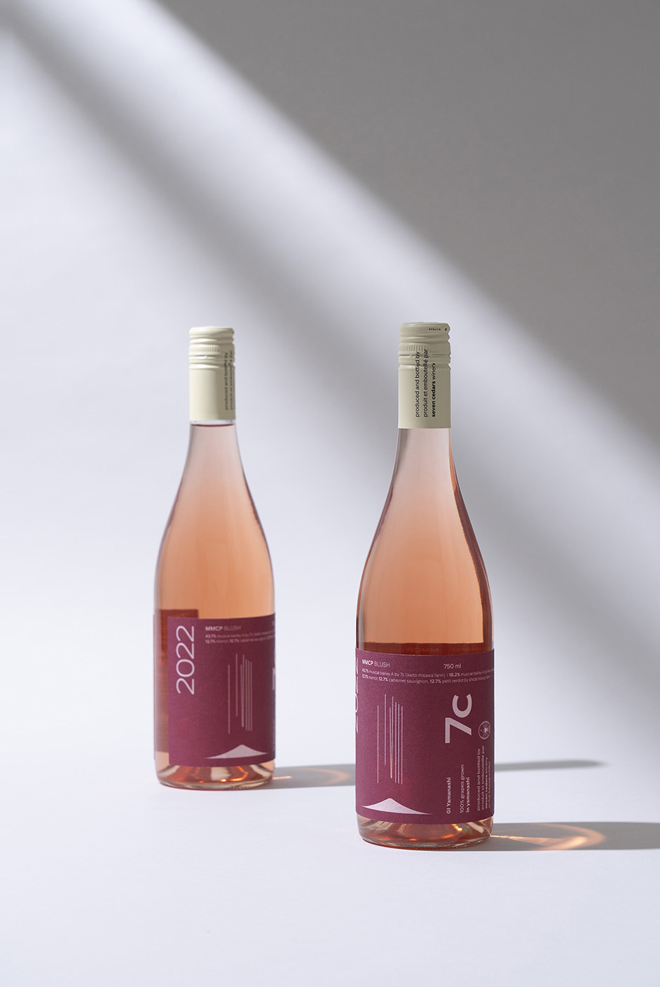
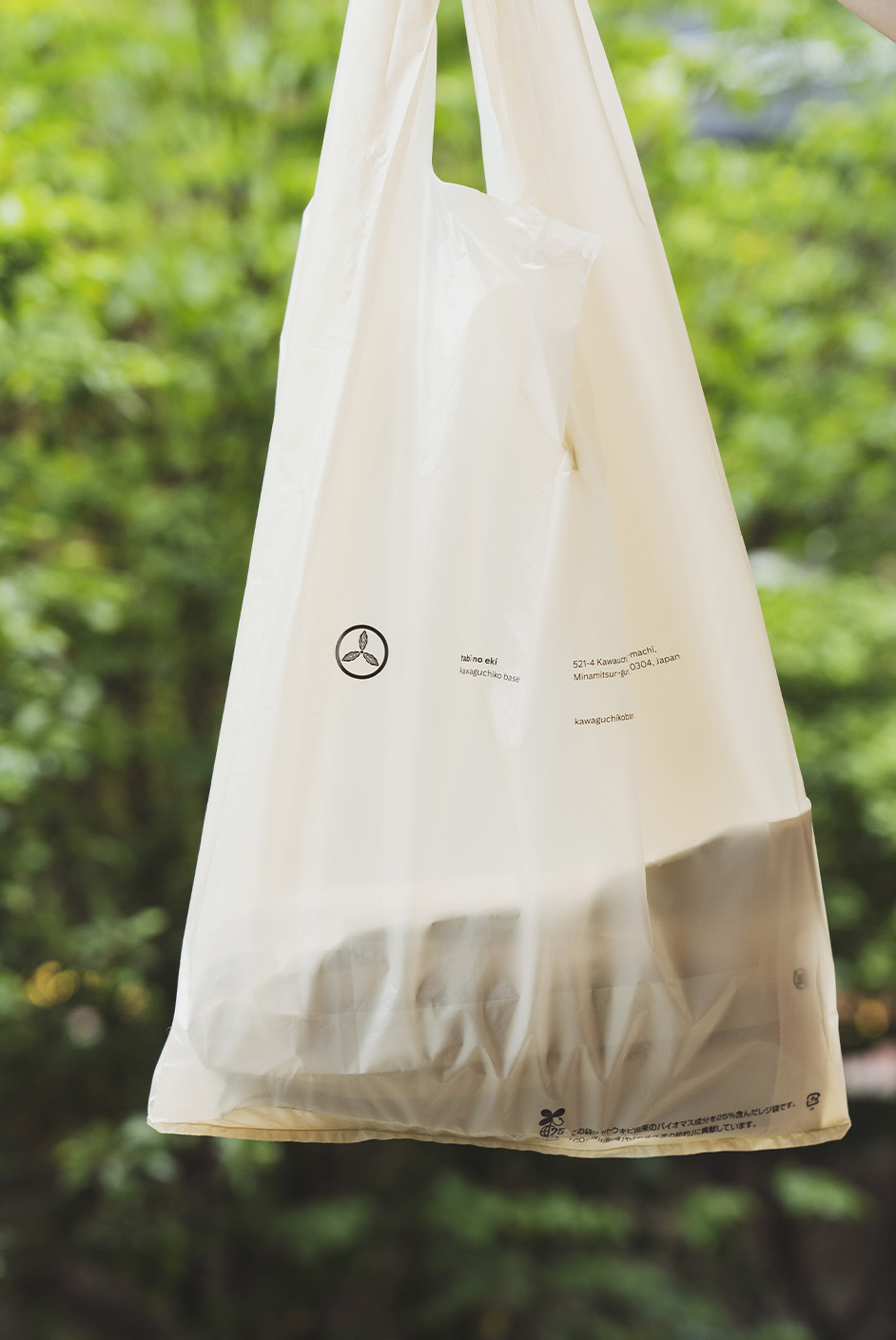
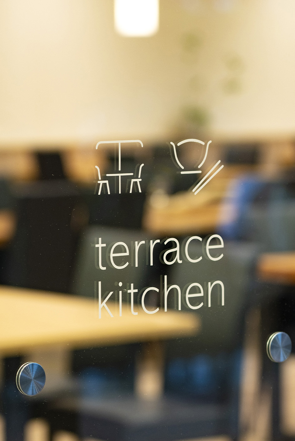
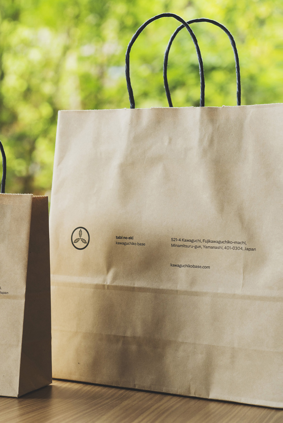
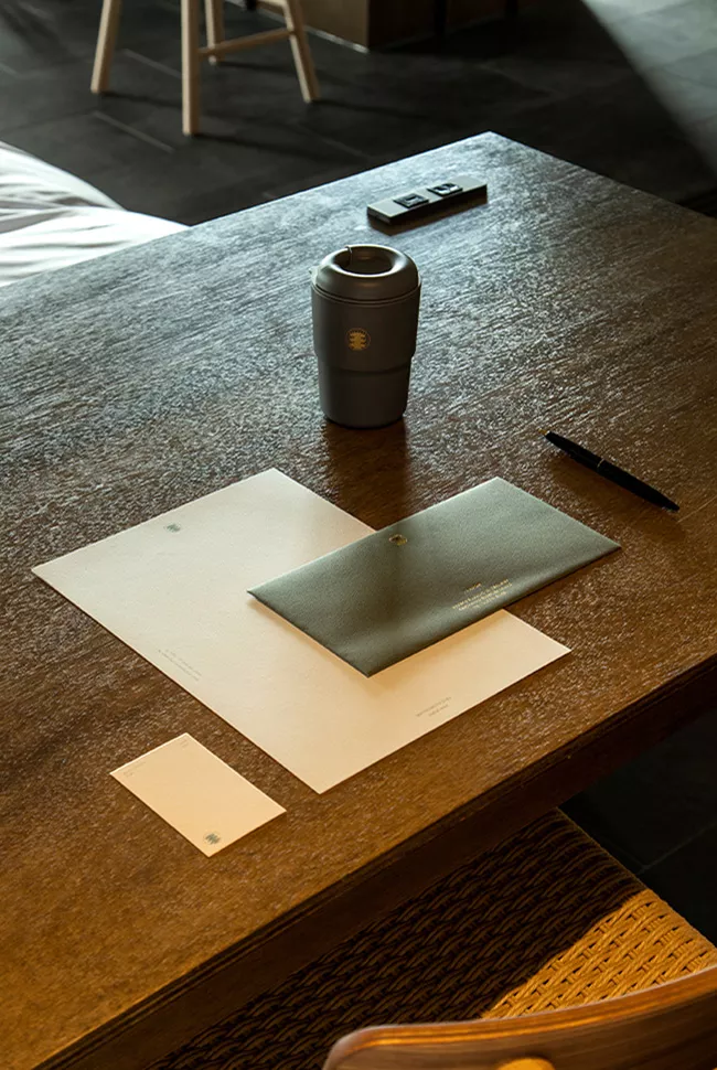
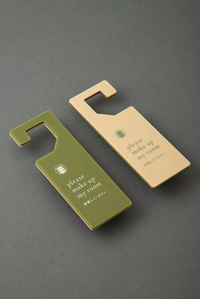
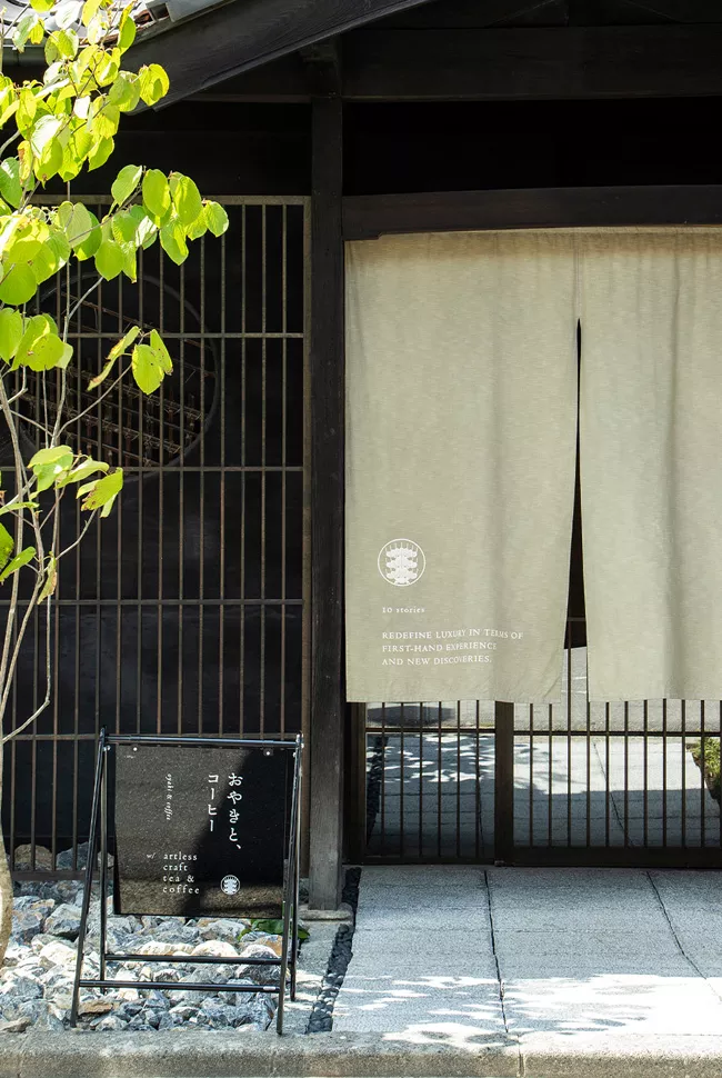
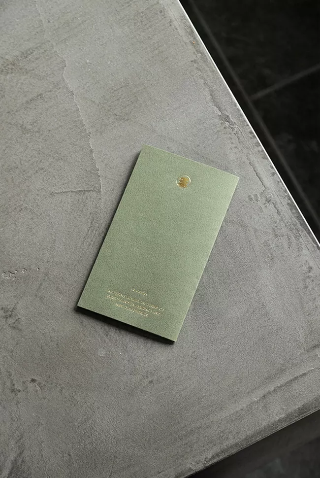
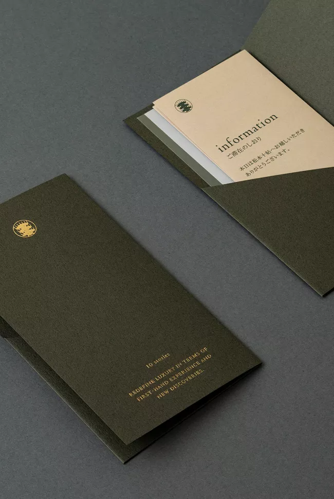
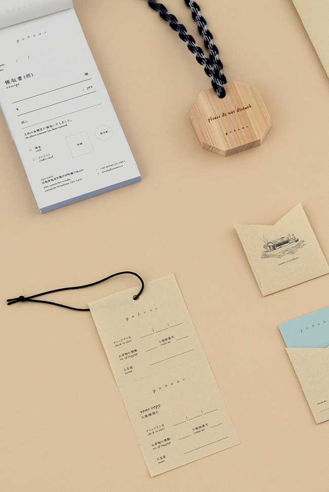
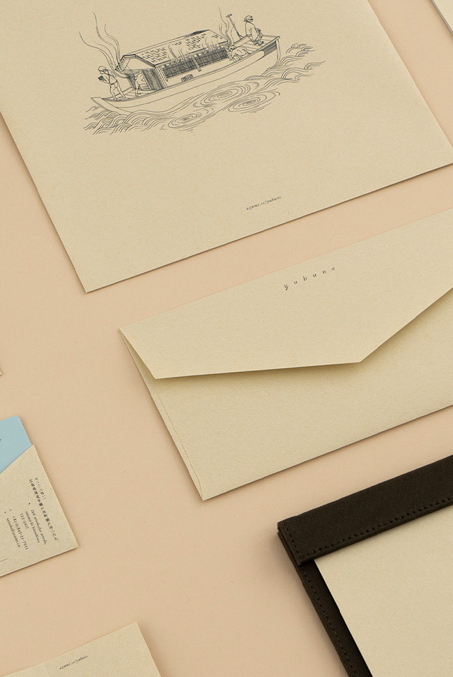
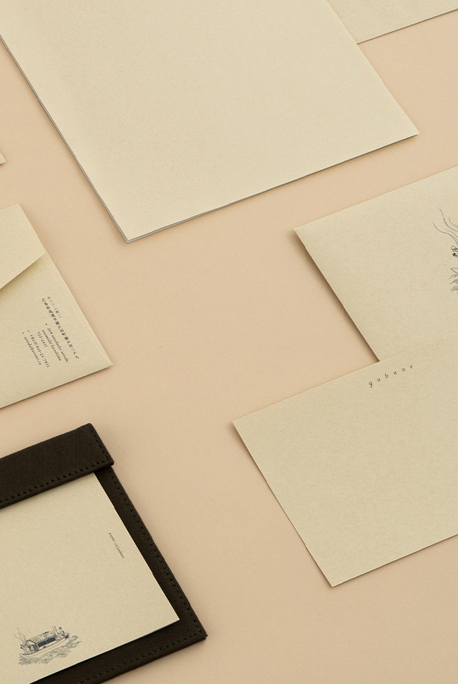
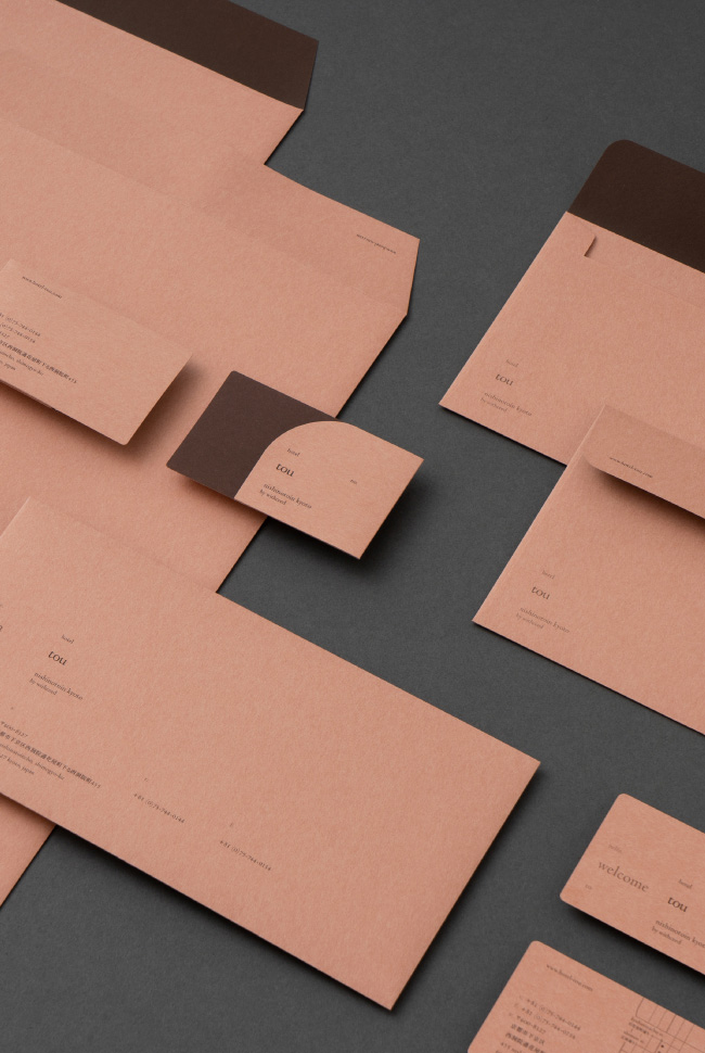
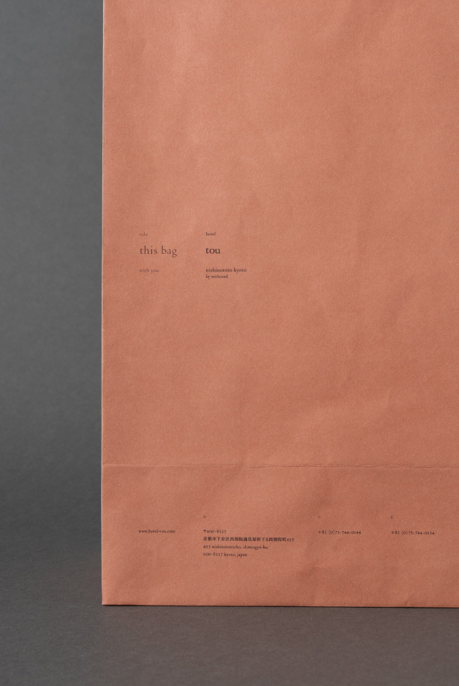
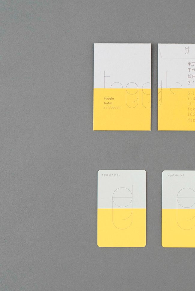
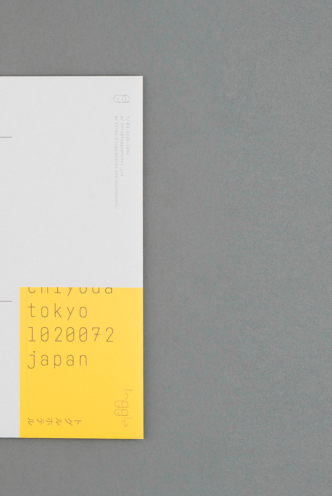
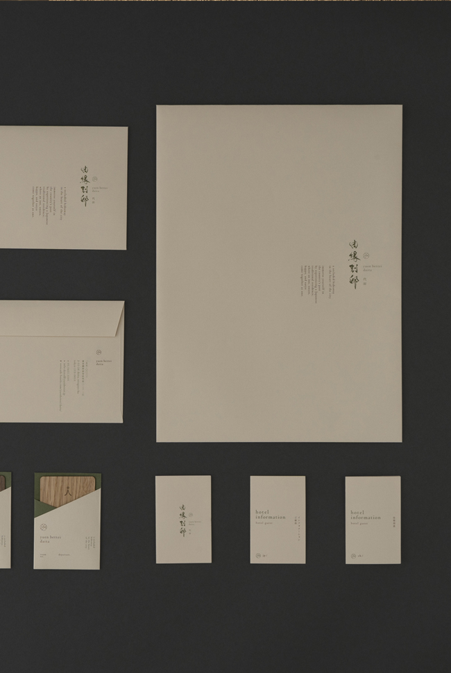
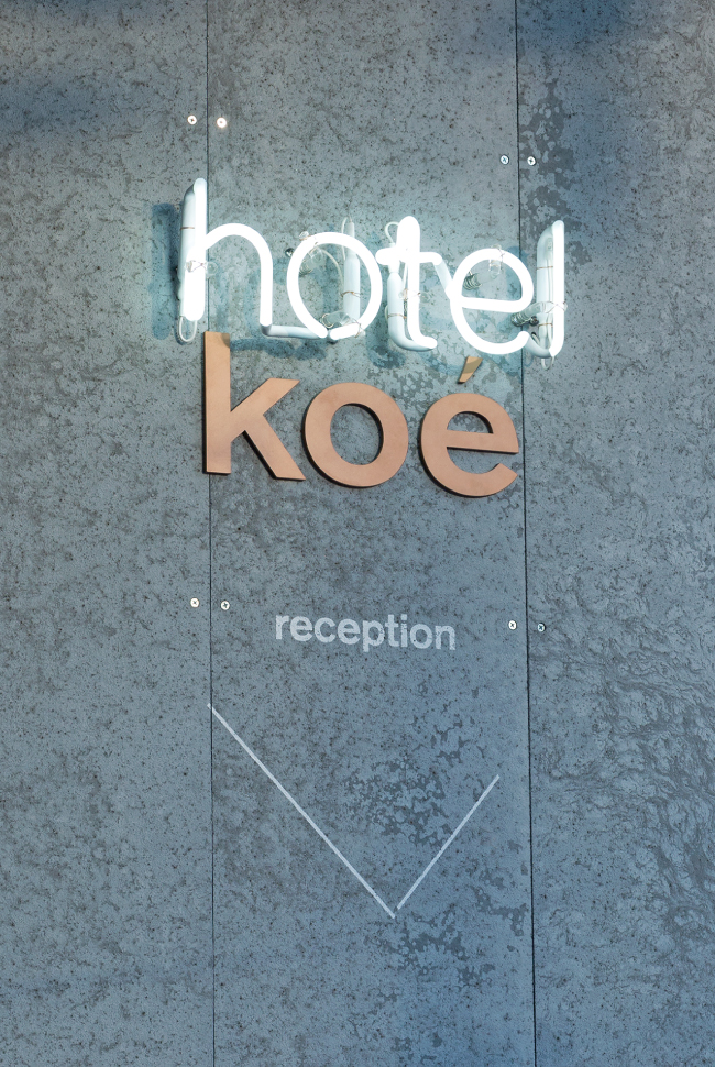
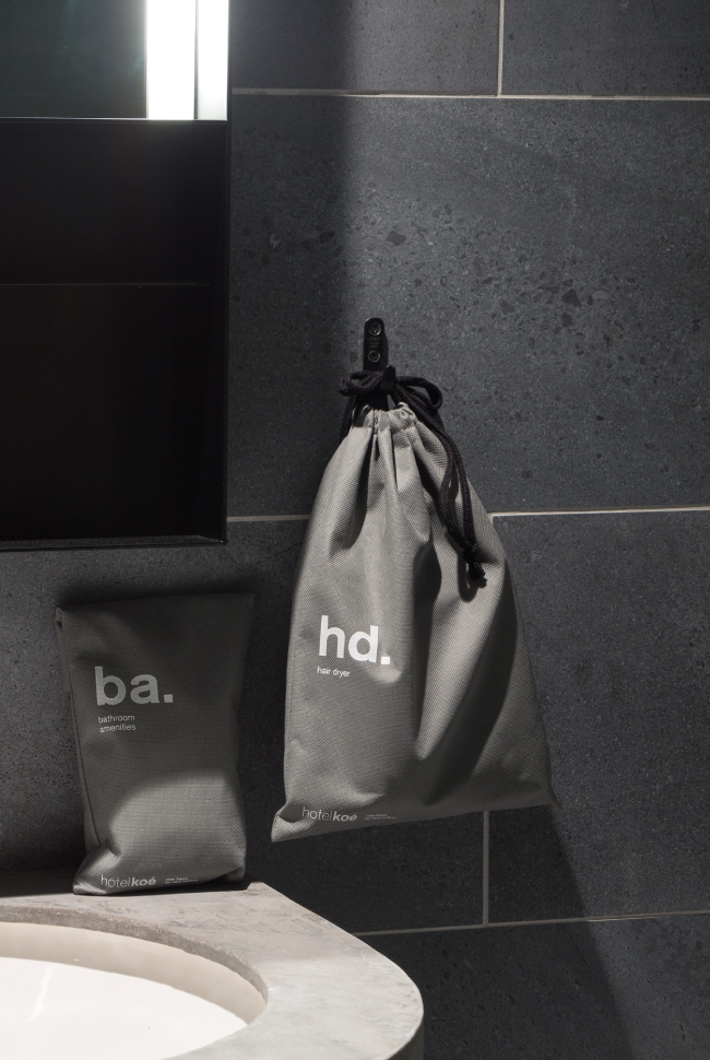
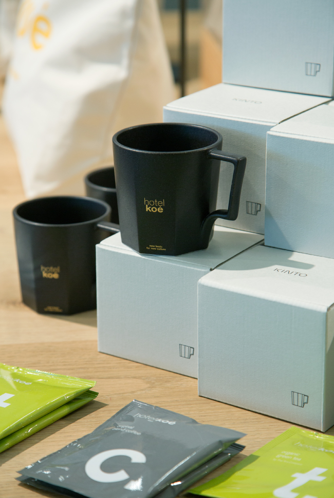
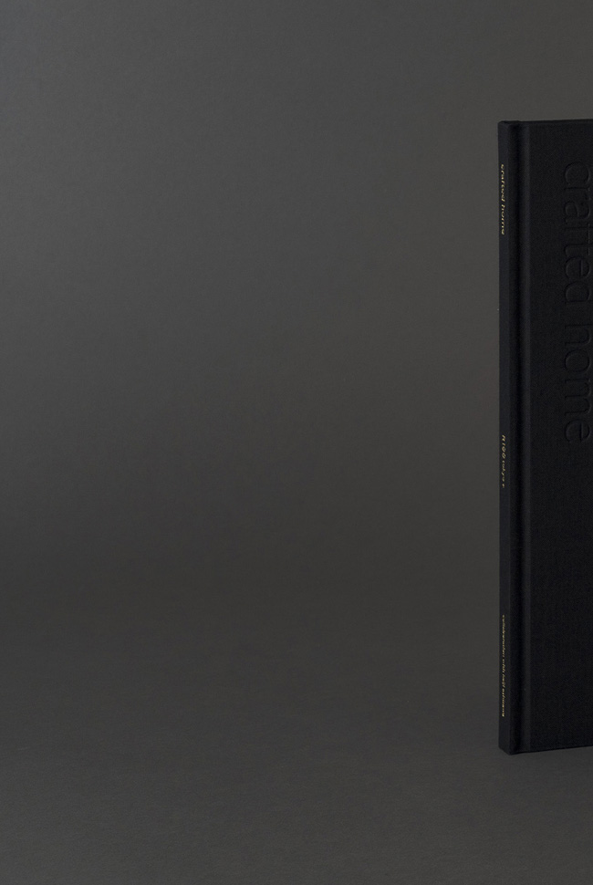
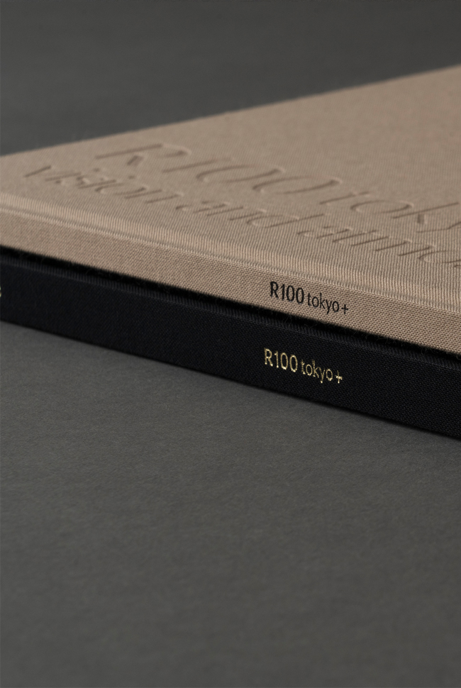
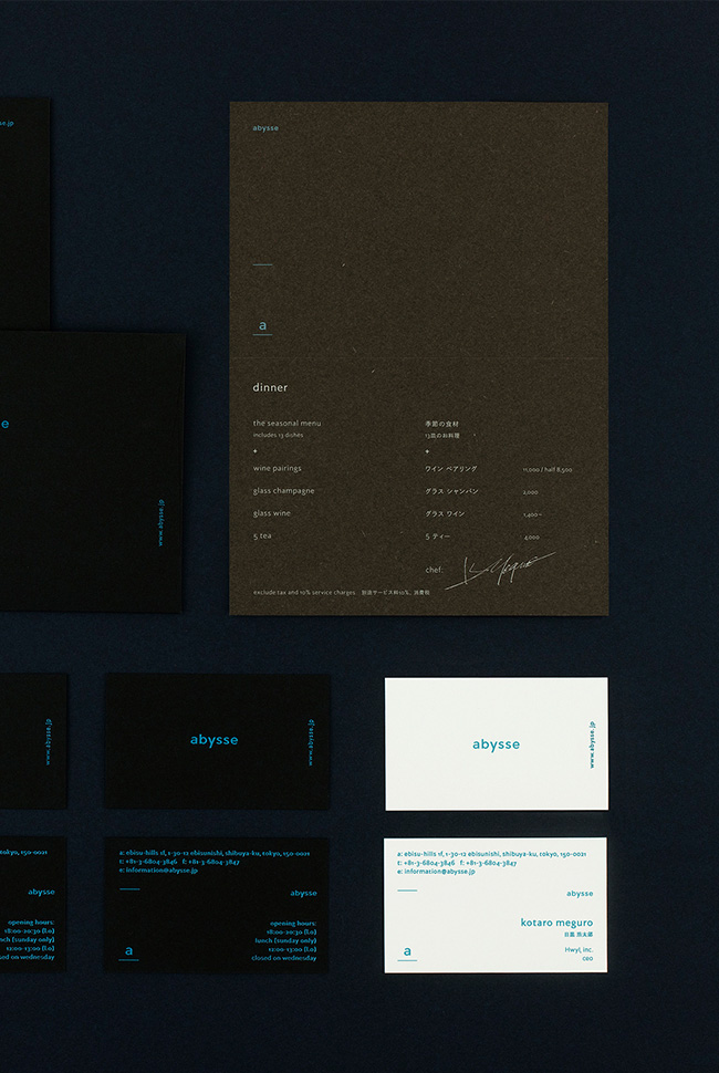
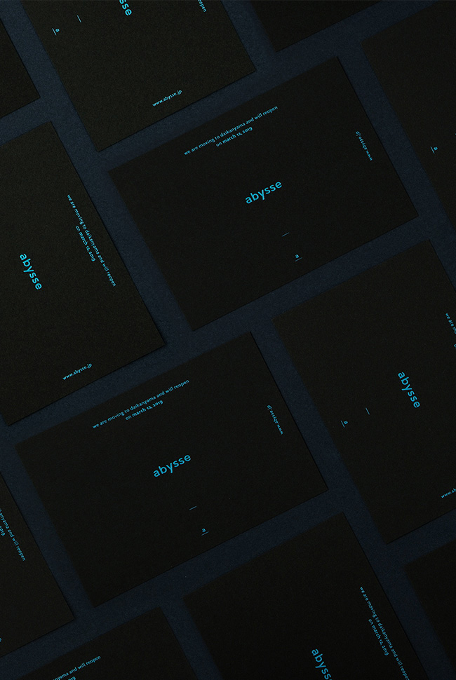
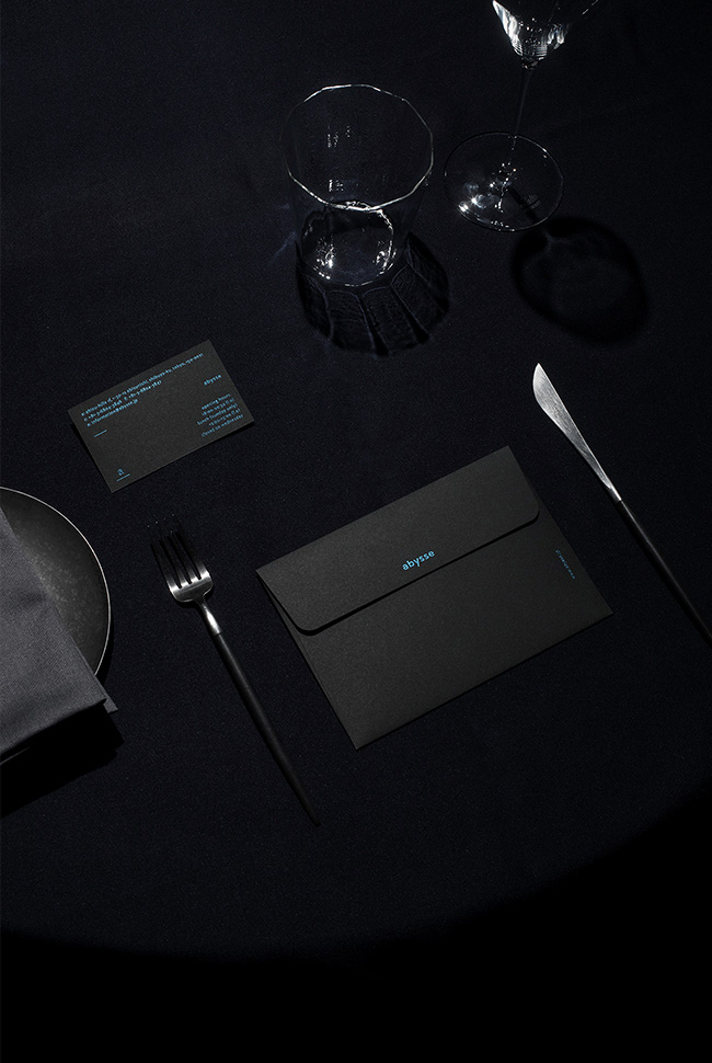
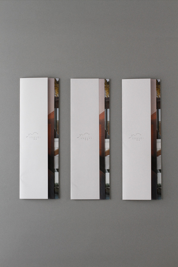
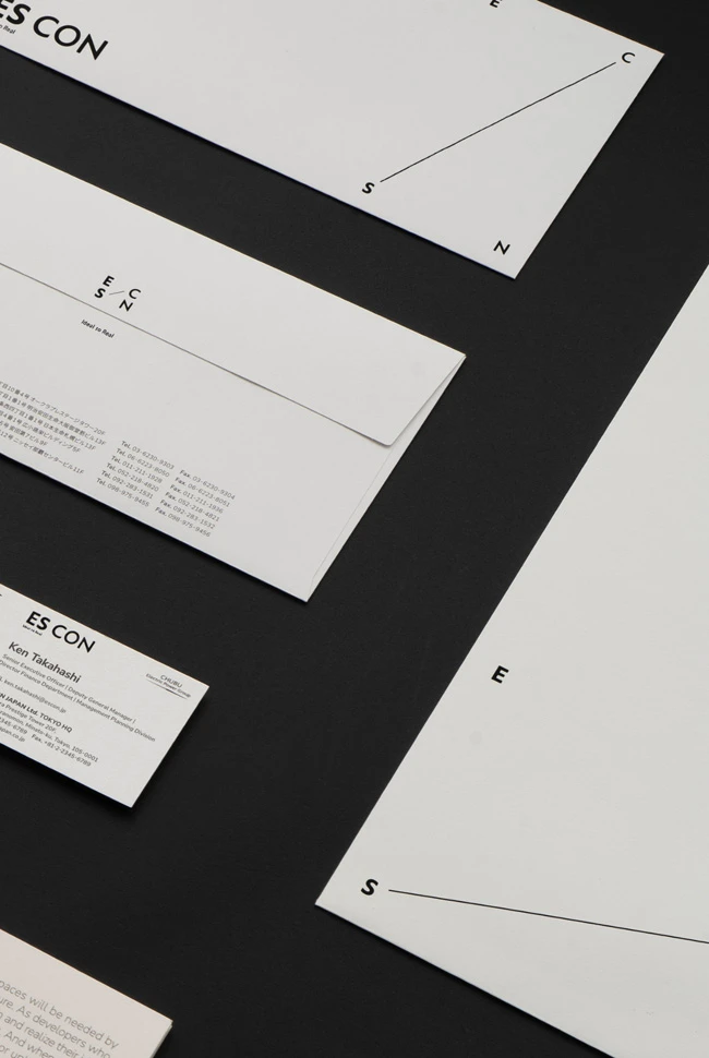
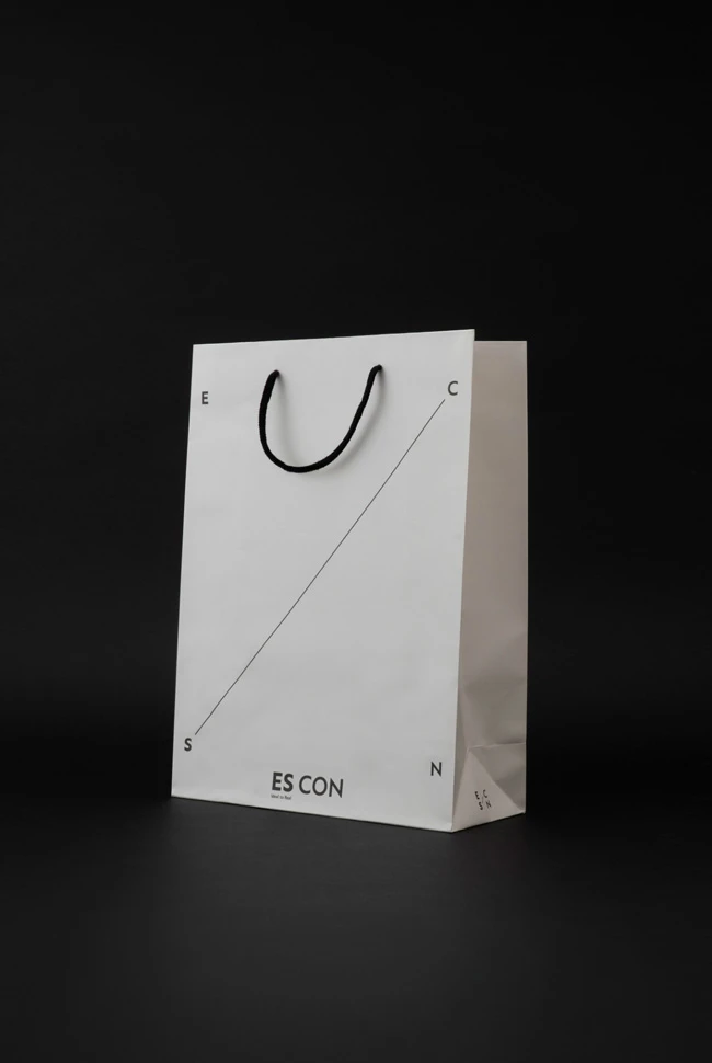
graphic design
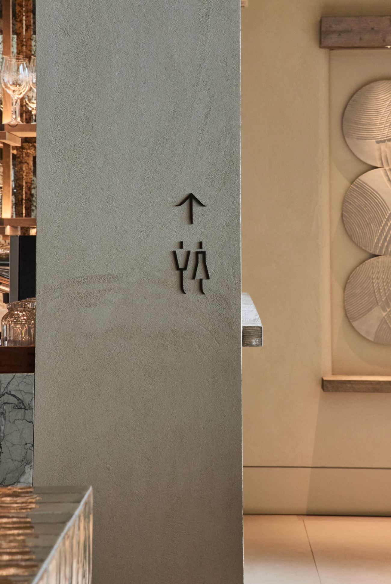
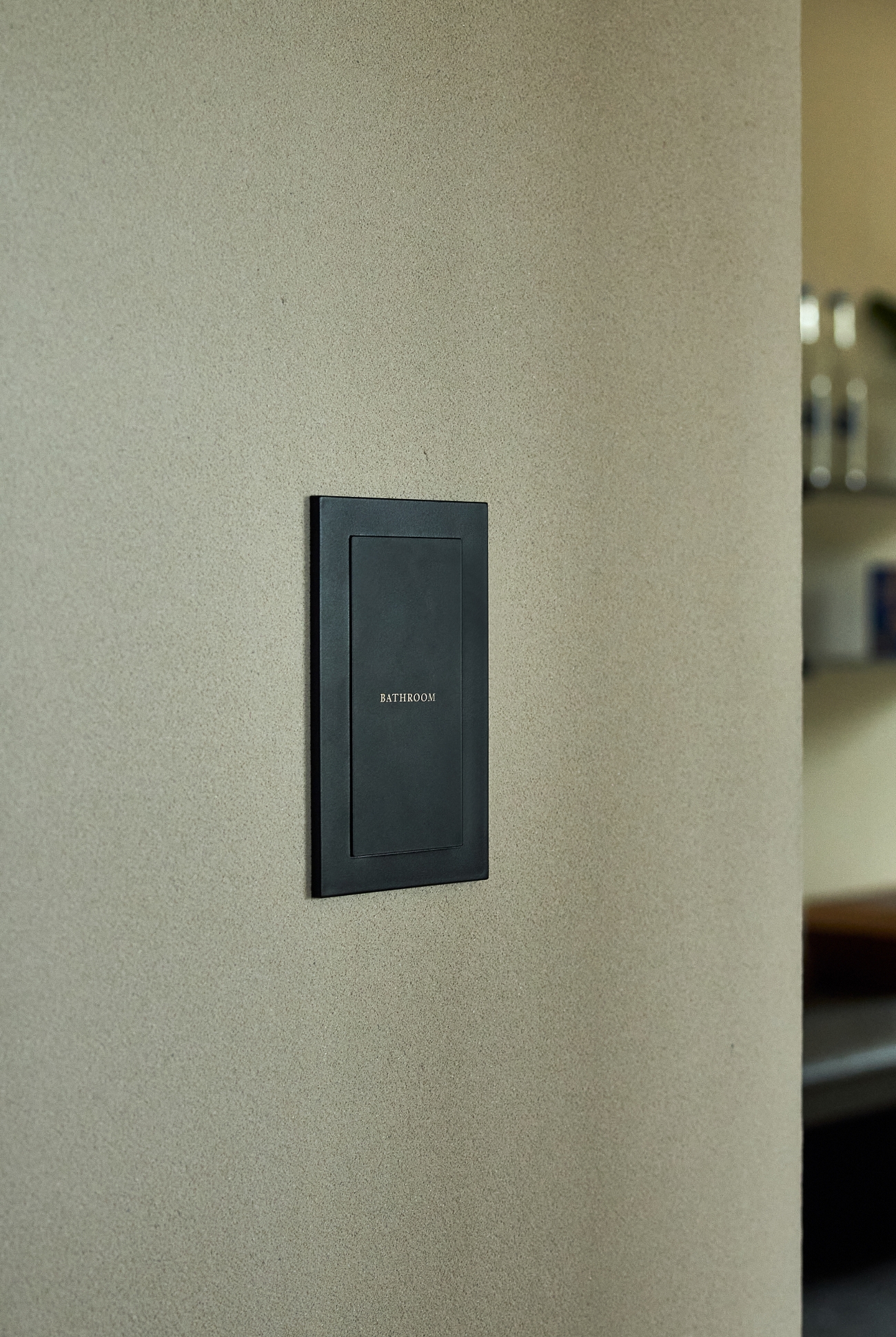
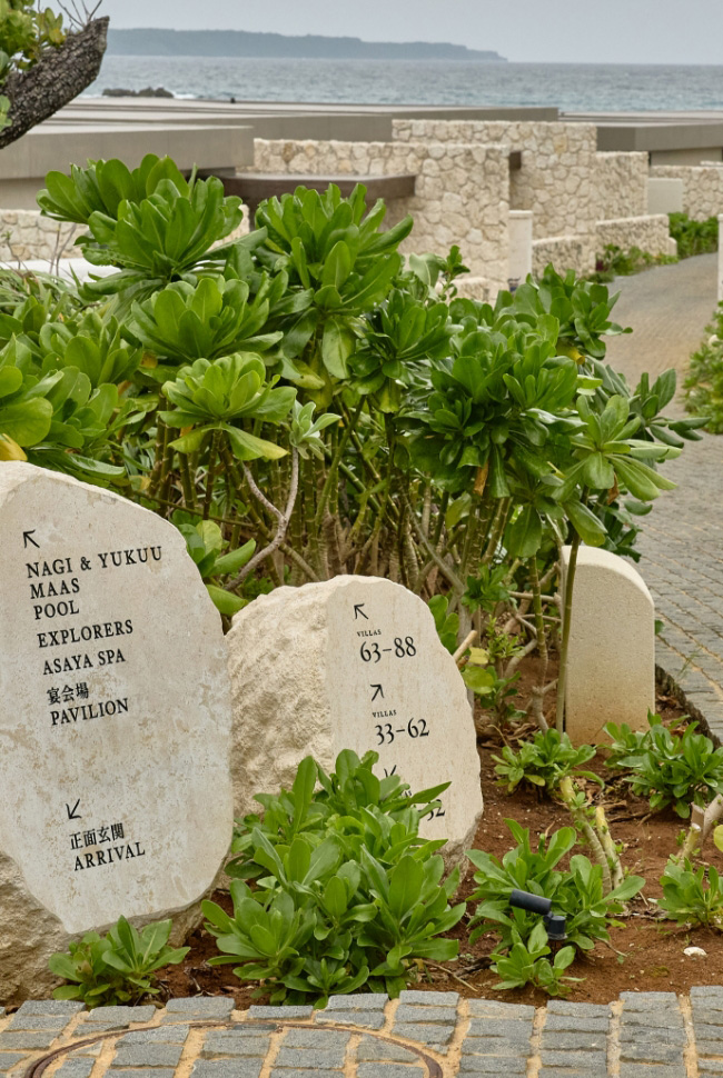
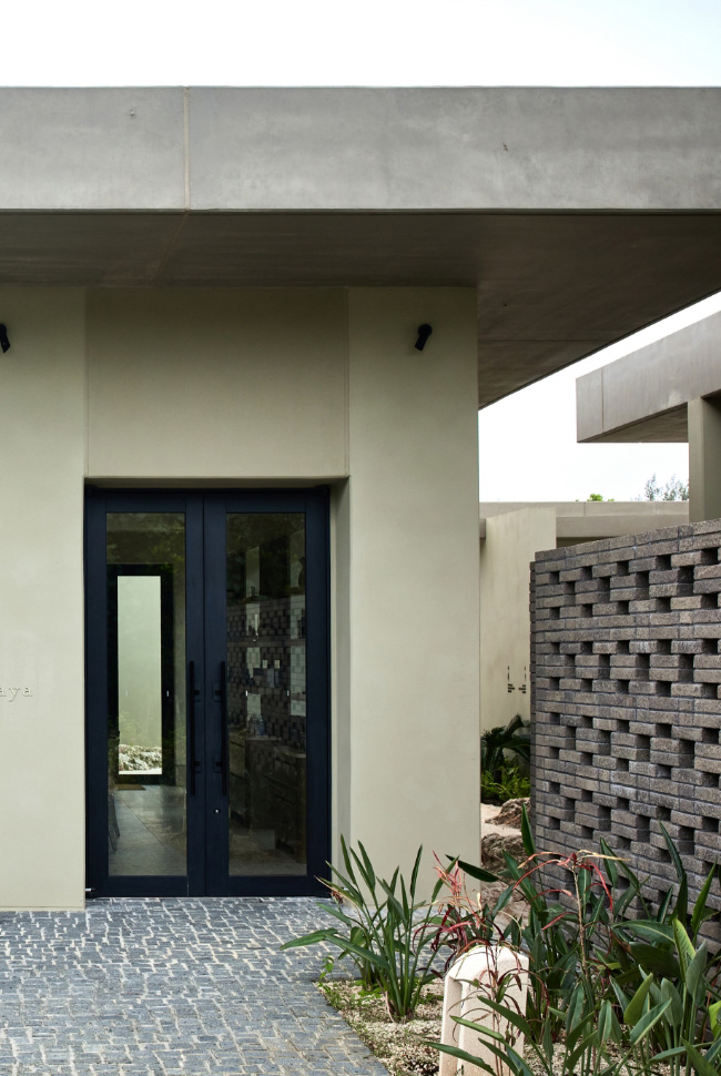
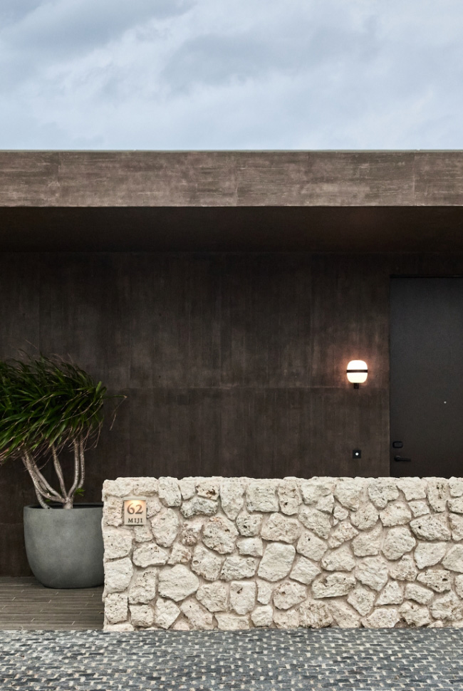
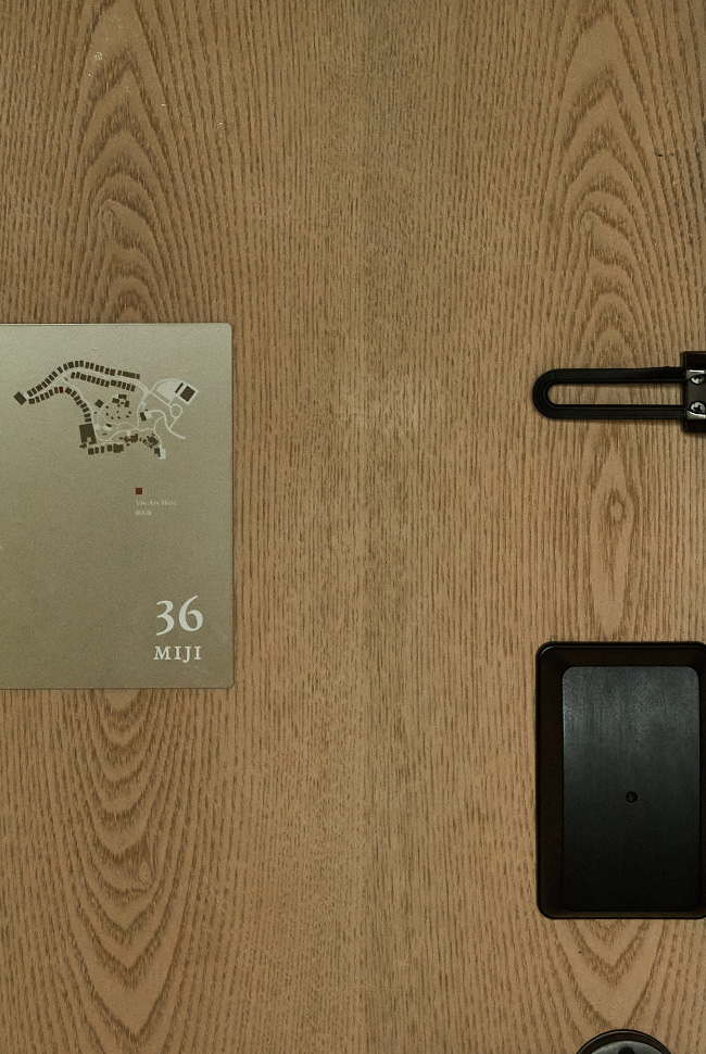
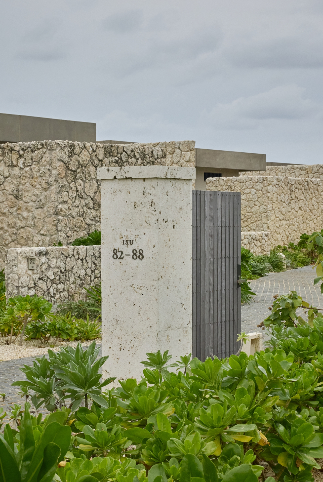
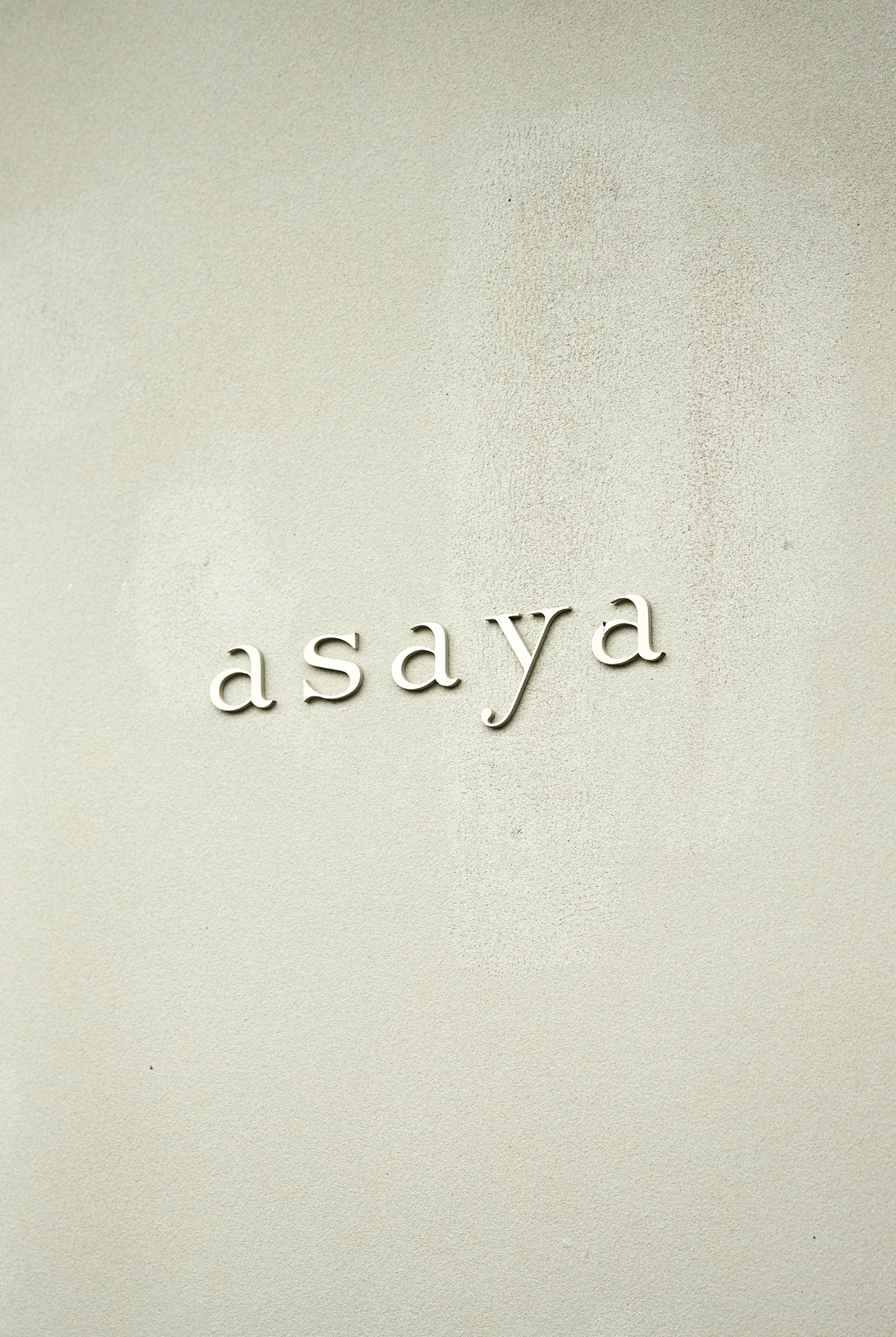
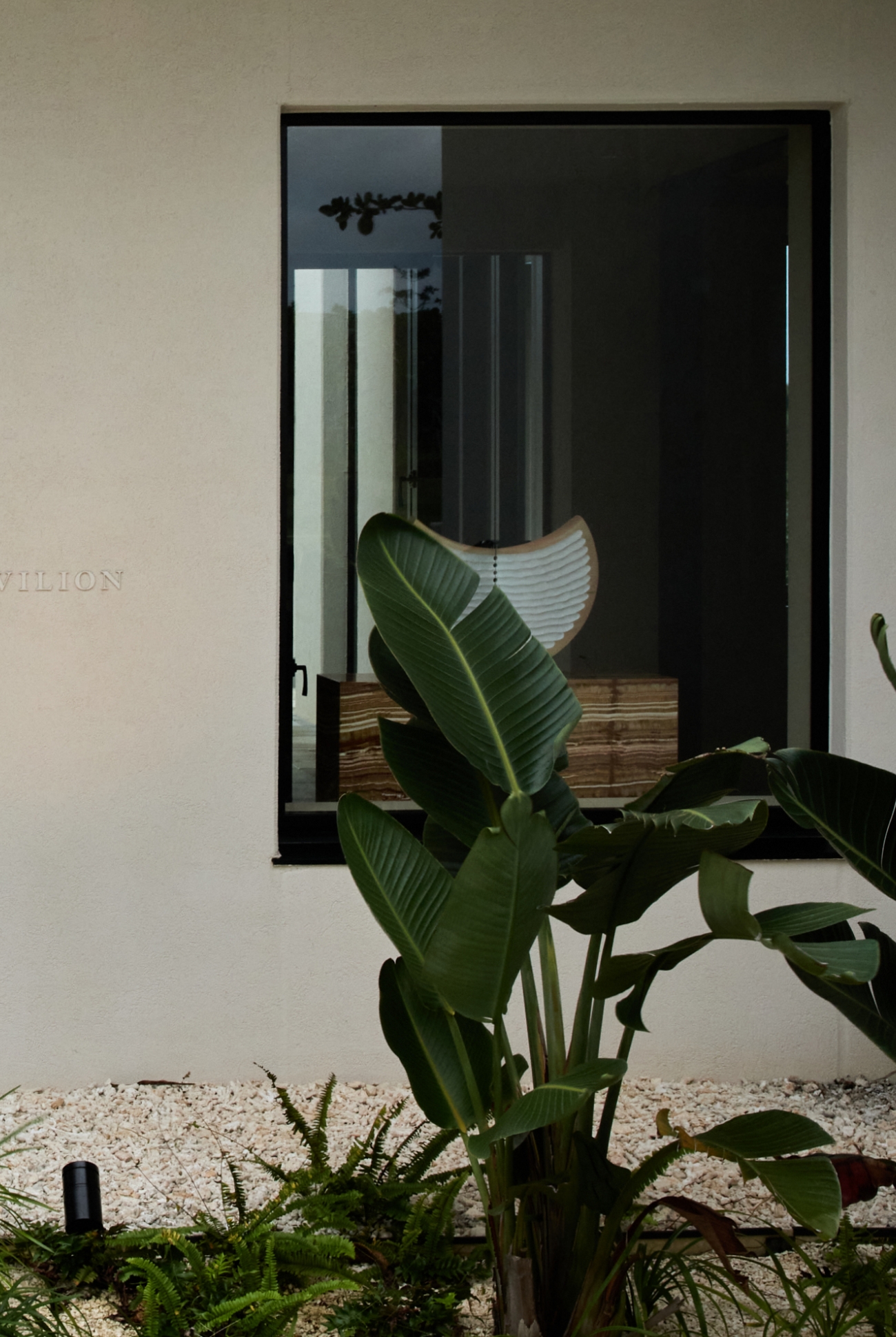
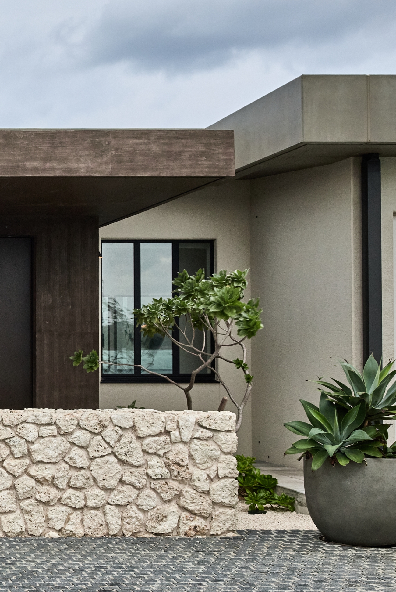
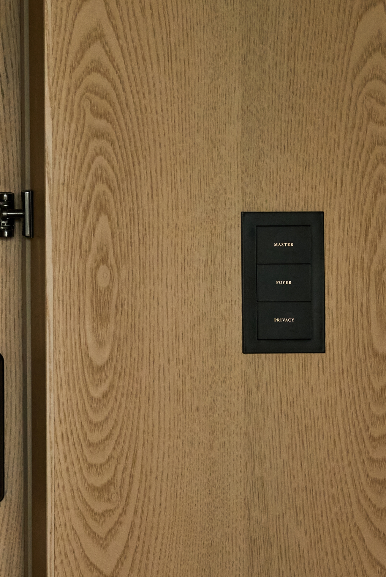
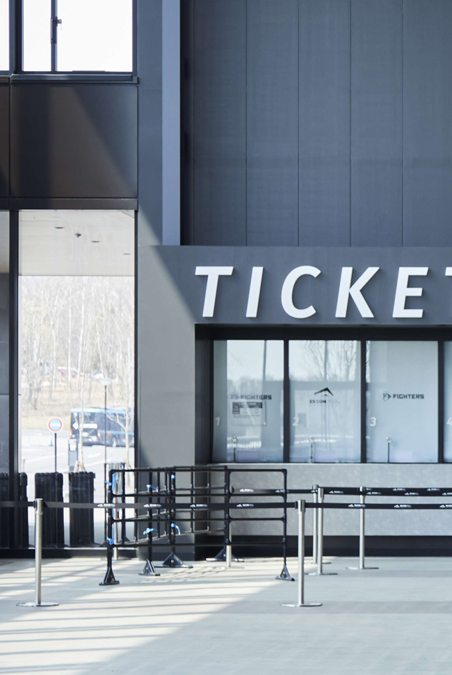
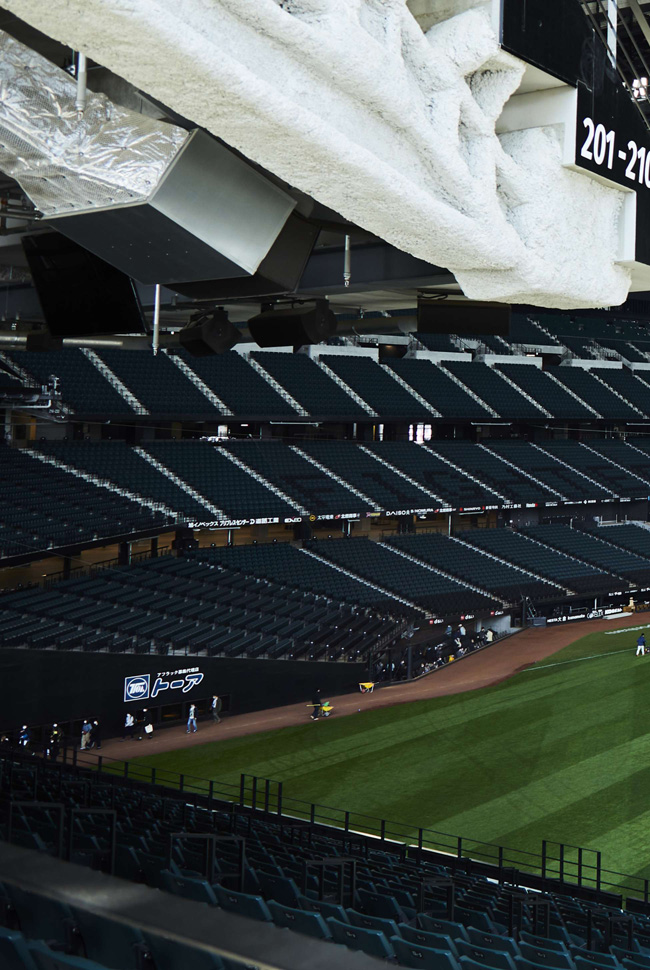
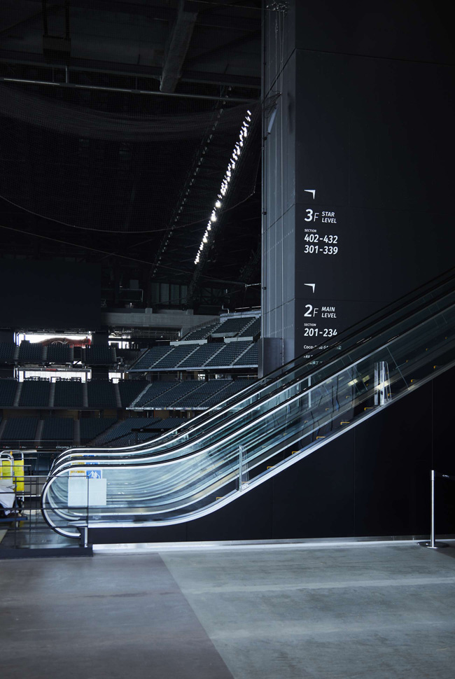
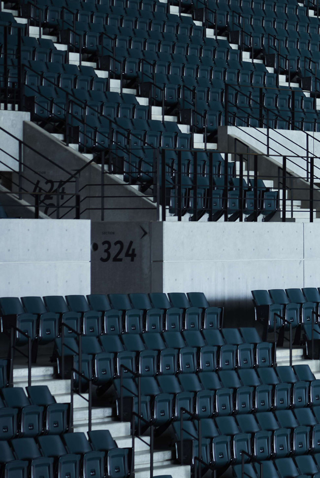
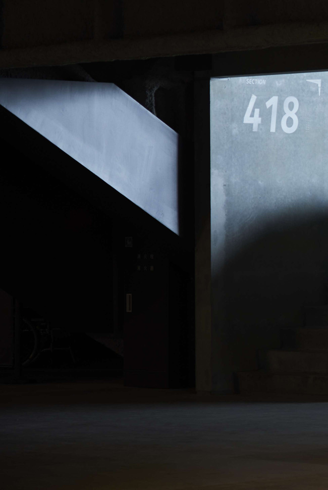
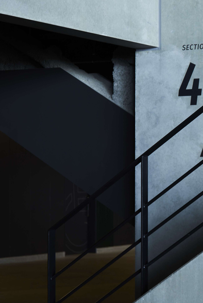
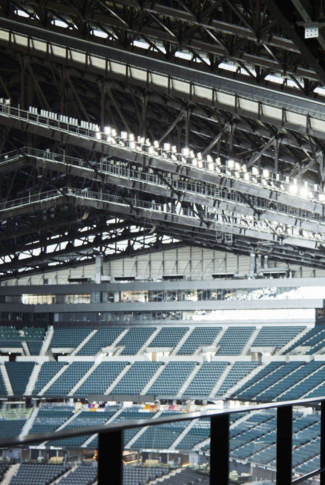
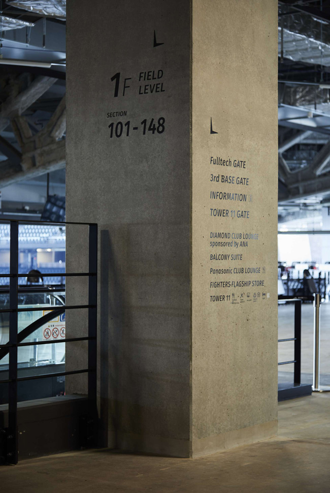
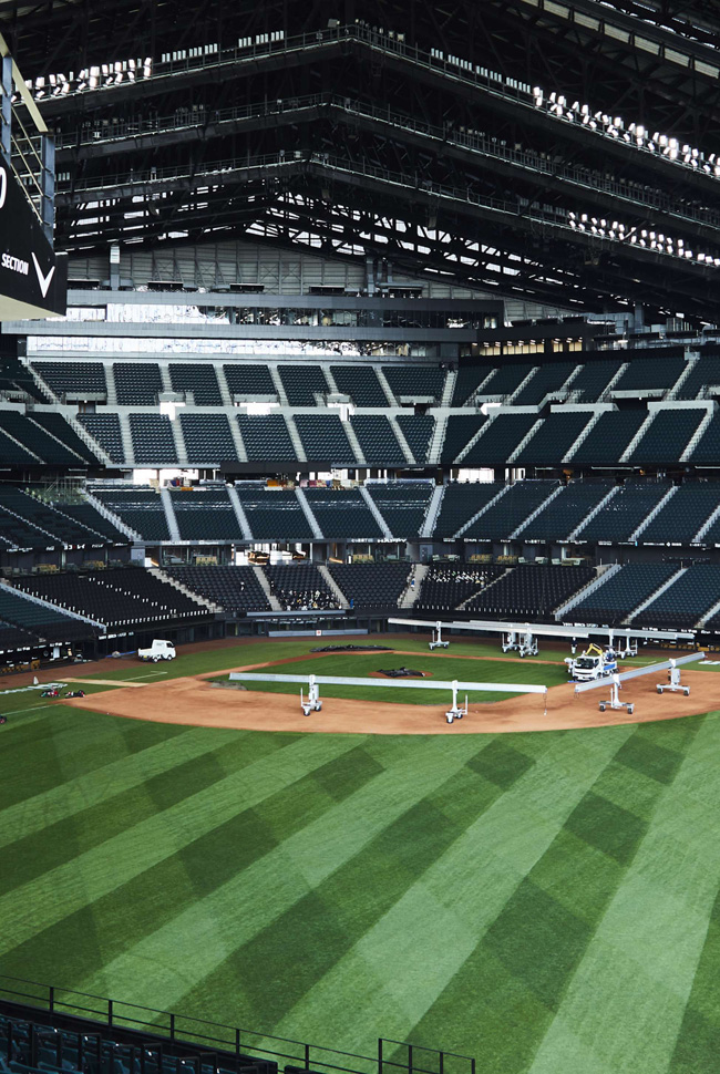
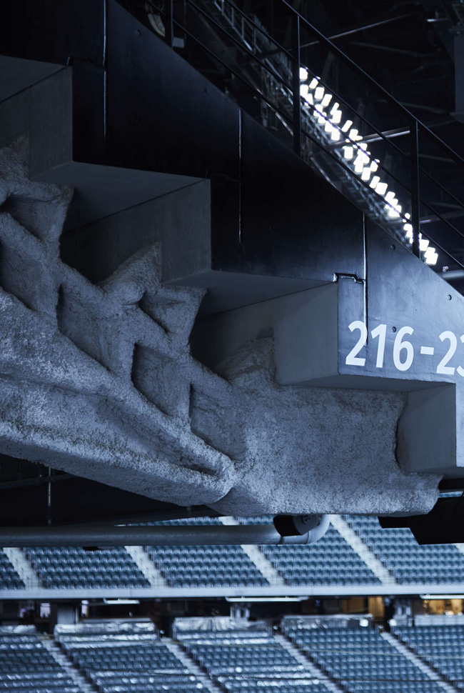
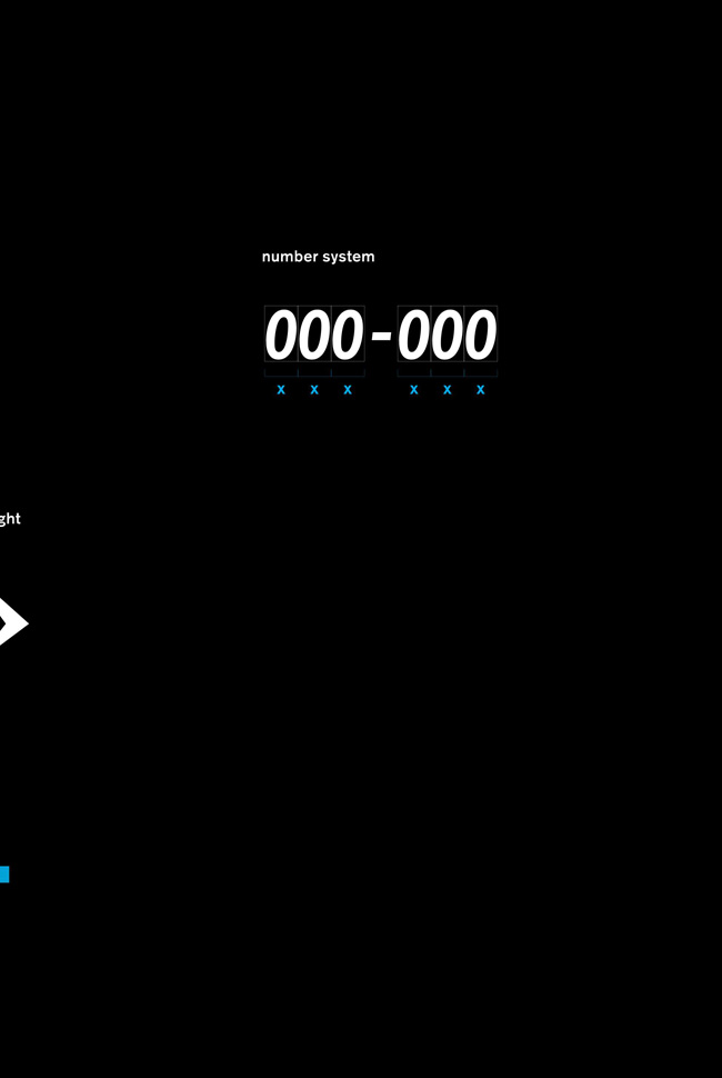
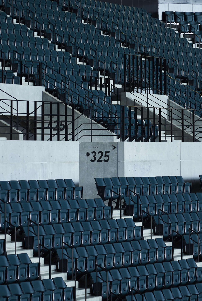
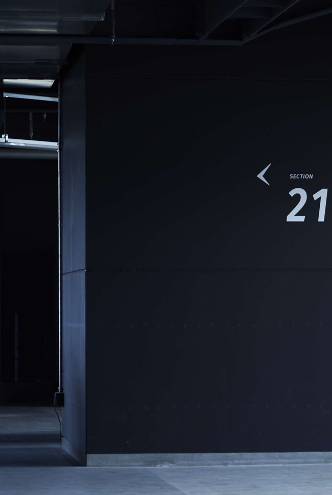
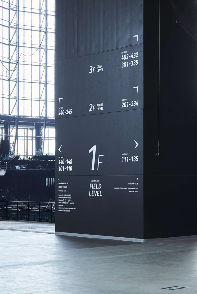
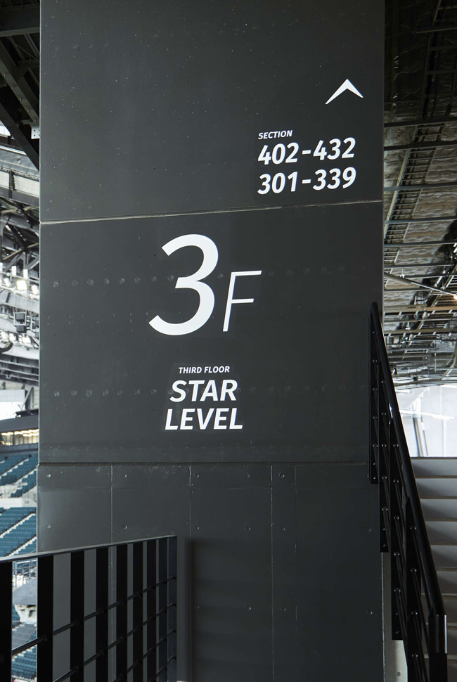
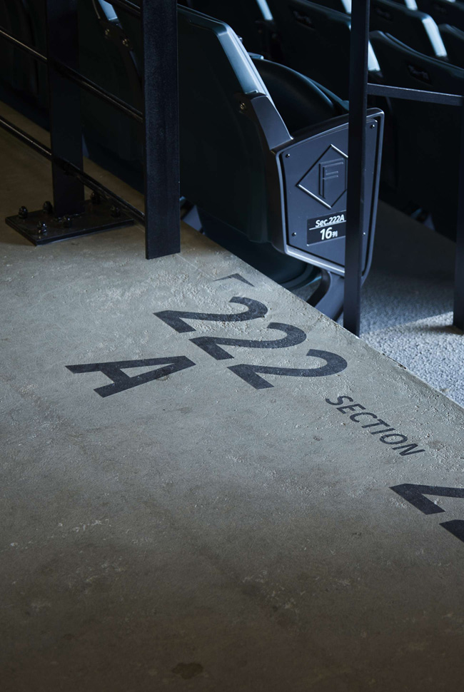
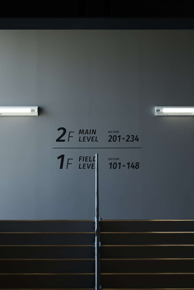
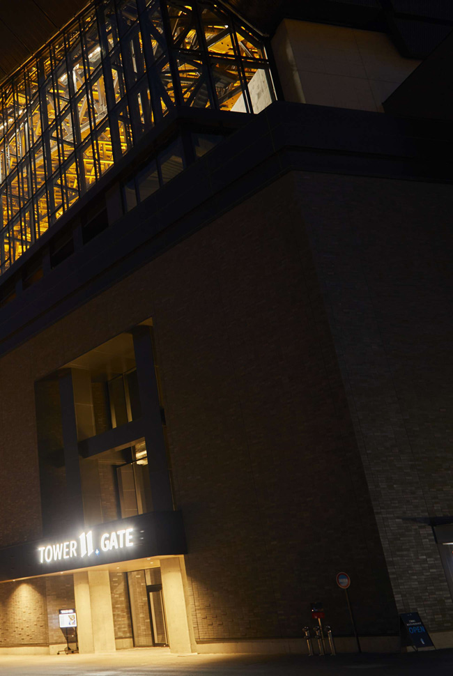
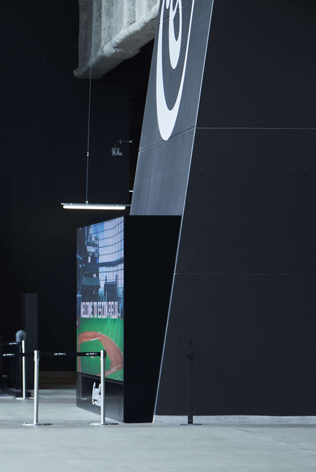
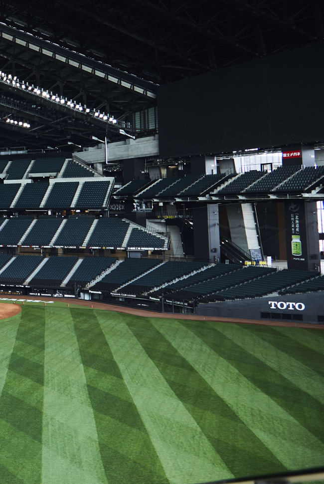
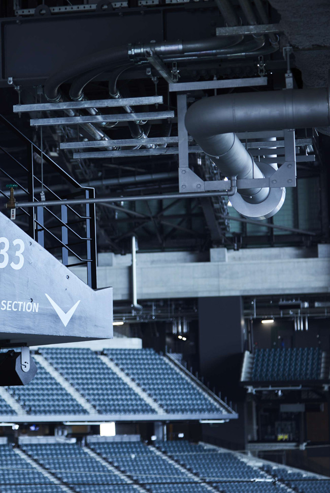
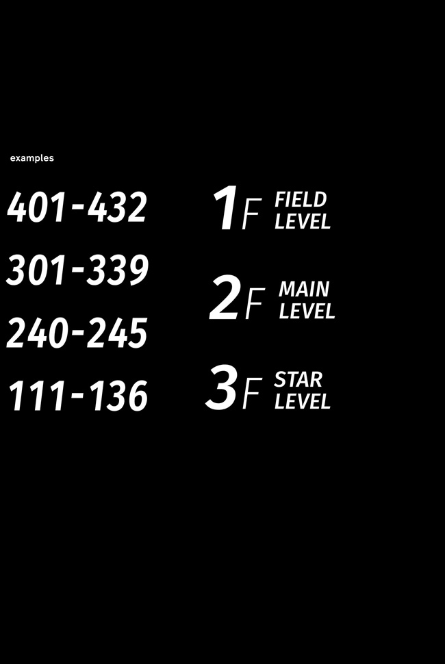
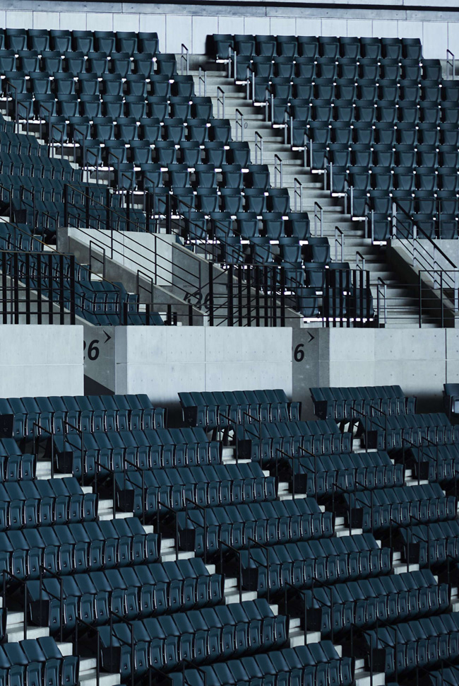
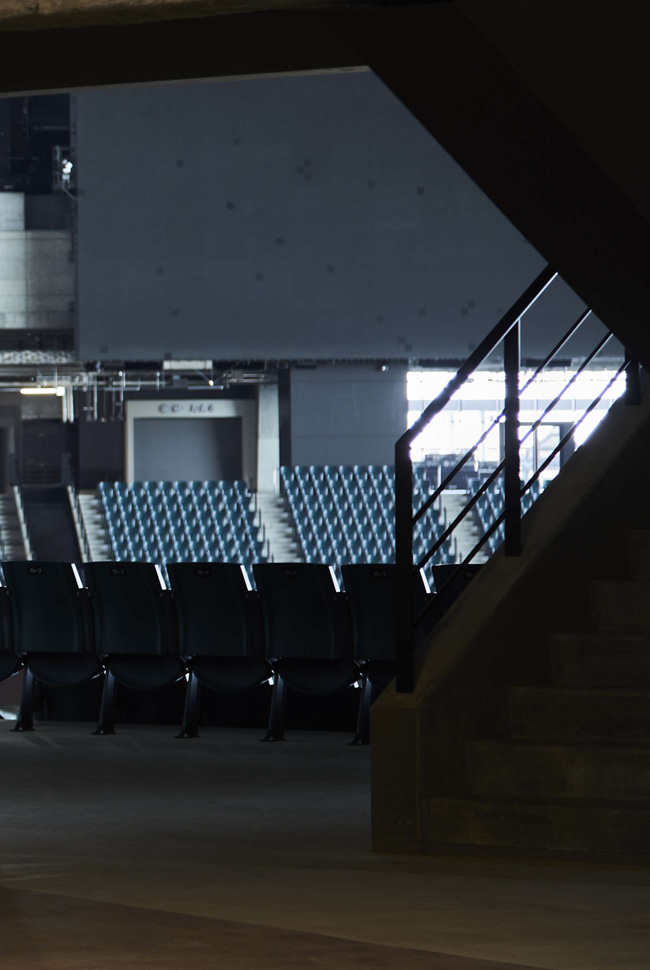
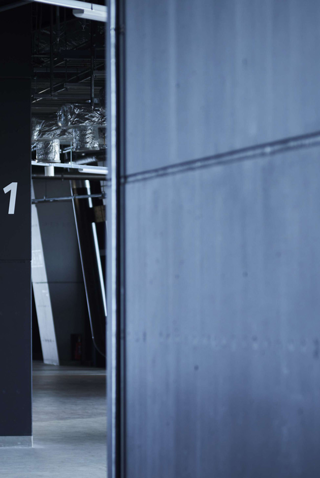
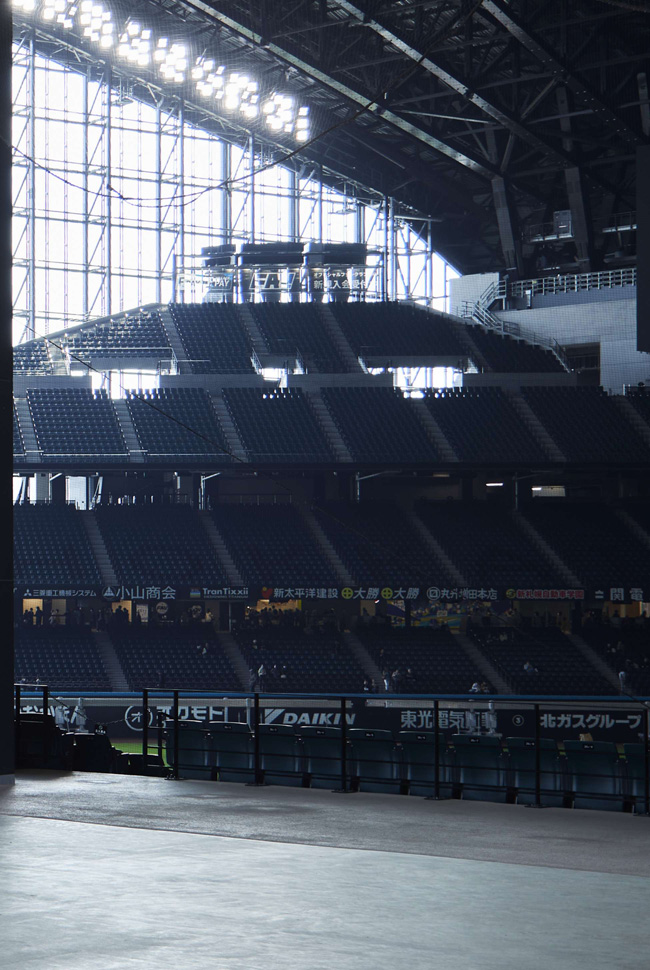
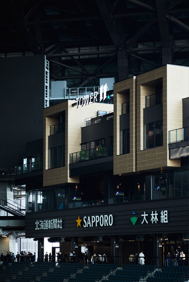
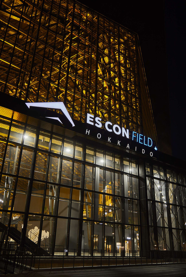
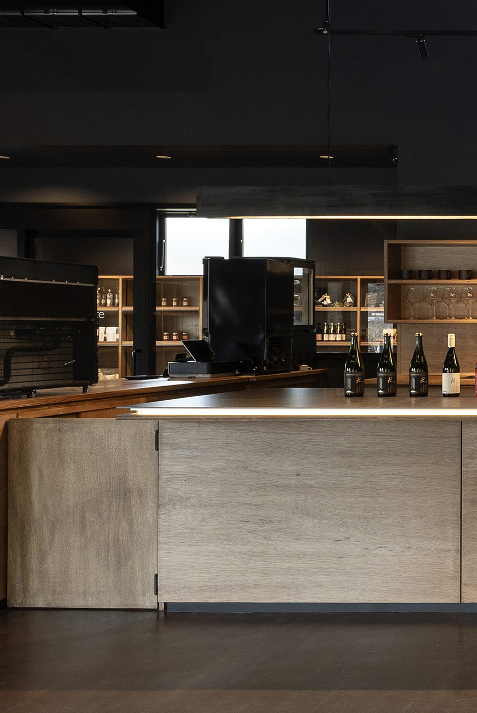
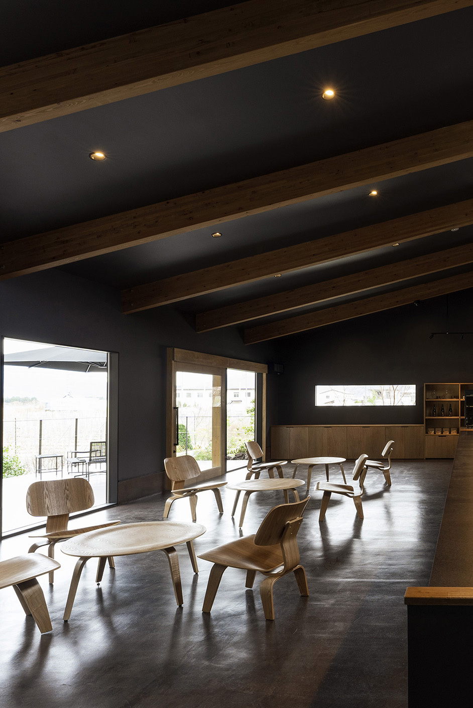
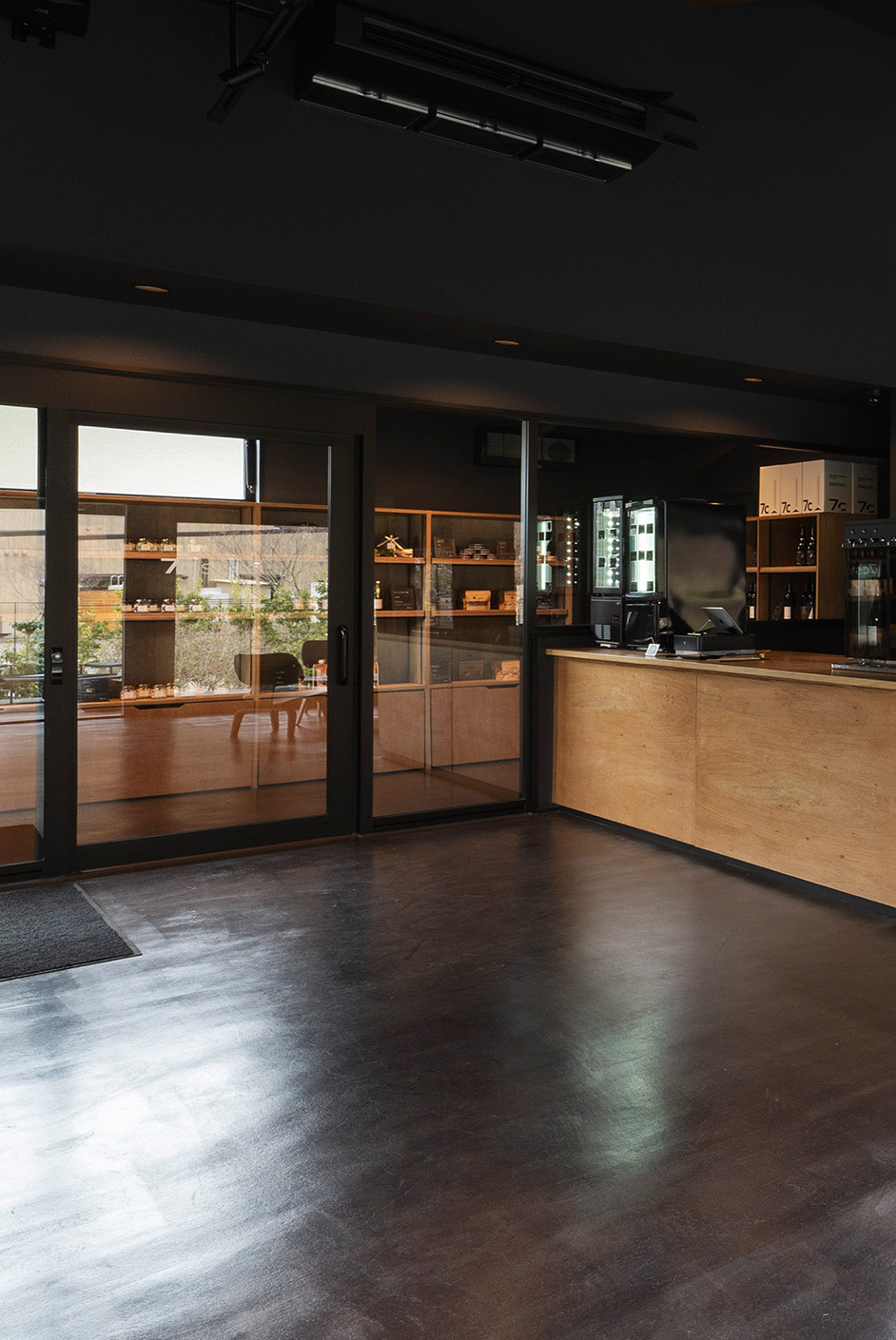
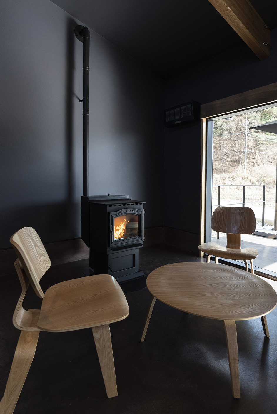
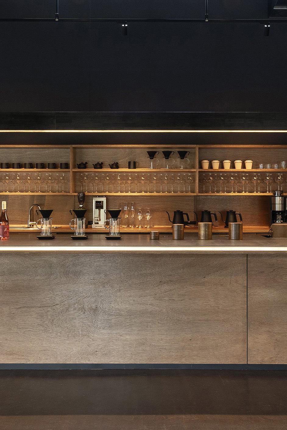
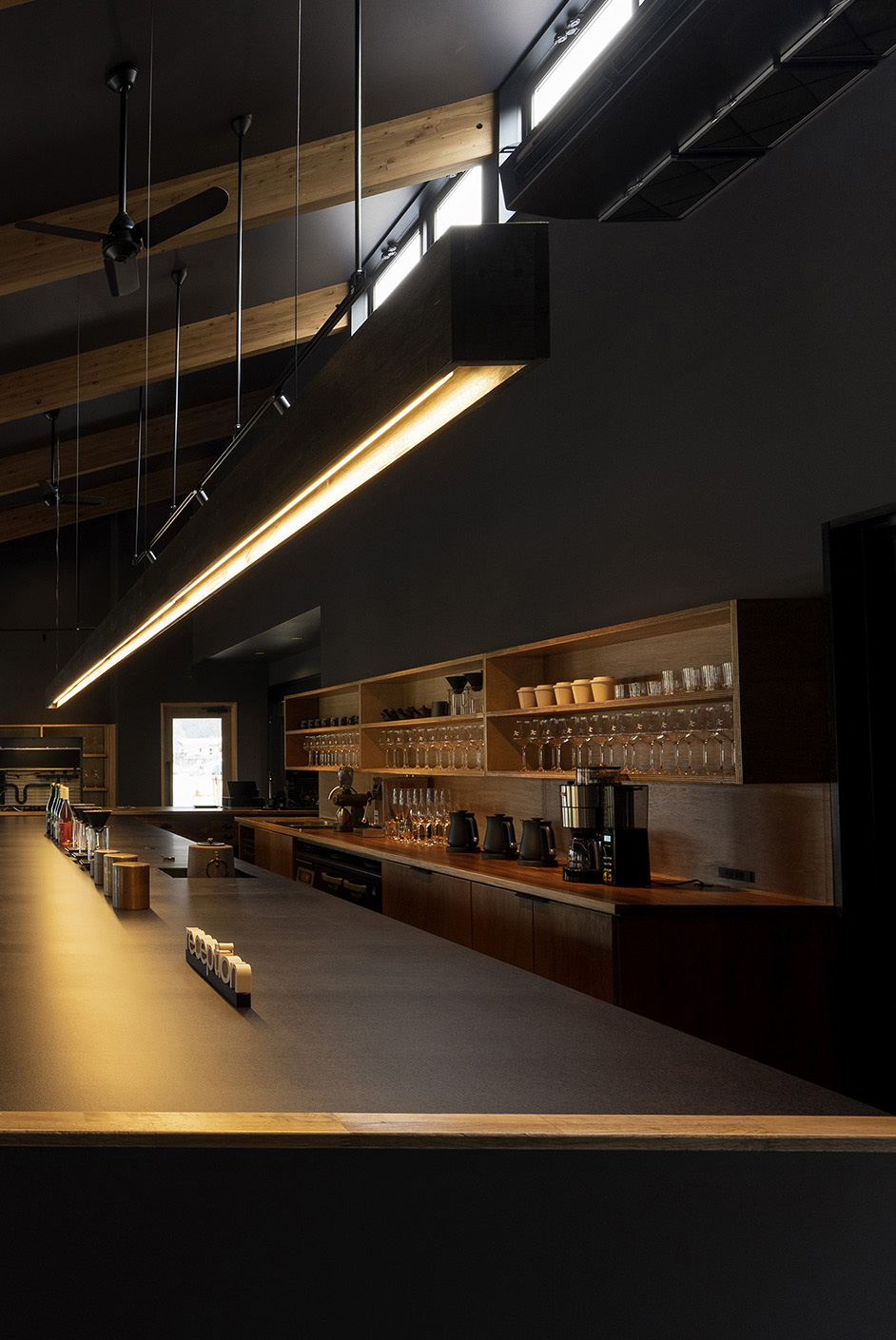
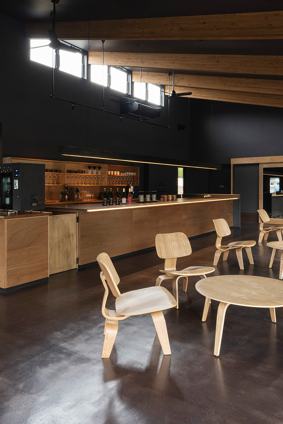
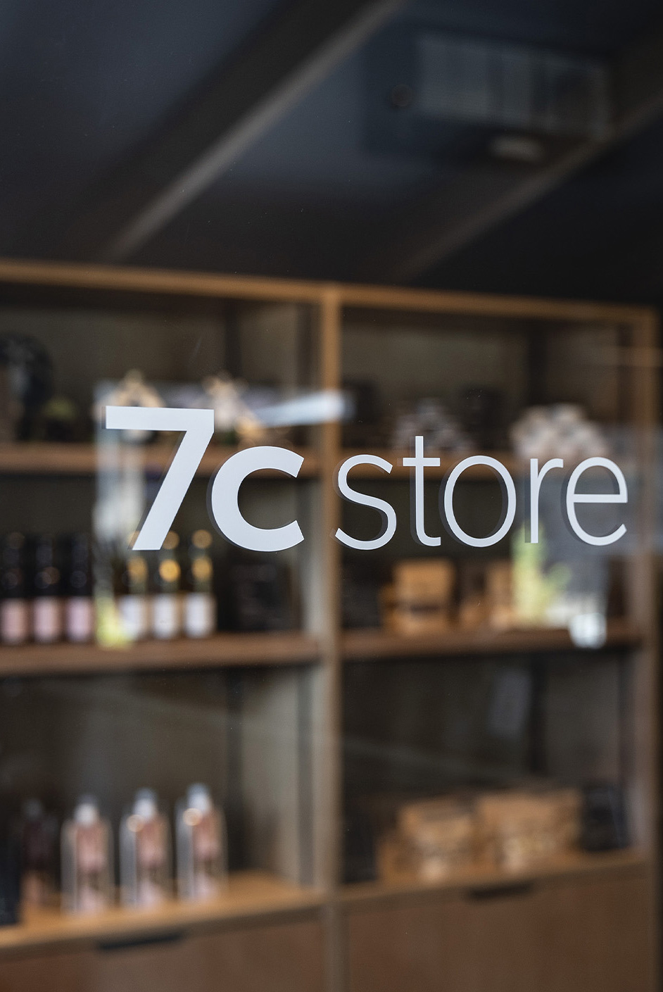
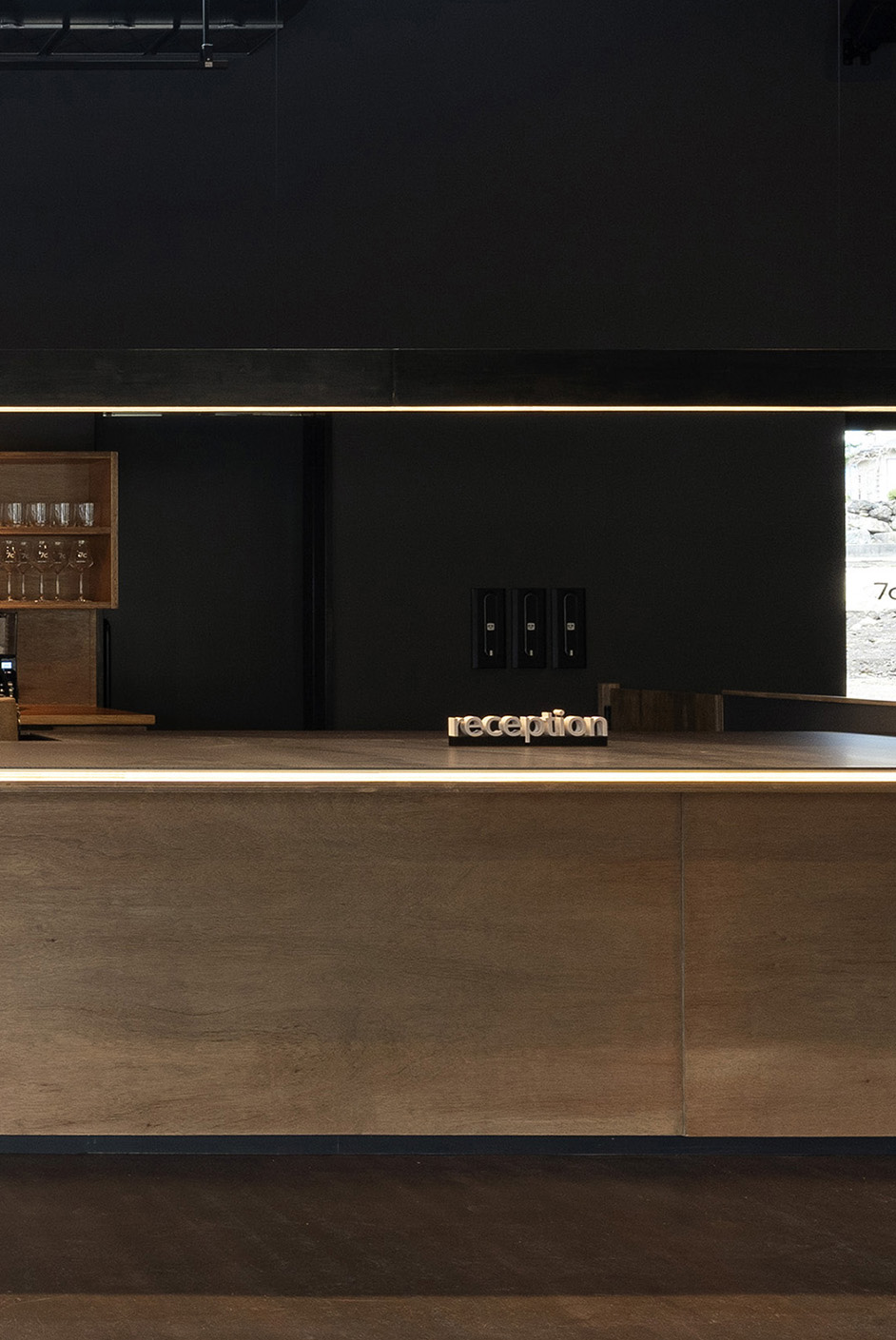
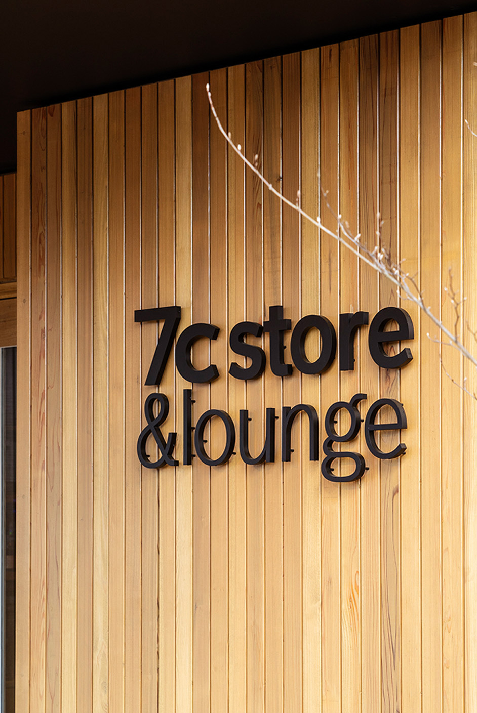
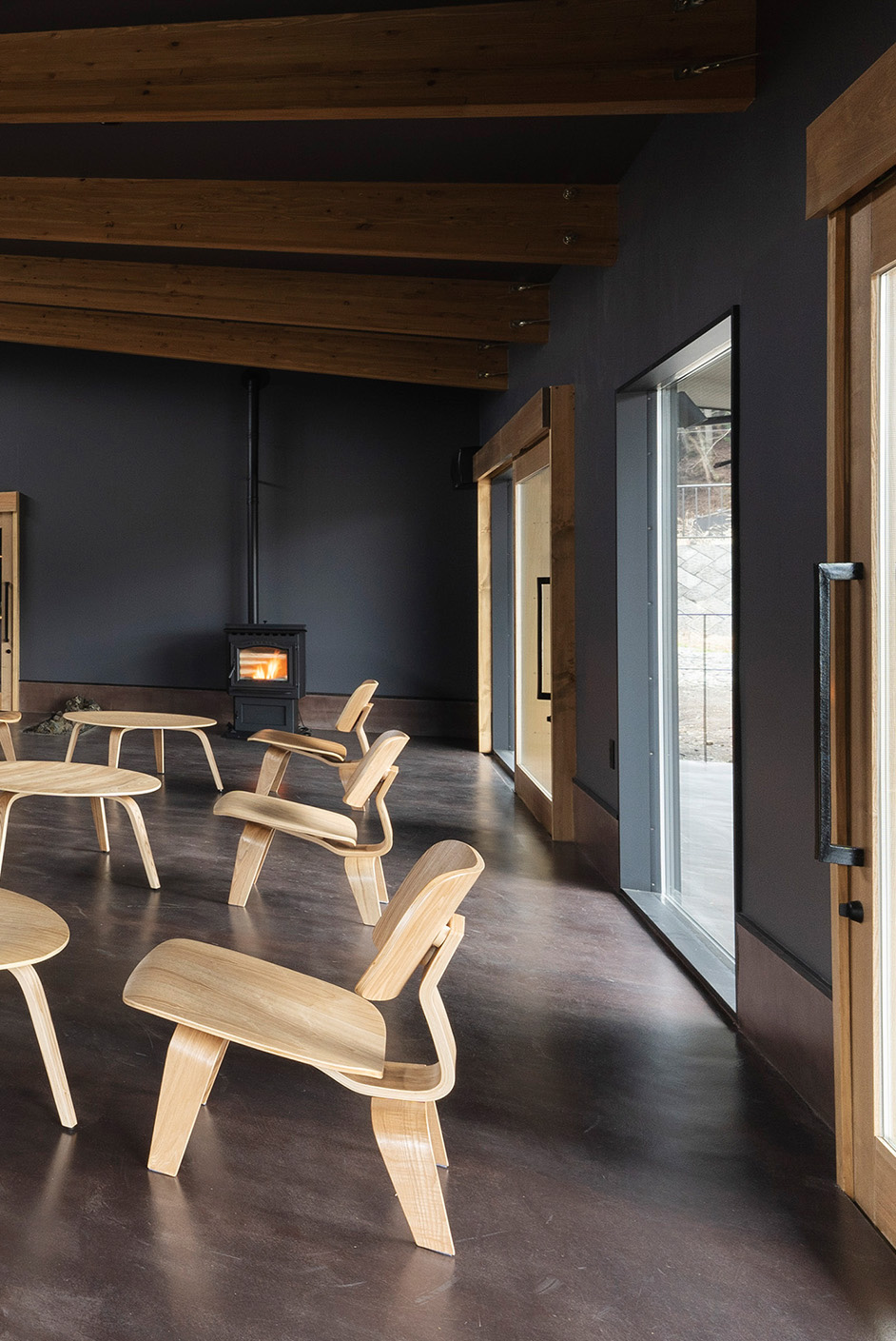
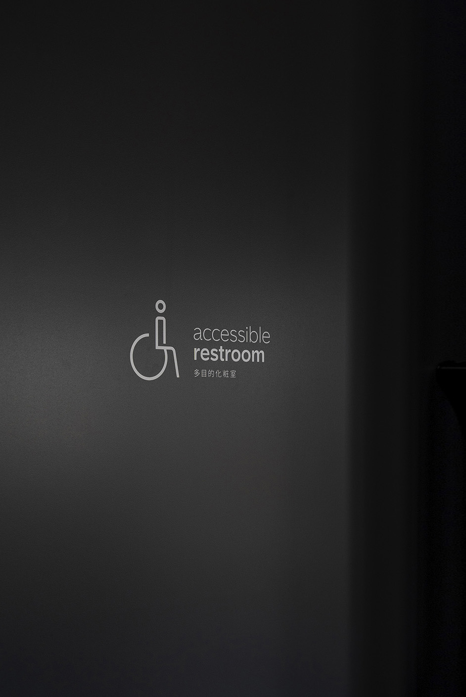
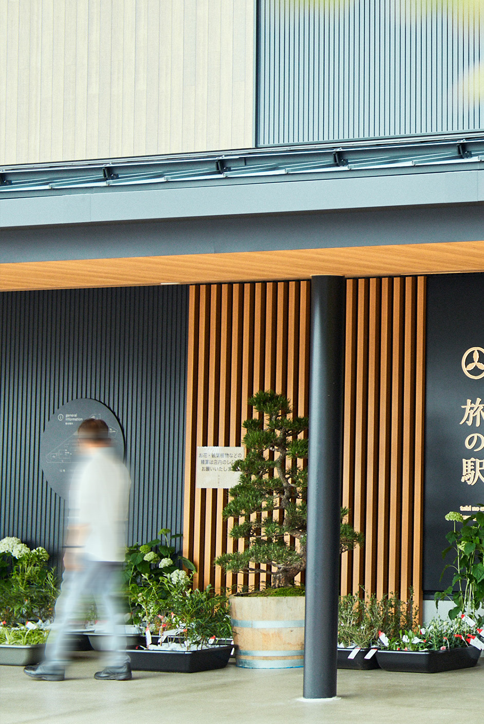
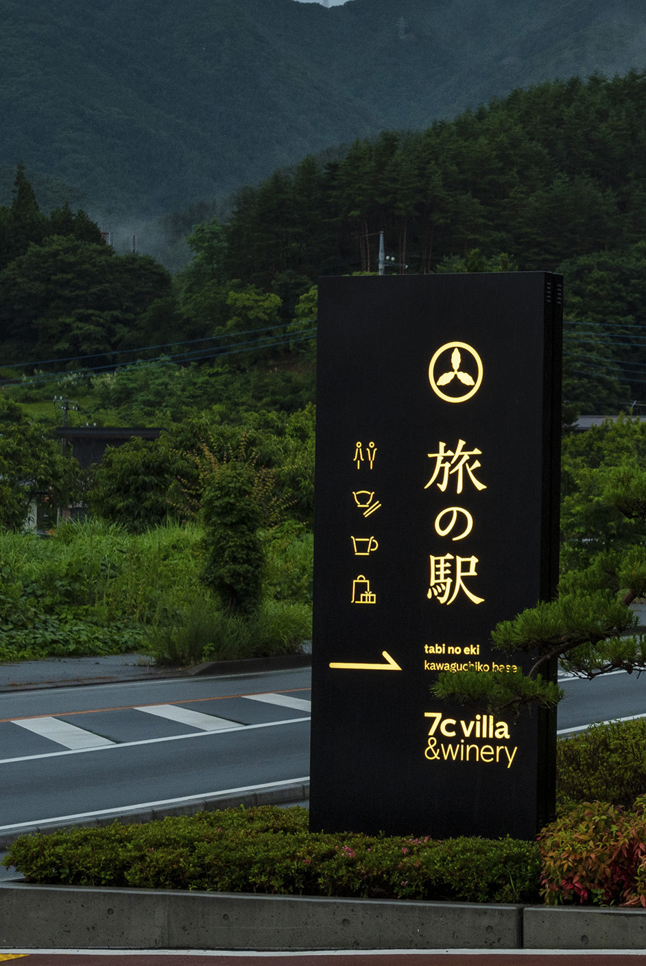
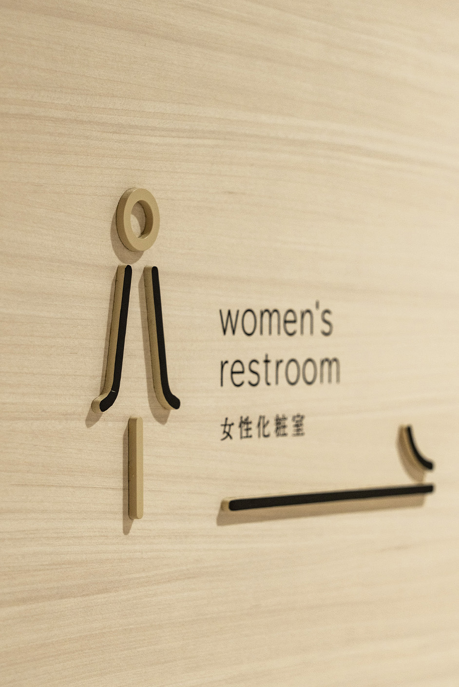
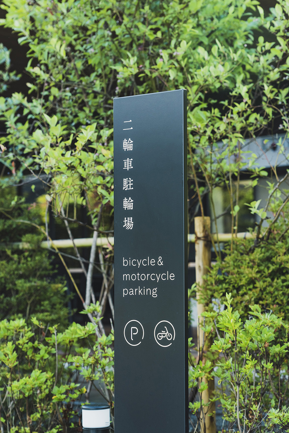
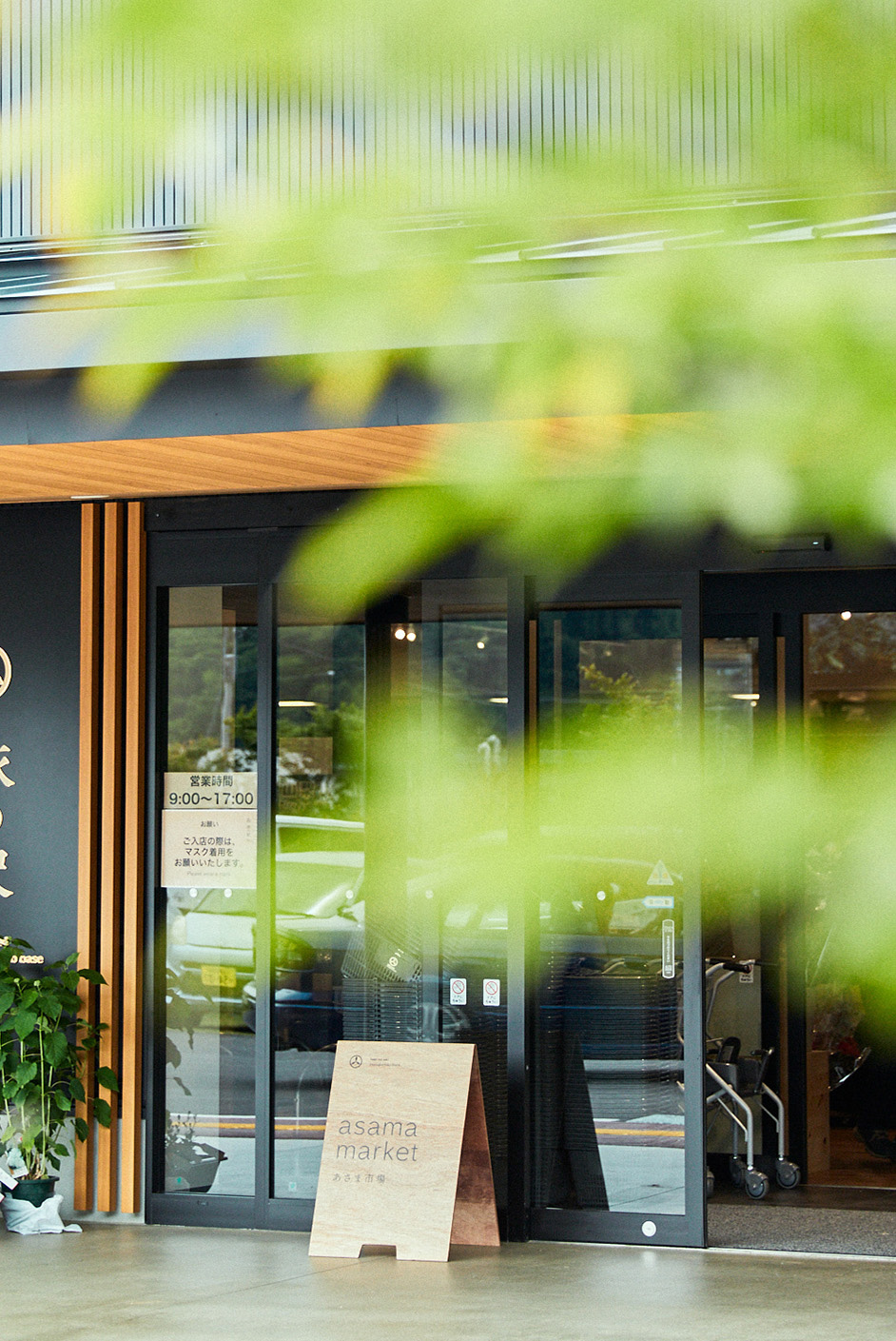
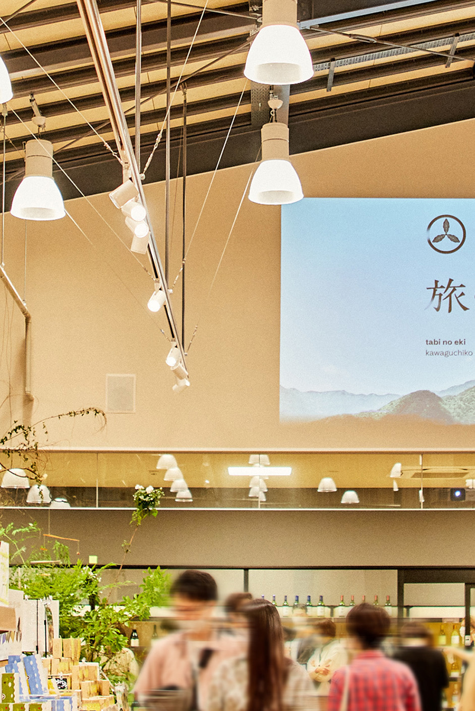
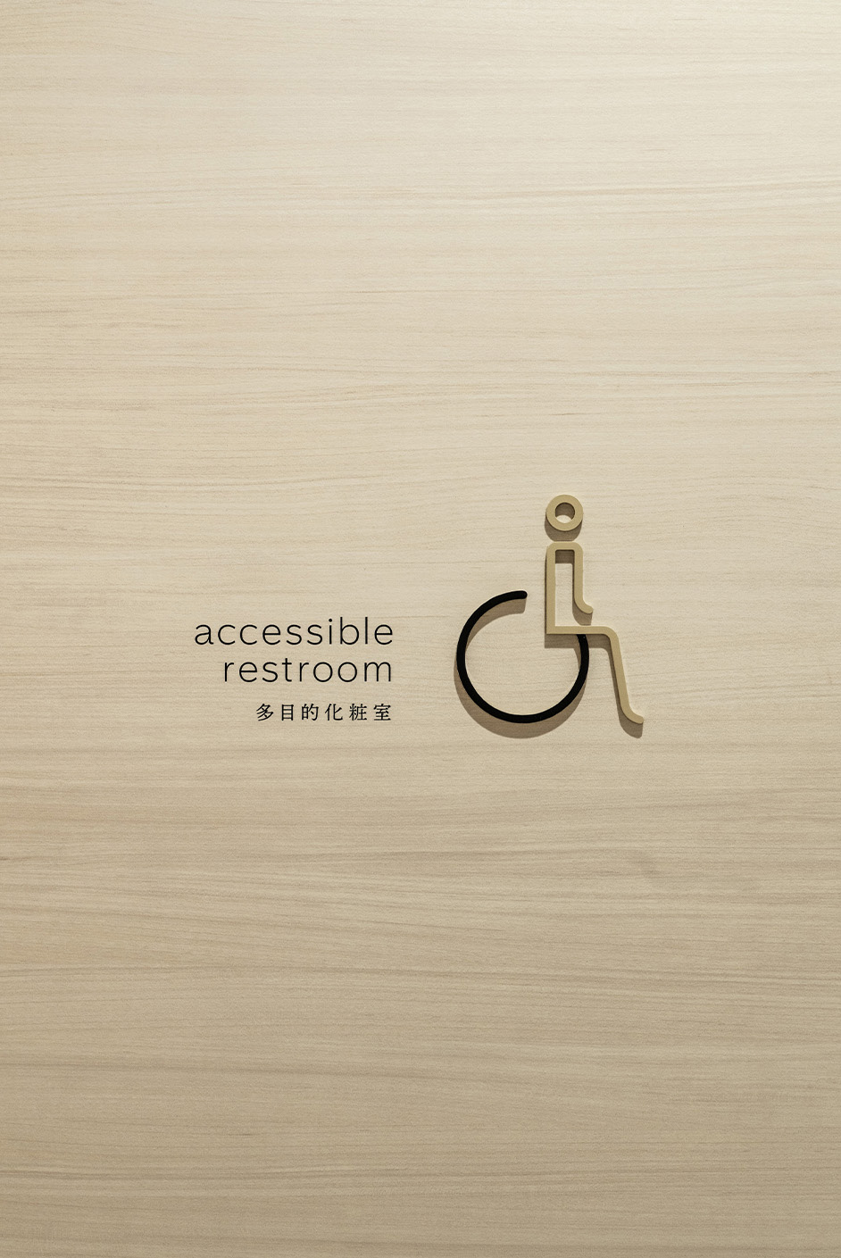
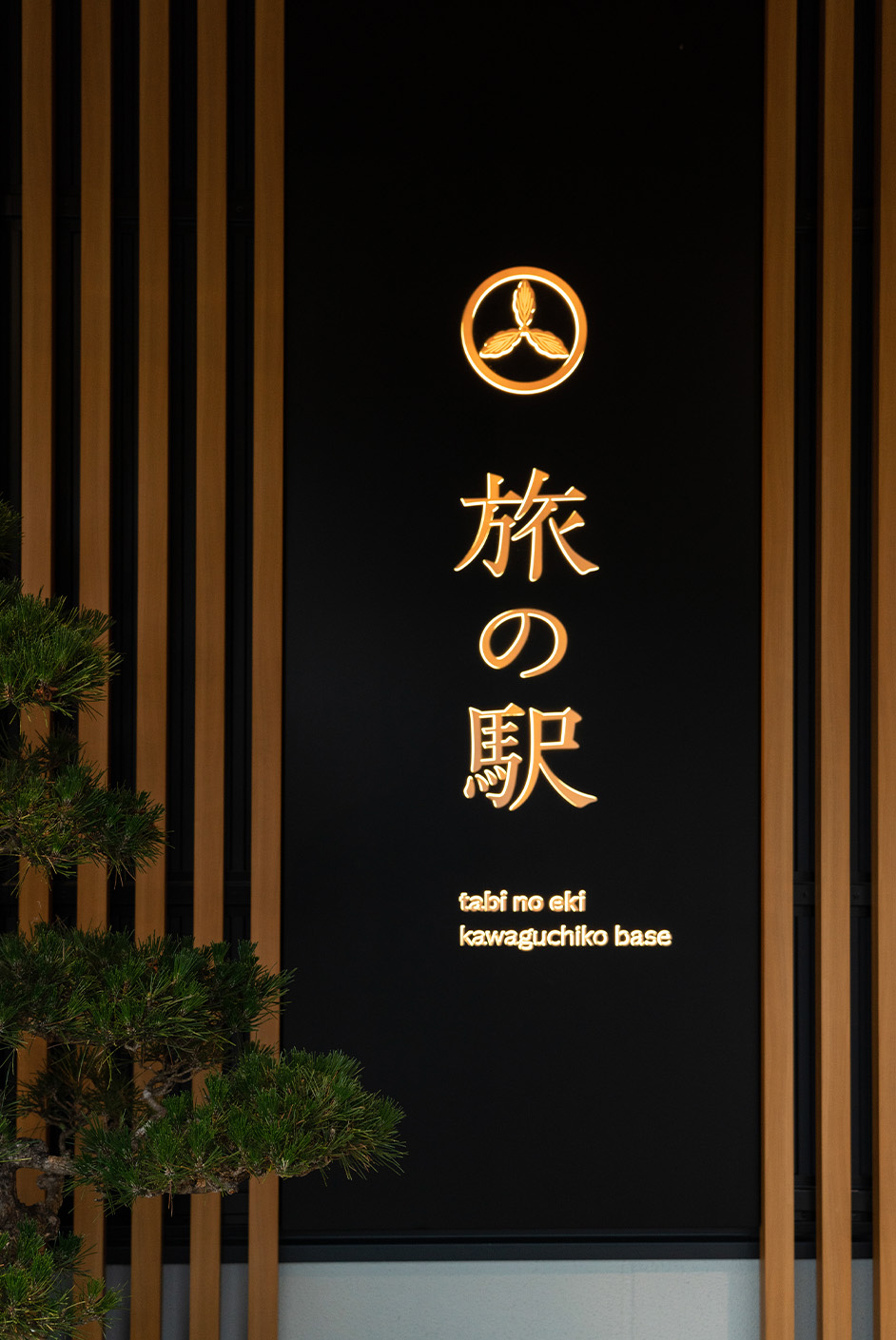
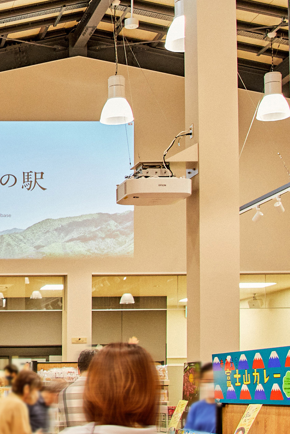
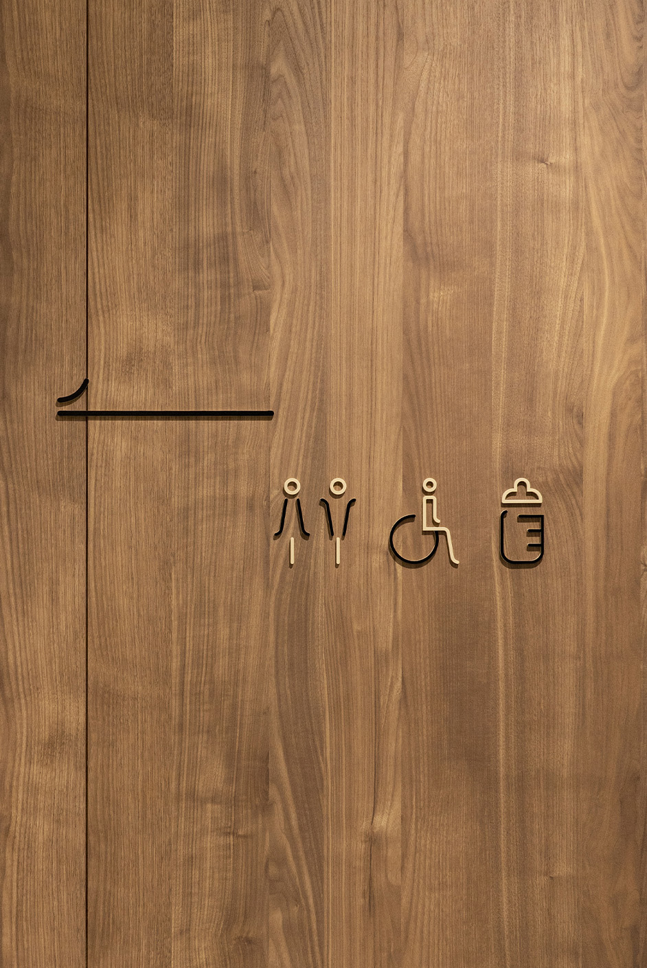
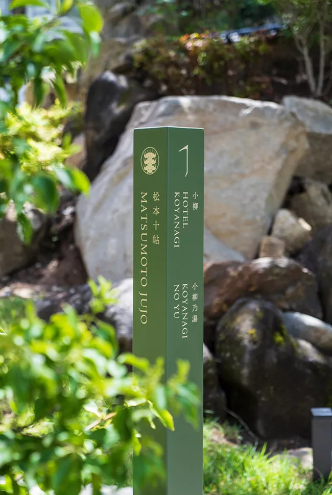
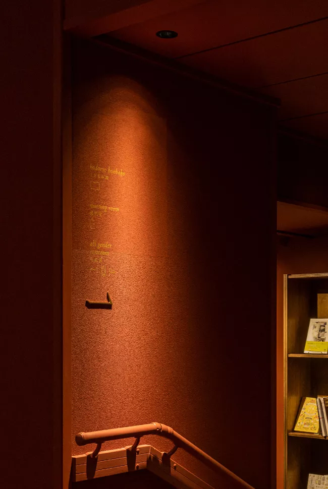
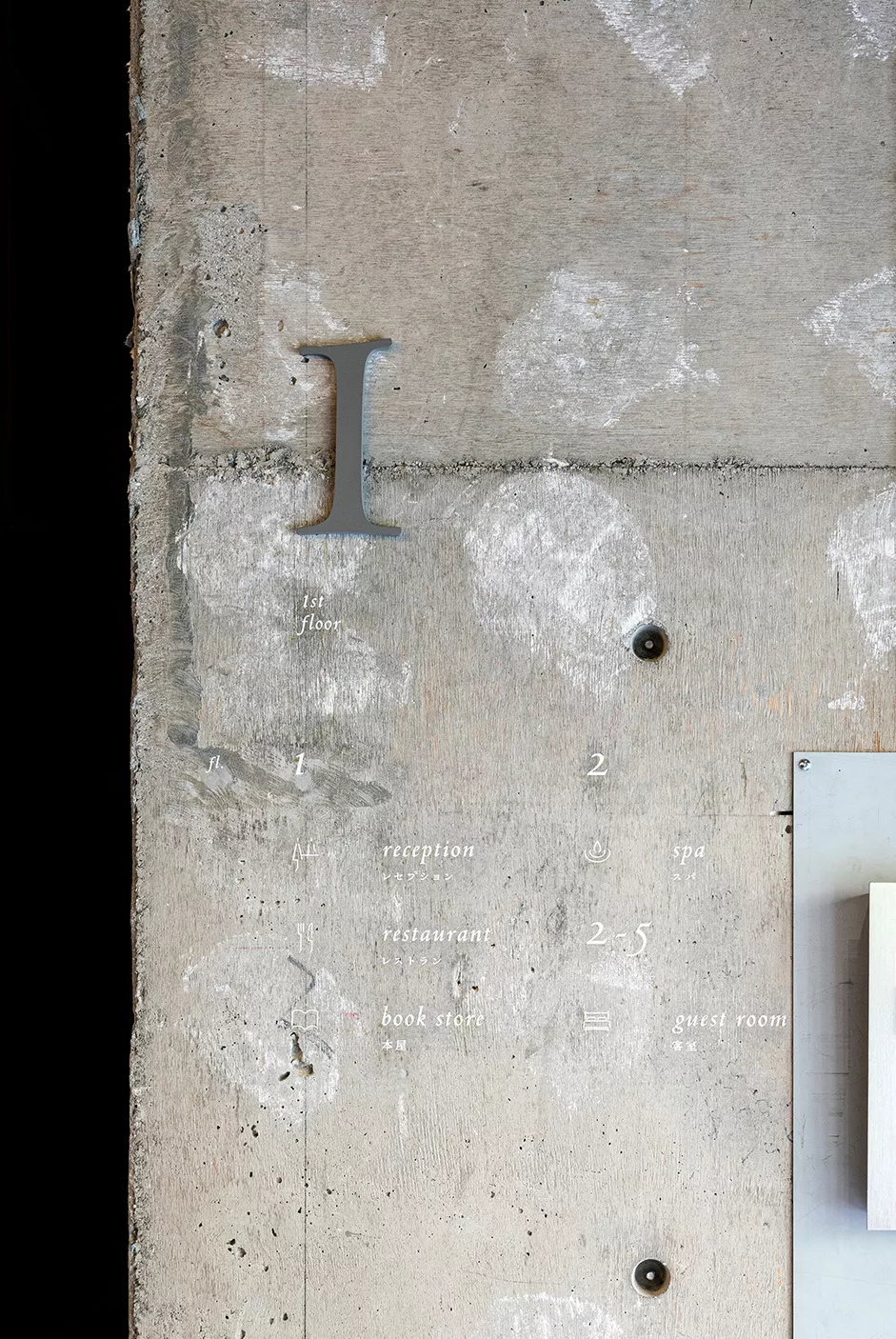
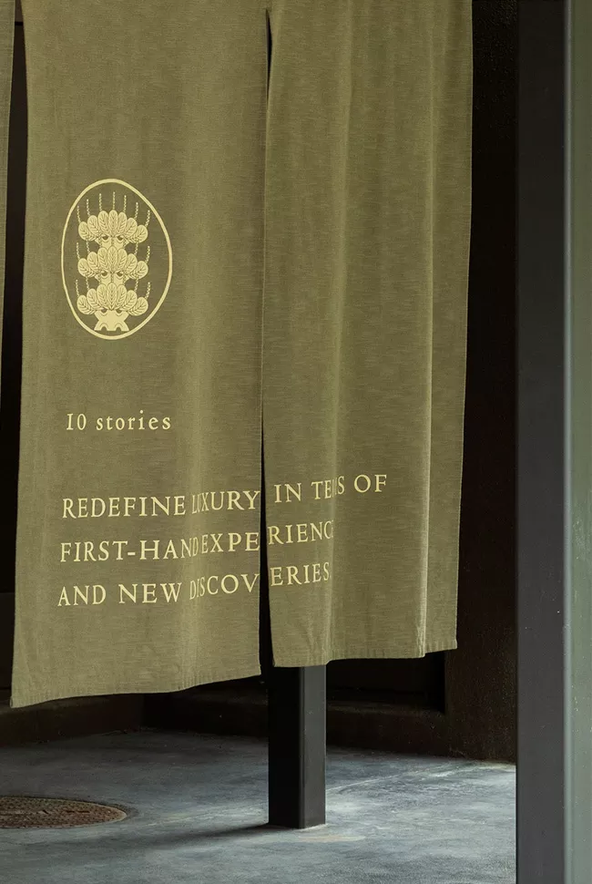
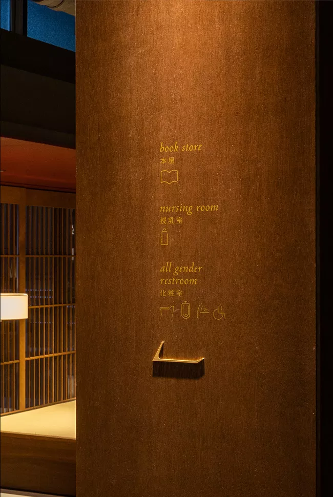
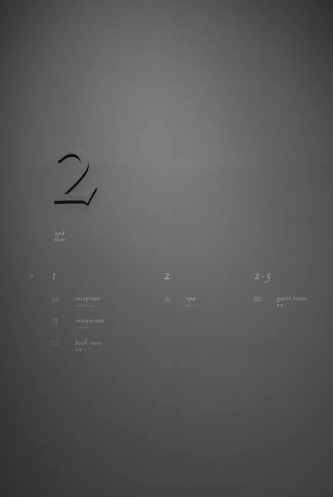
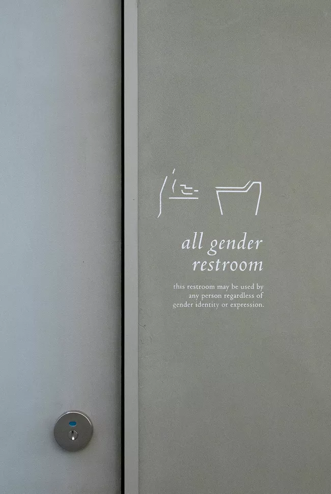
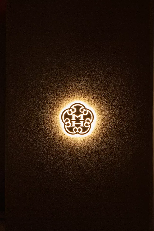
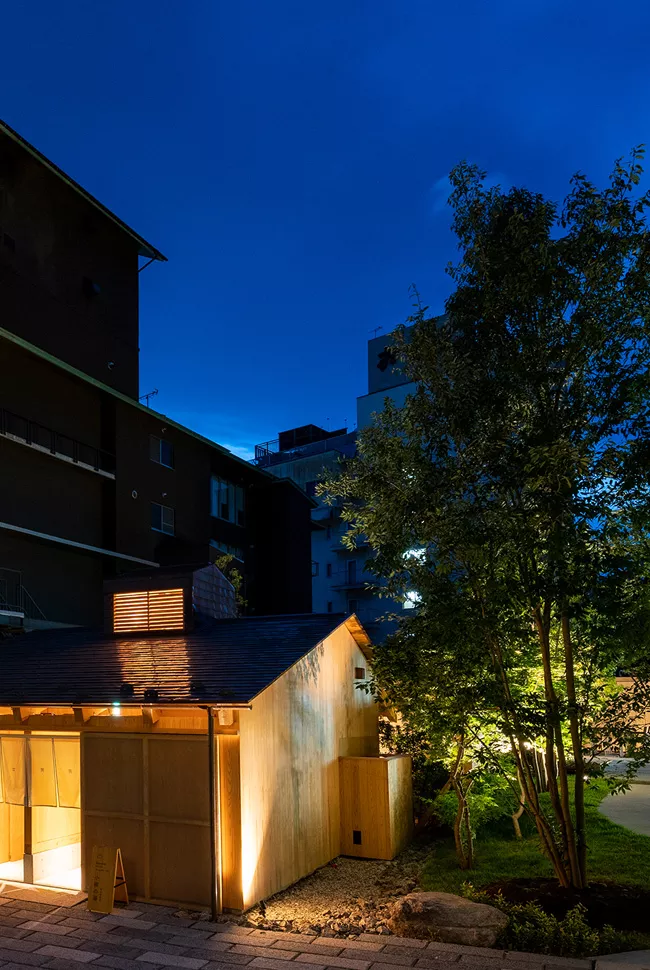
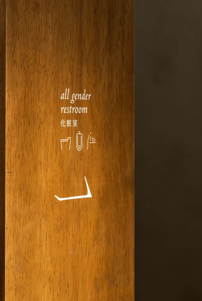
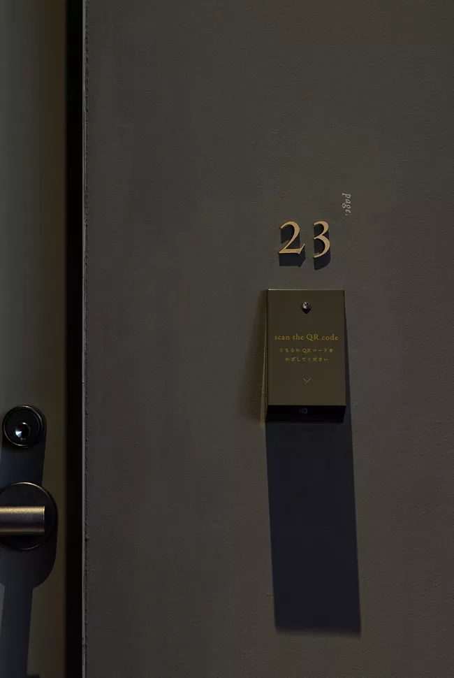
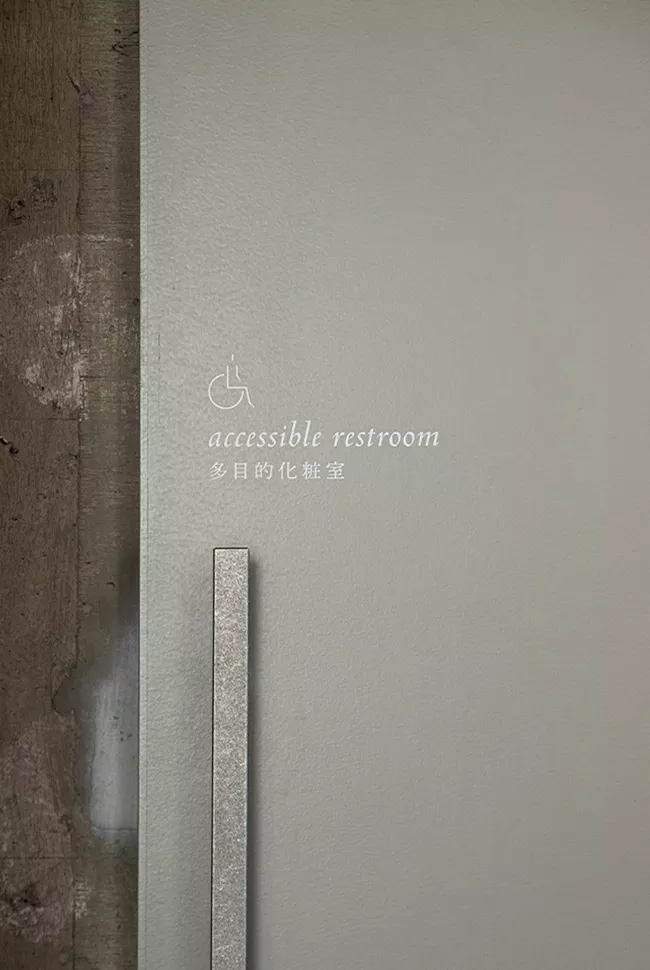
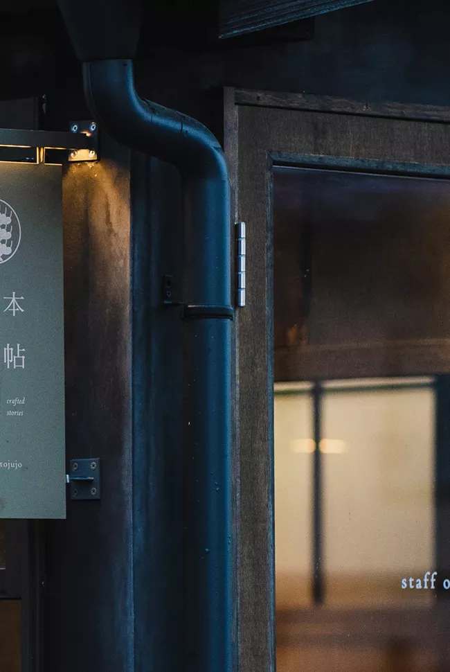
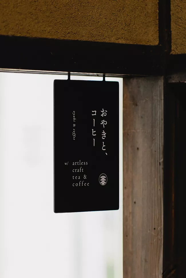
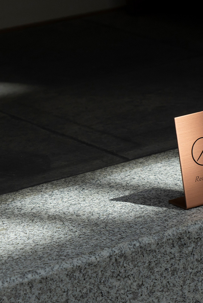
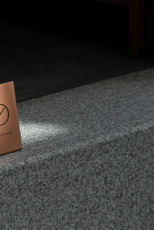
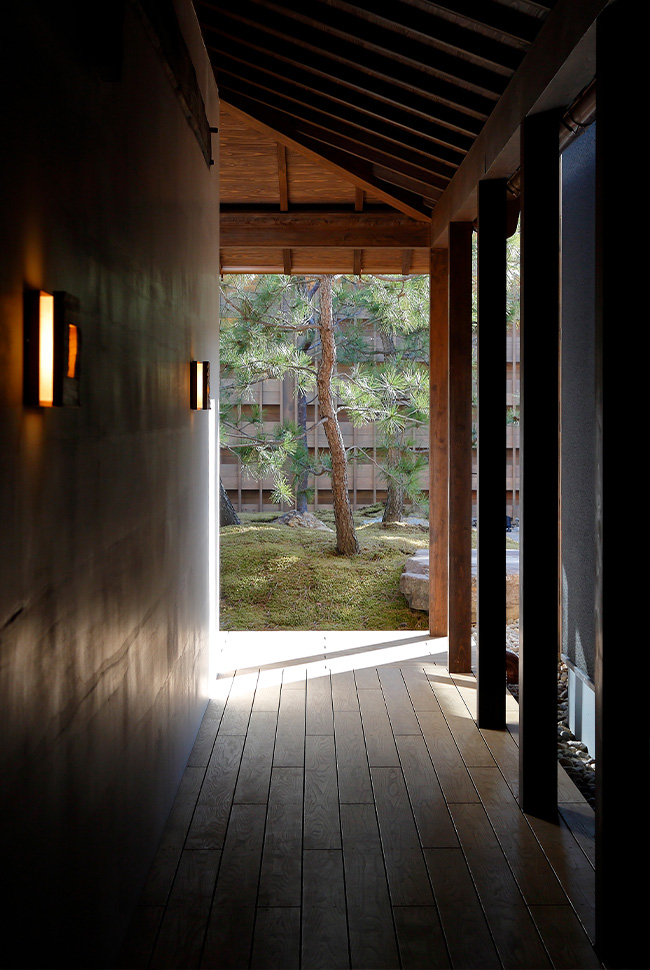
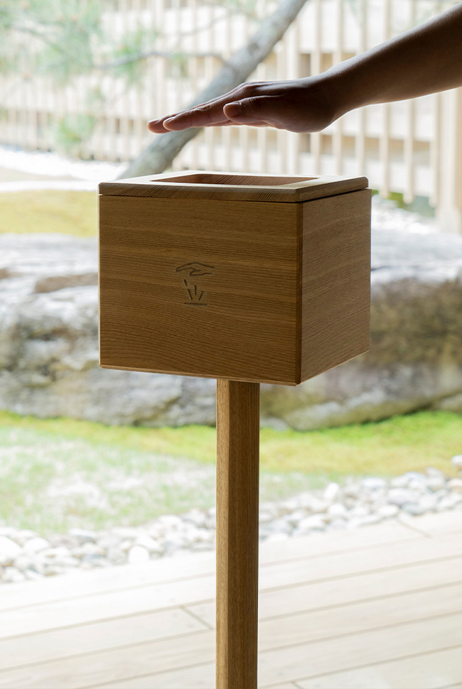
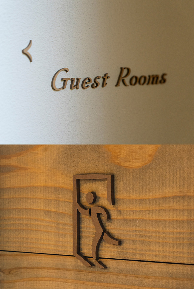
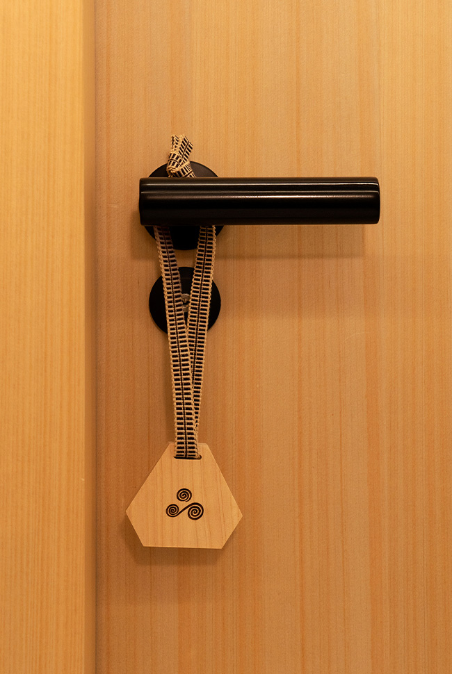
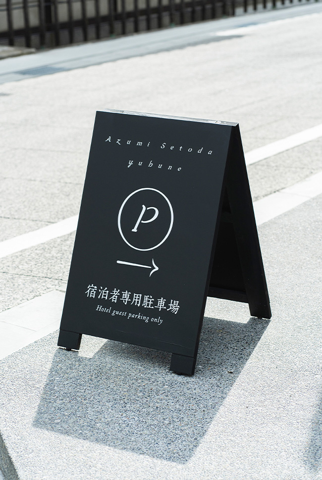
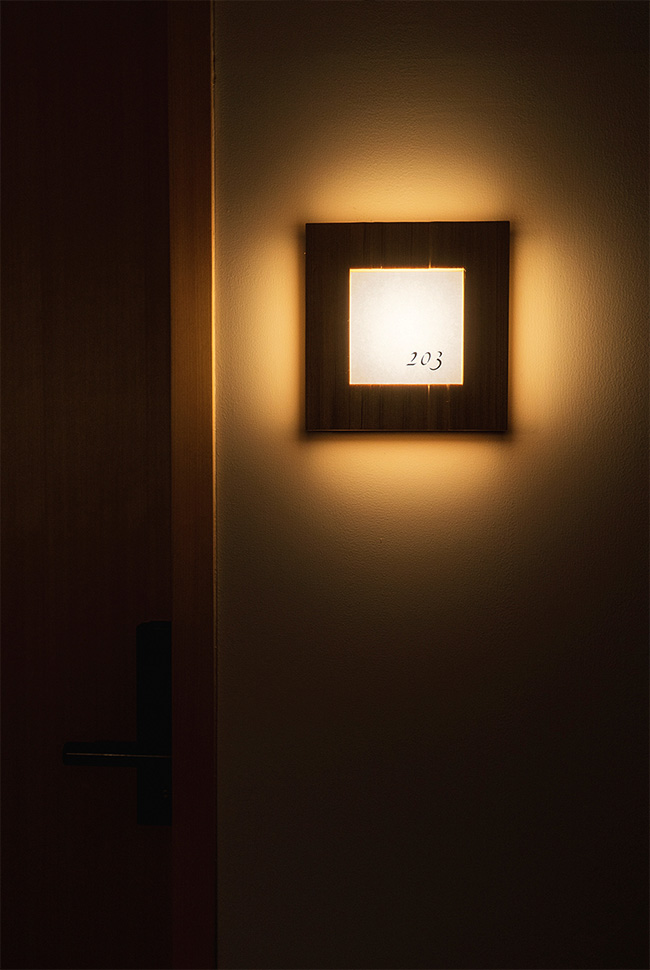
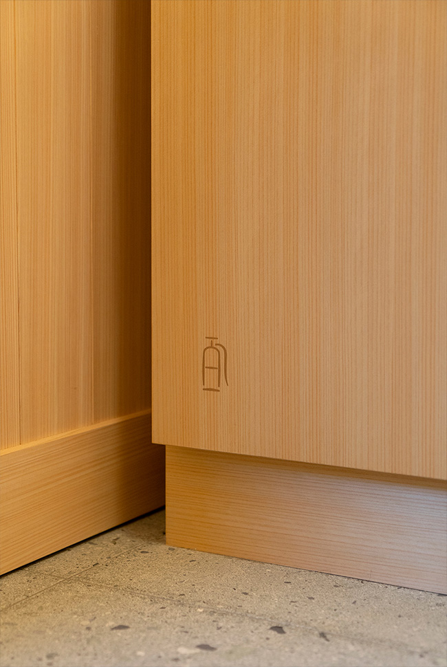
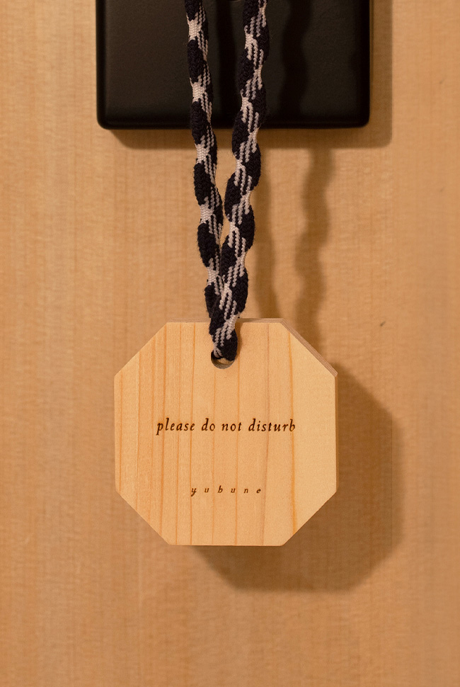
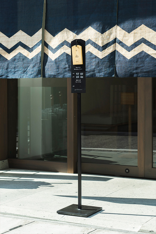
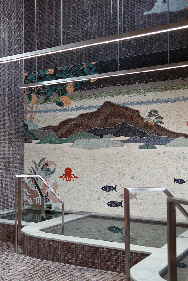
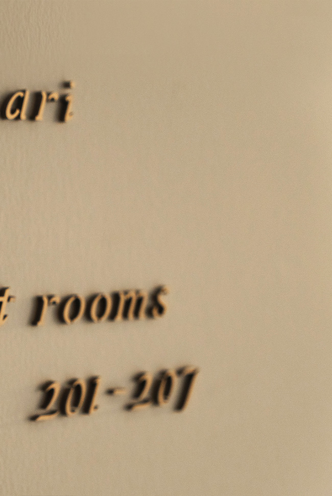
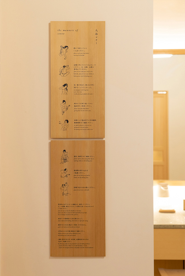
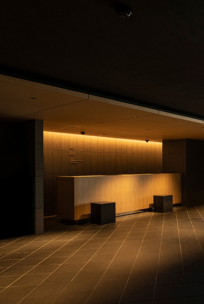
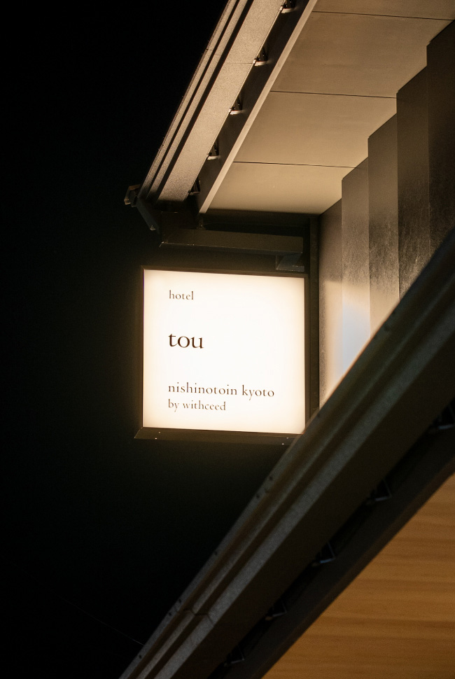
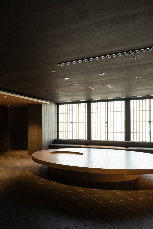
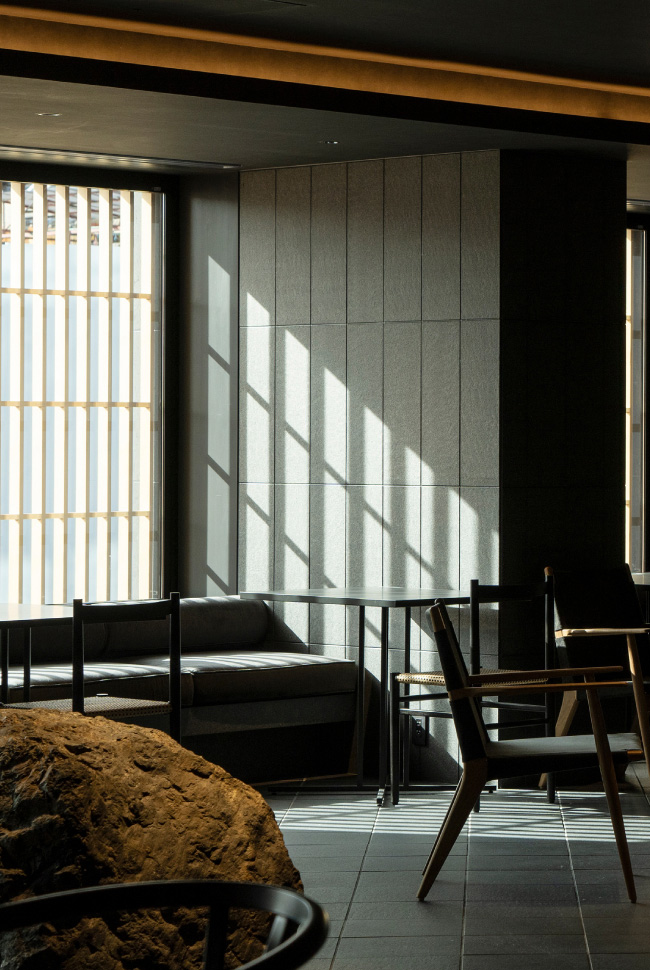
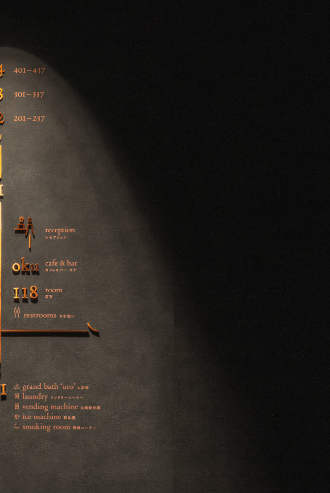
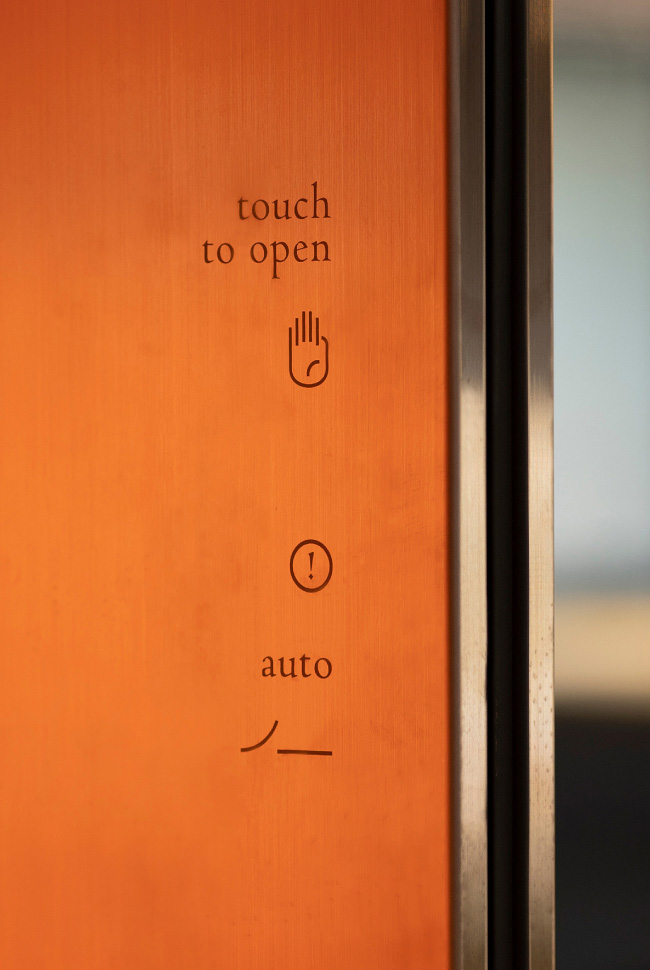
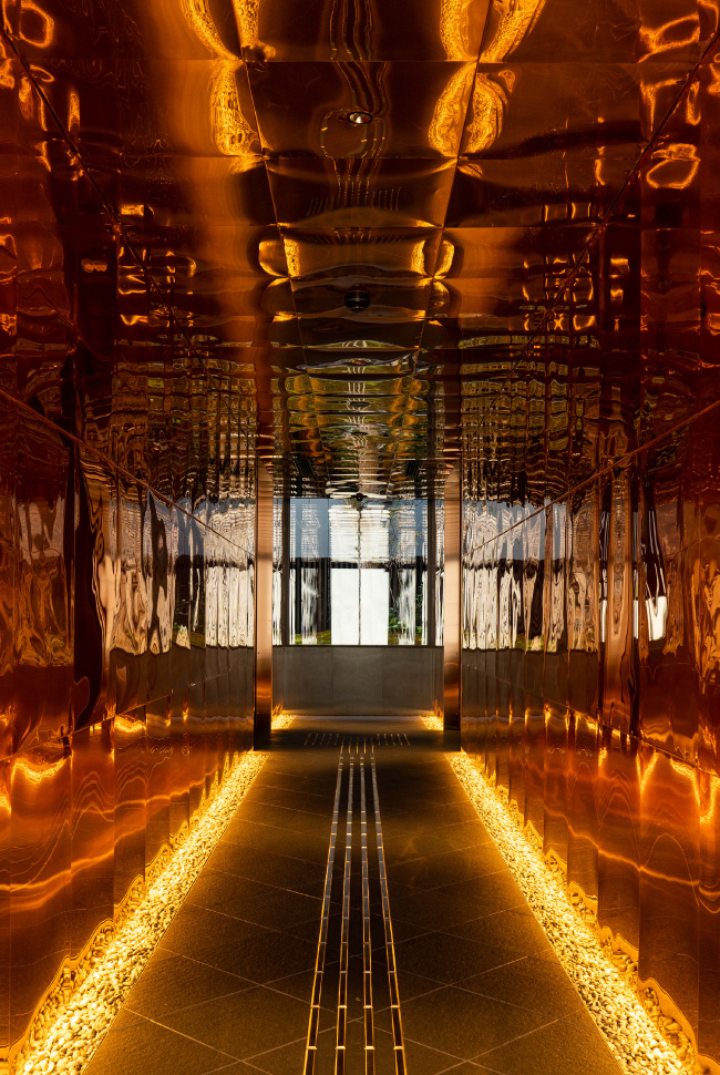
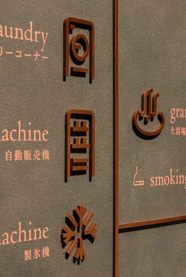
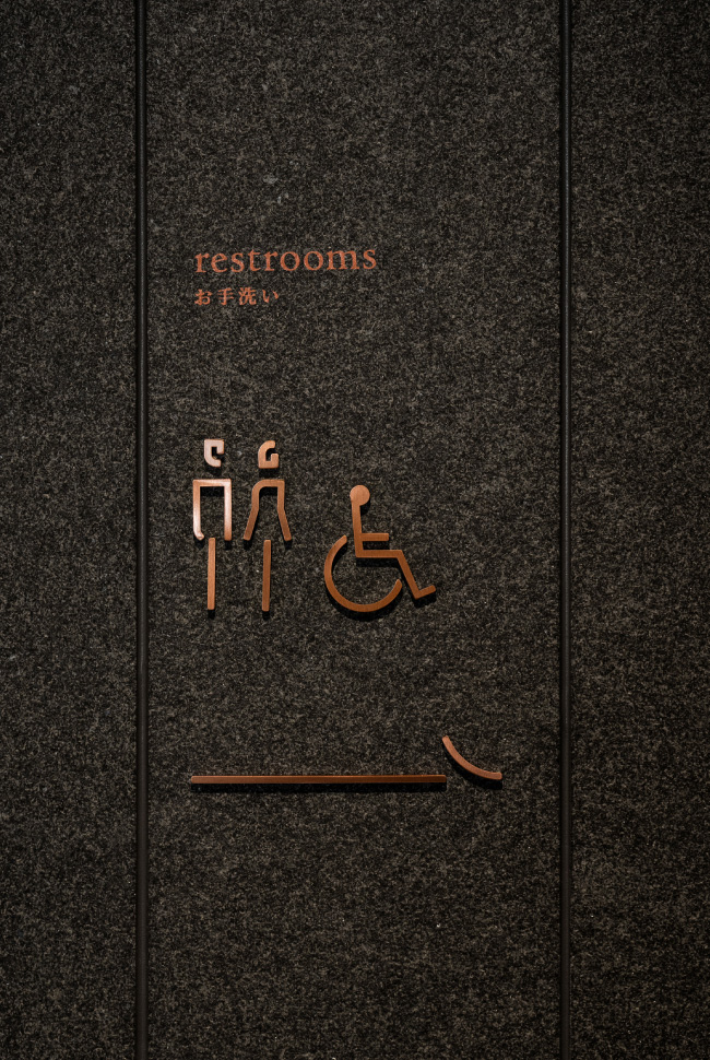
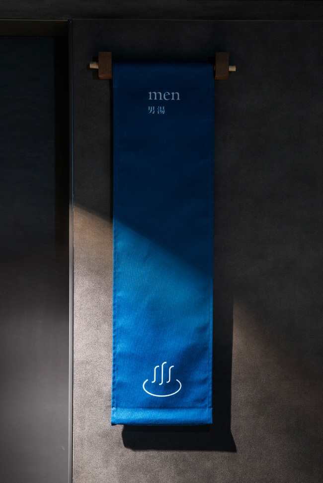
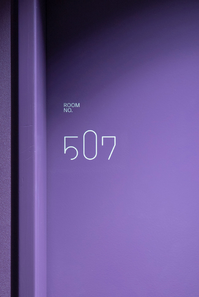
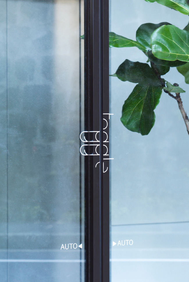
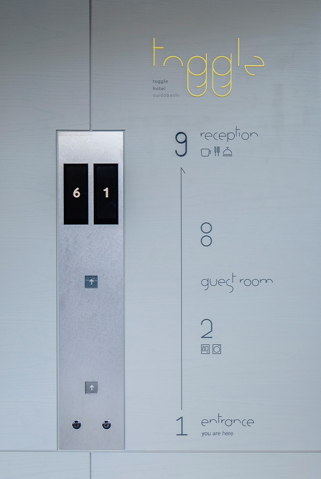
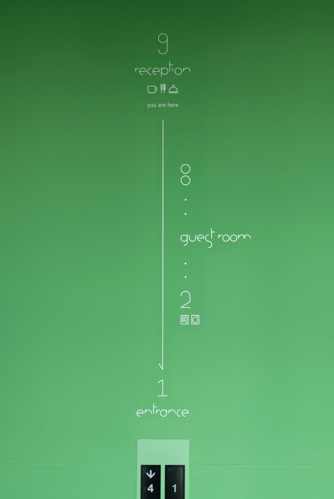
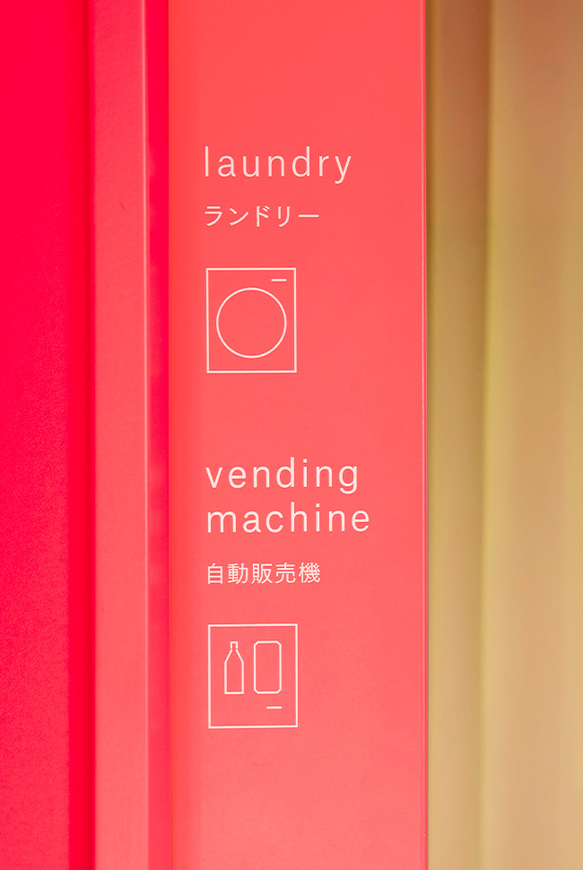
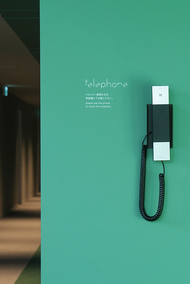
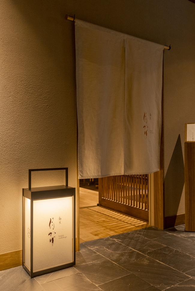
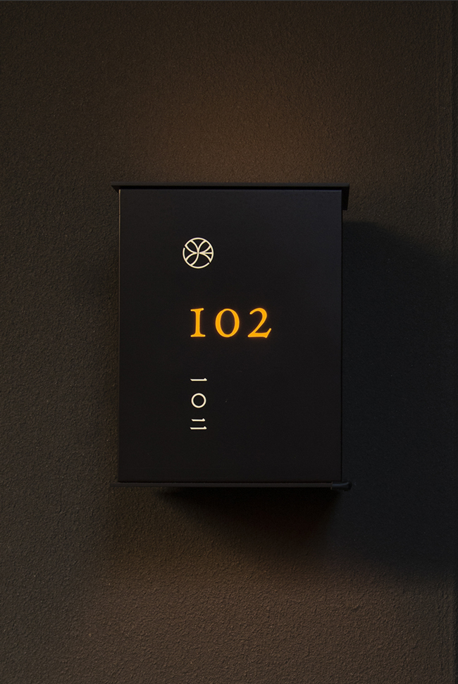
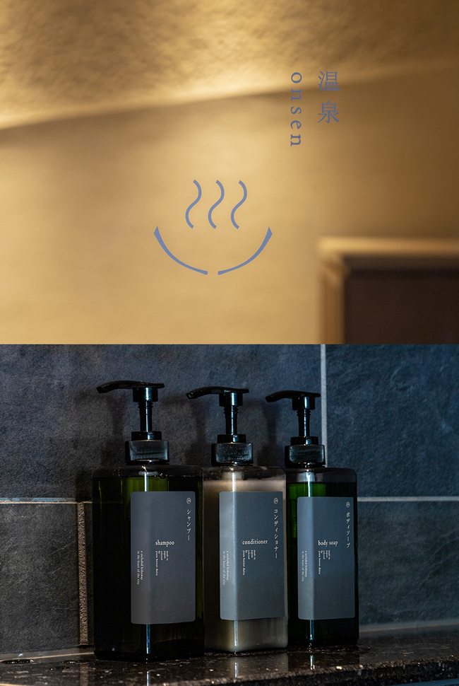
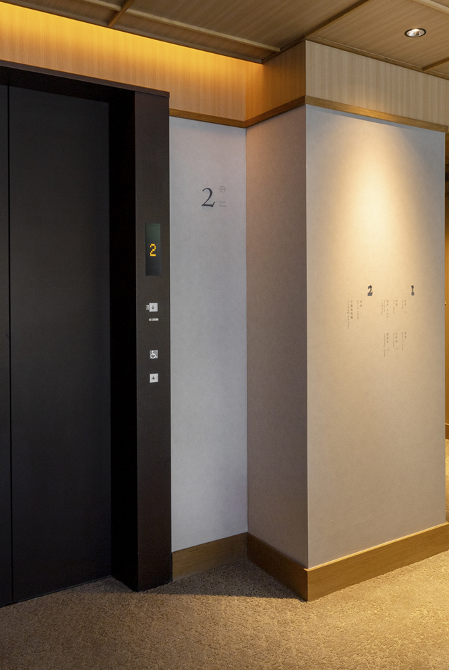
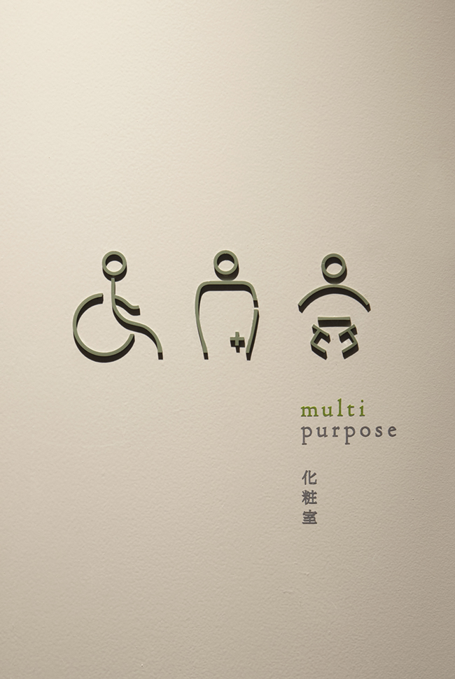
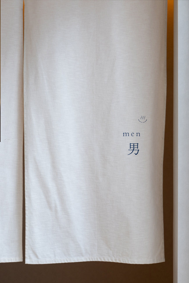
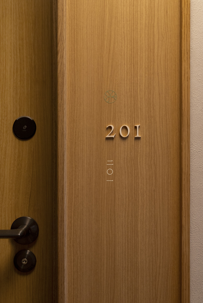
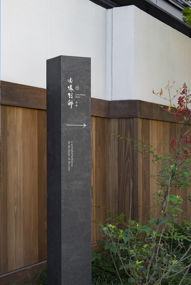
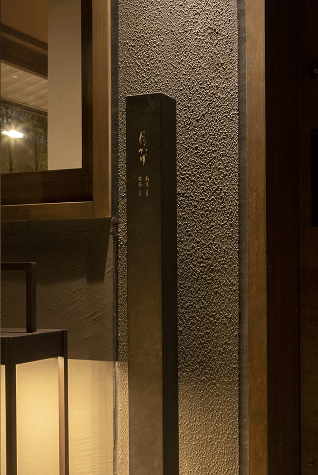
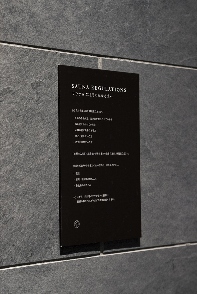
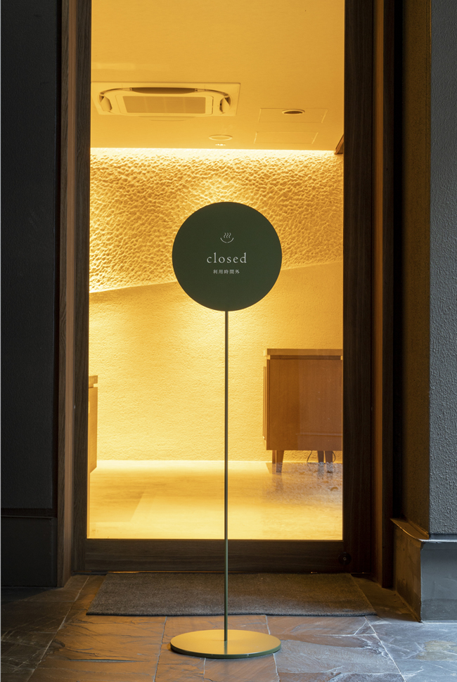
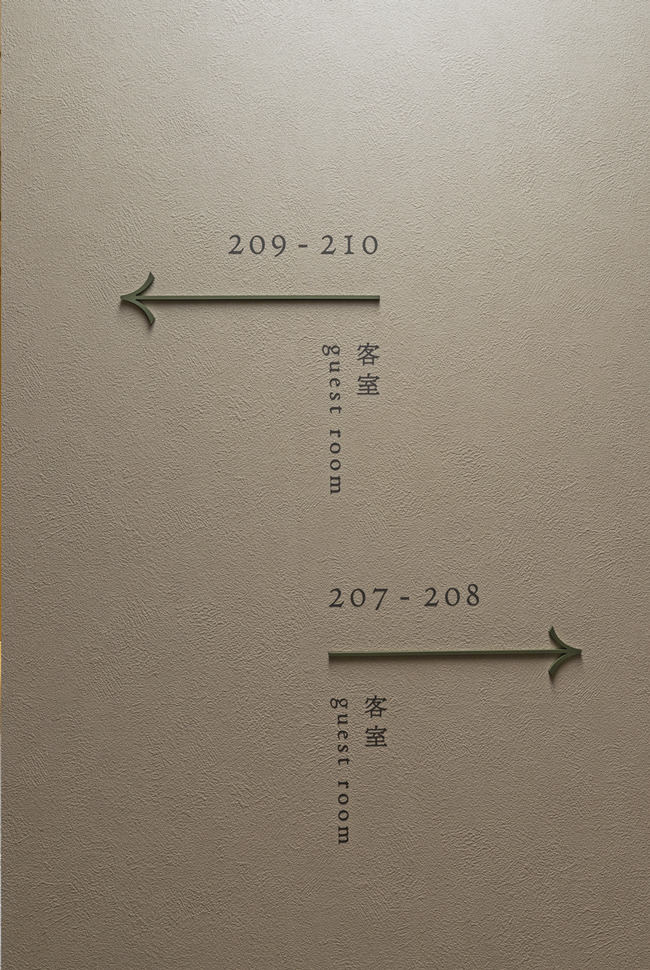
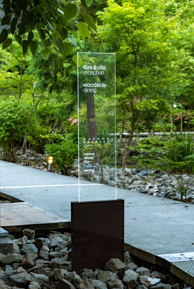
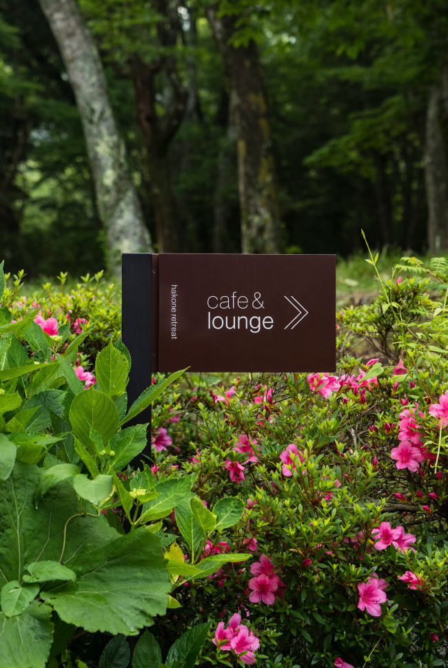
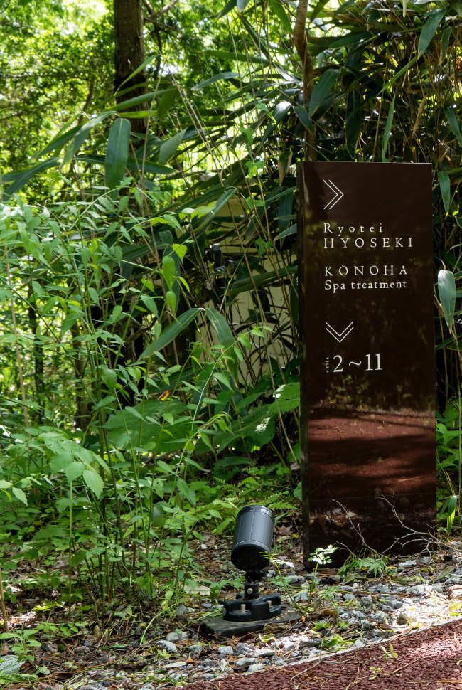
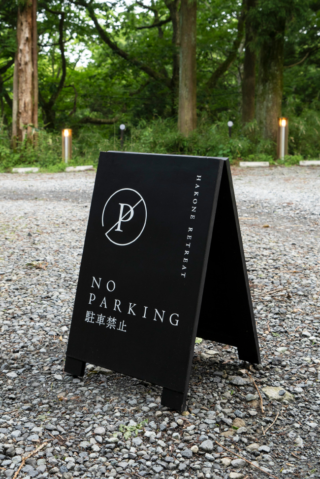
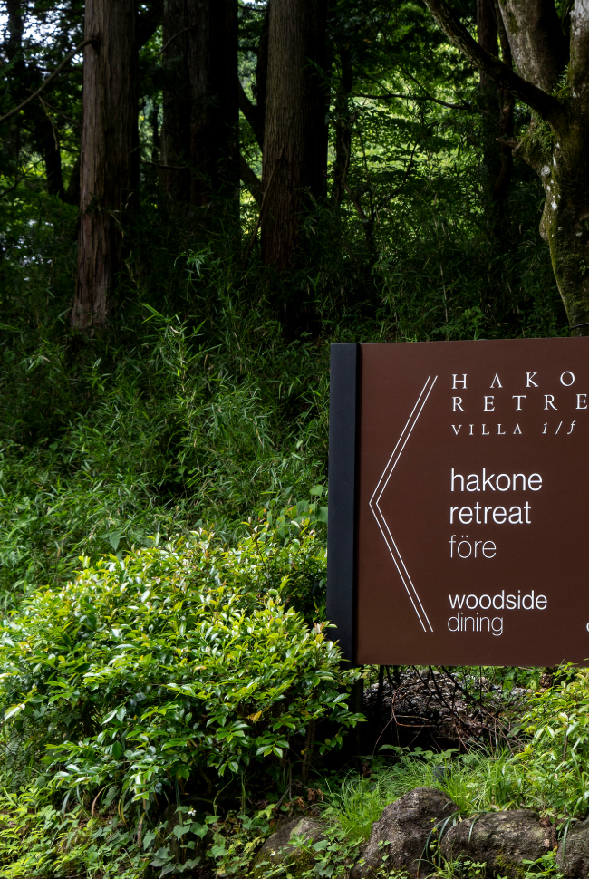
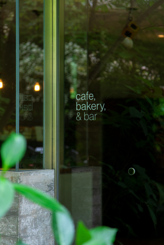
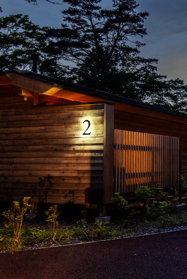
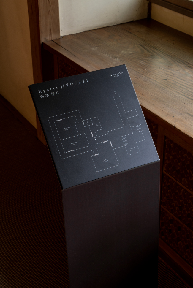
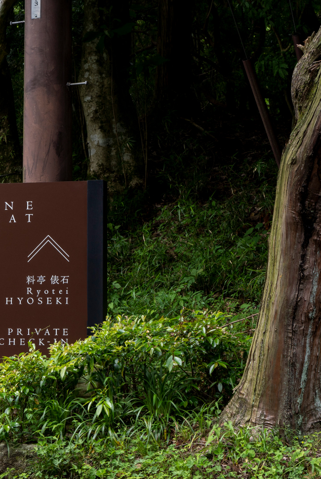
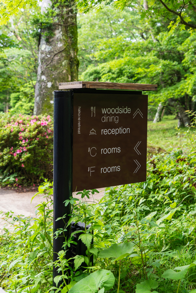
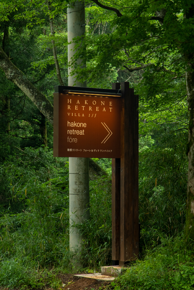
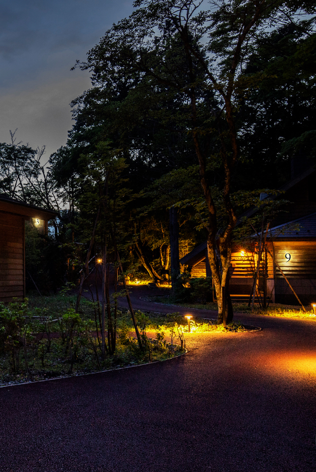
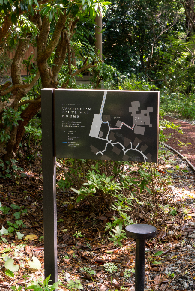
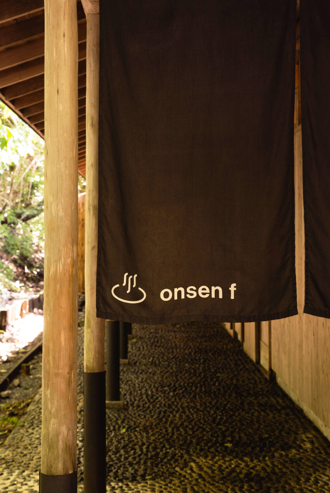
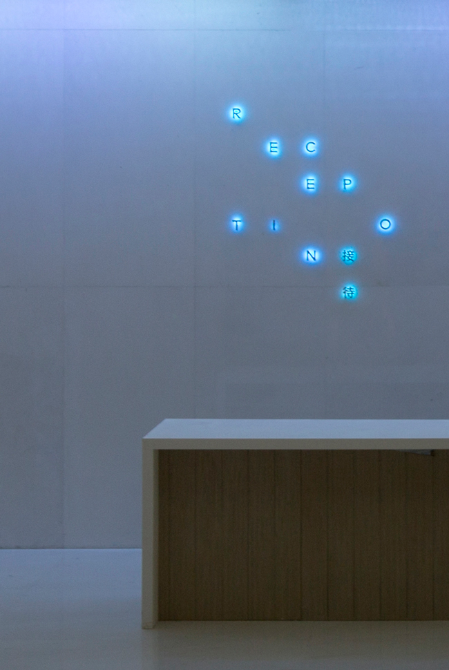
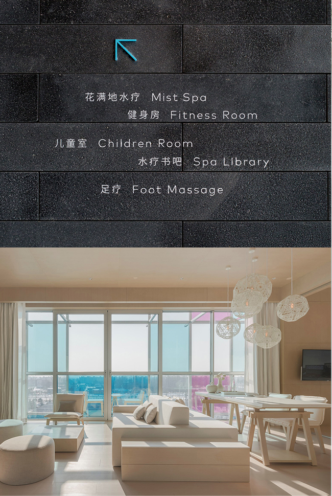
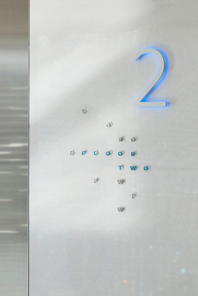
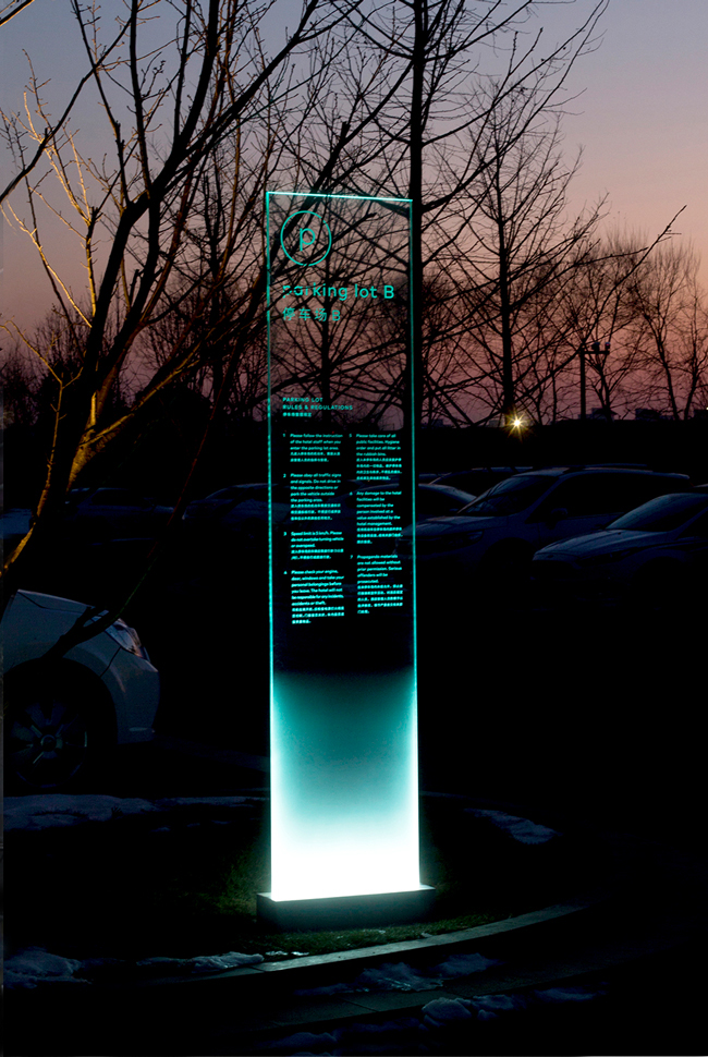
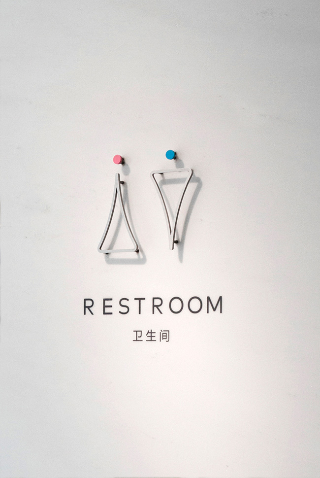
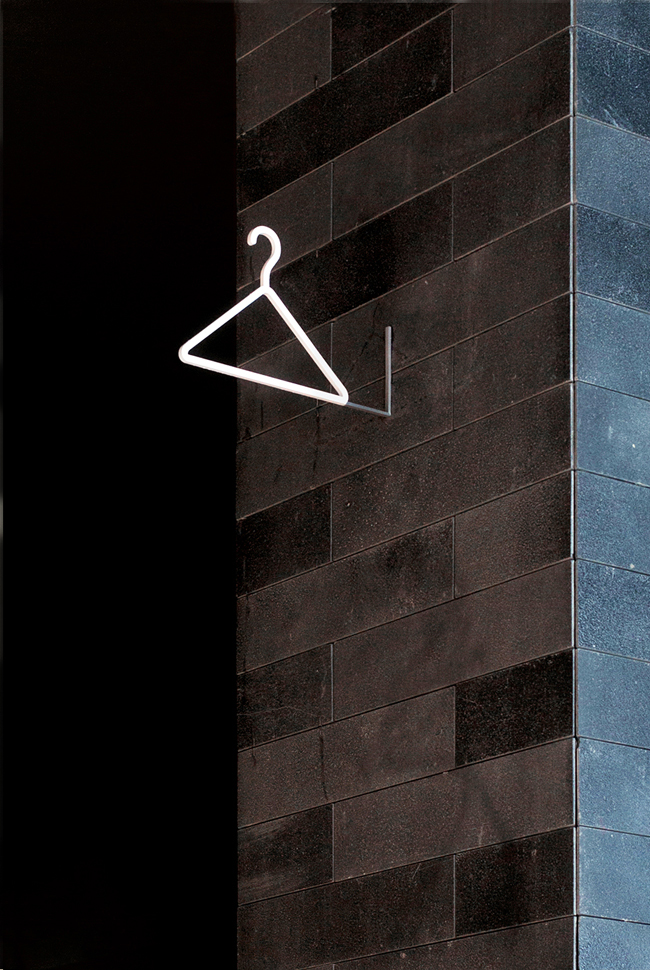
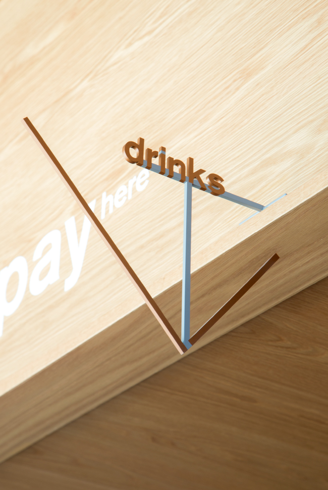
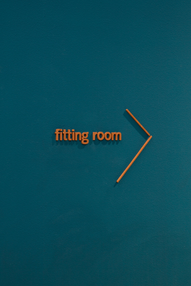
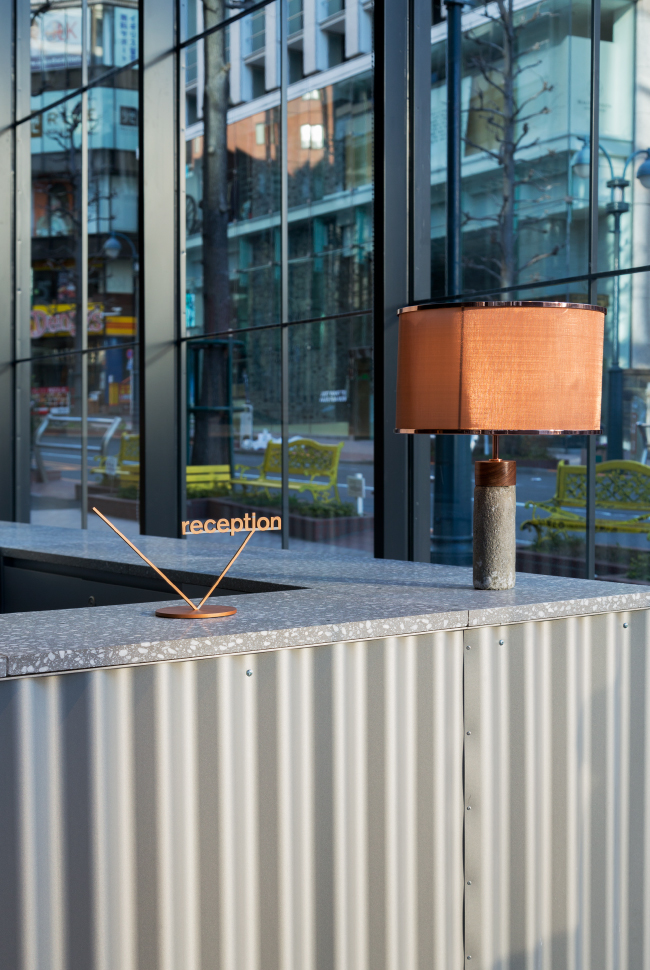
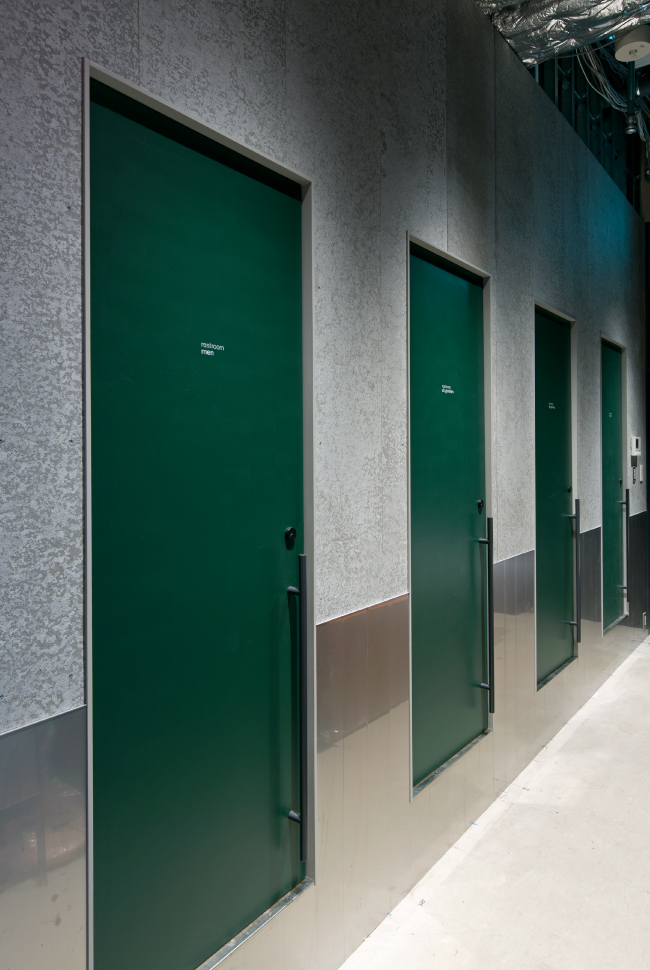
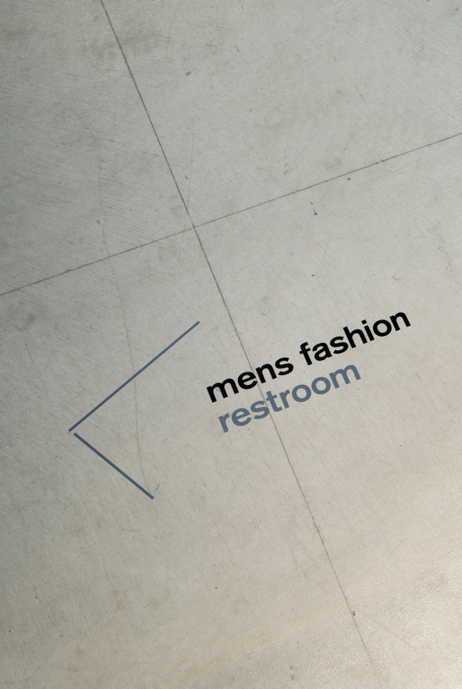
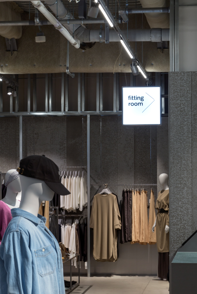
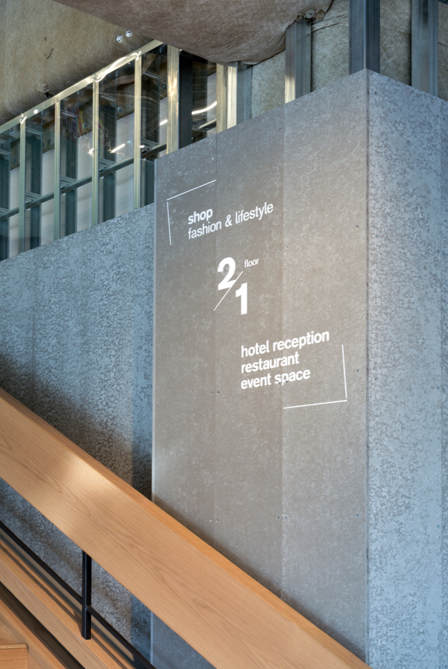
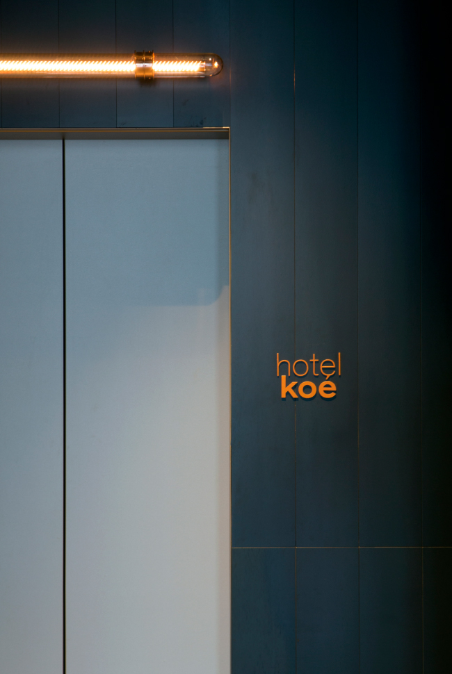
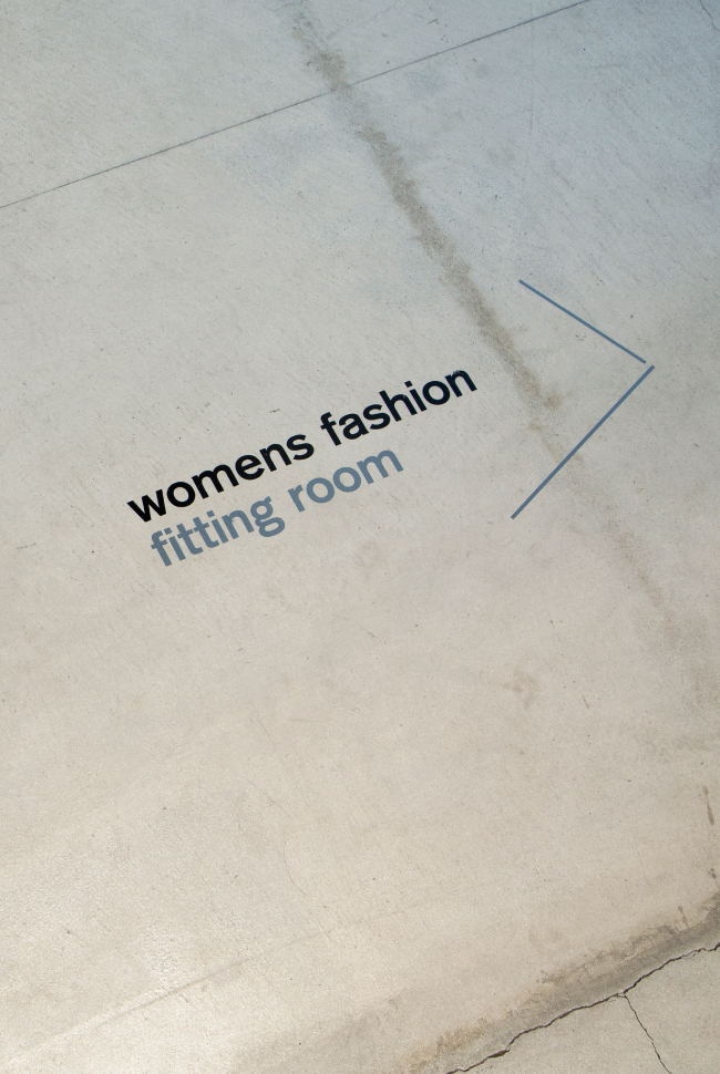
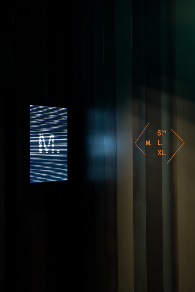
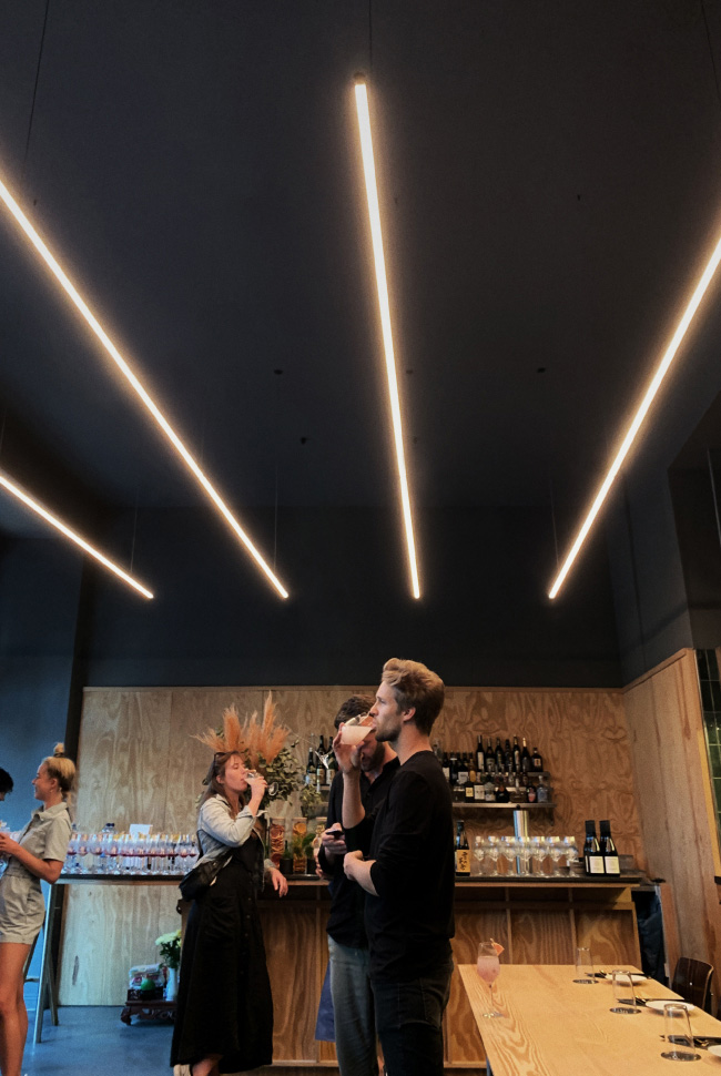
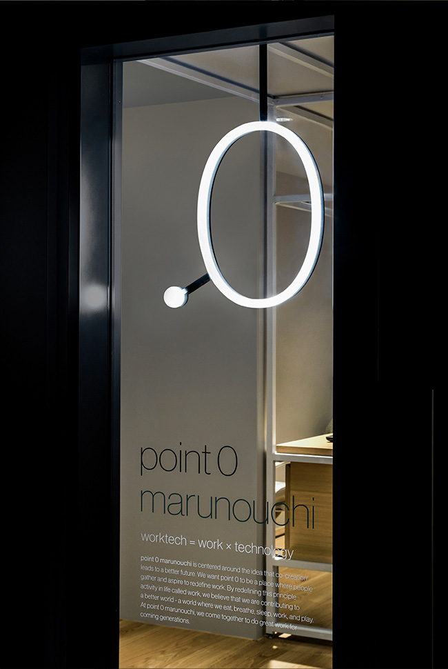
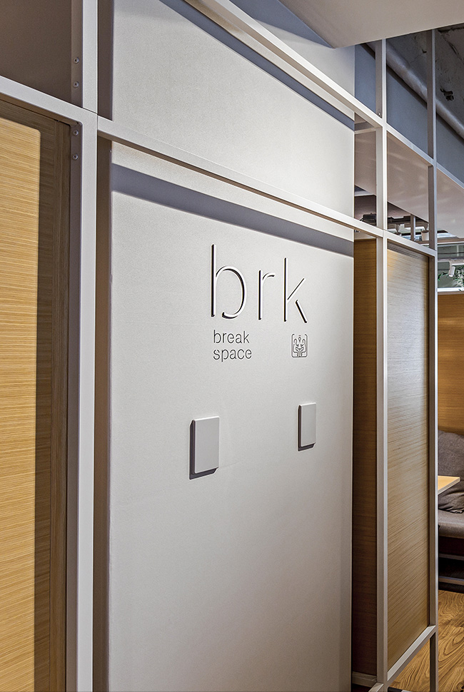
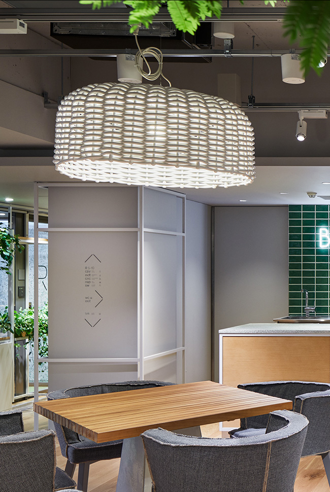
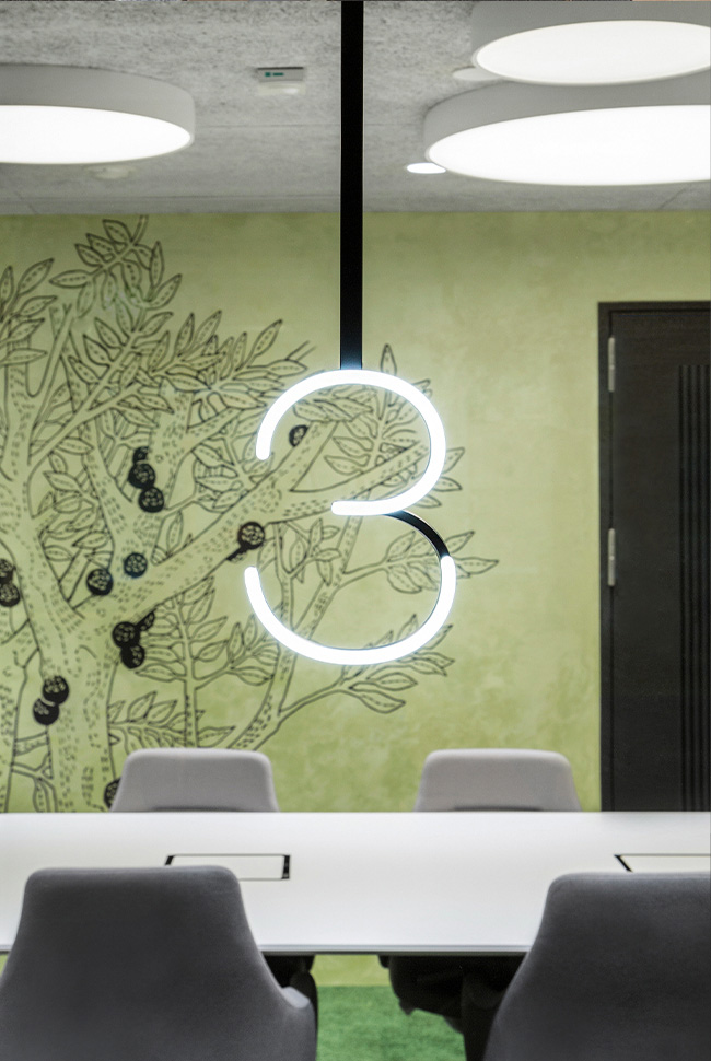
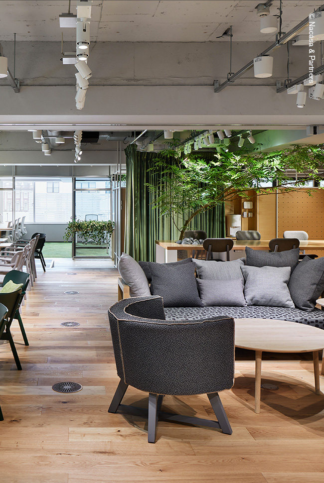
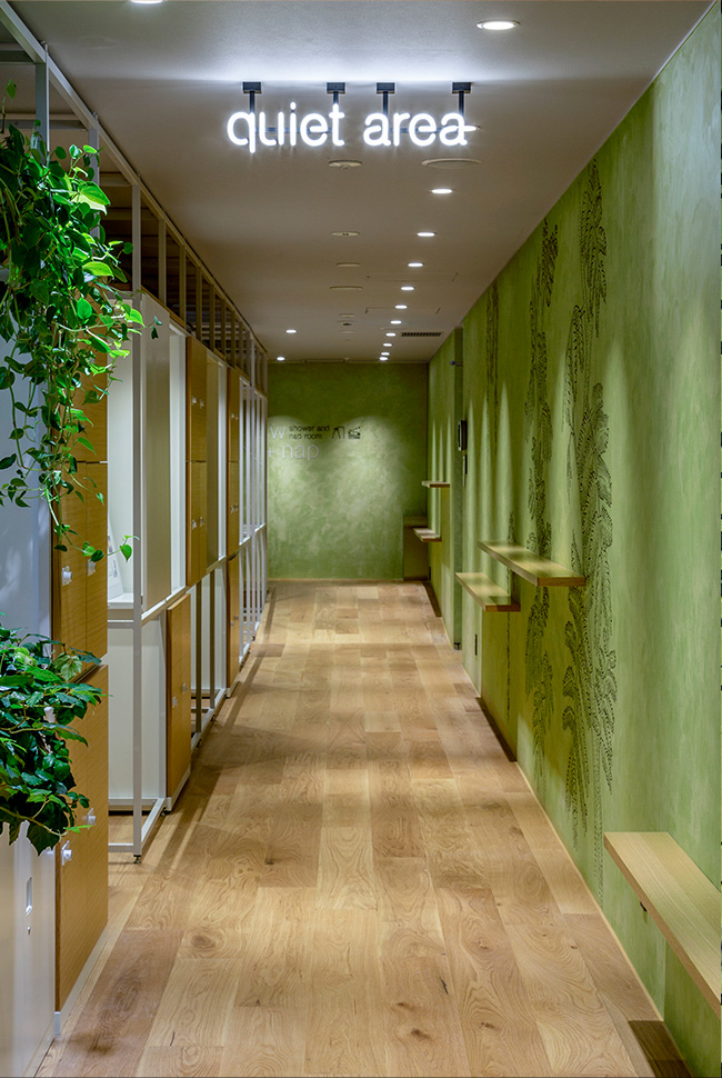
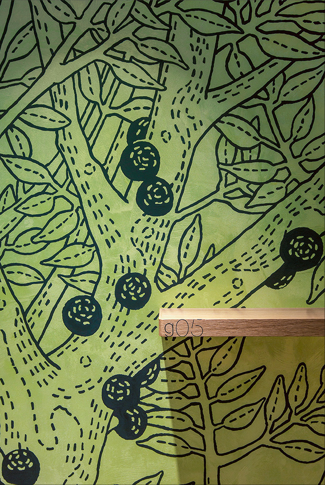
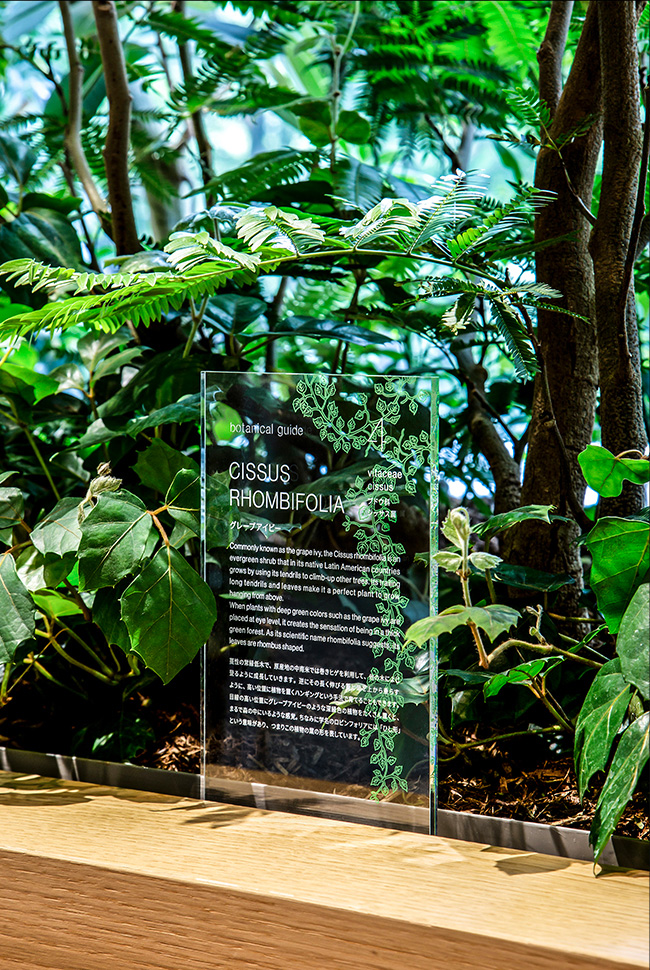
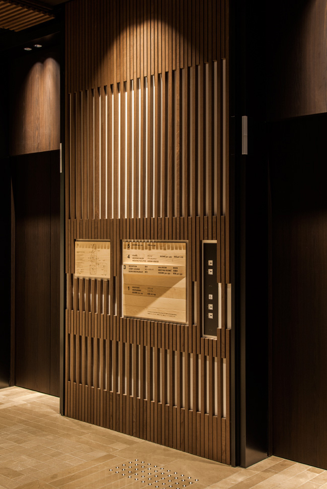
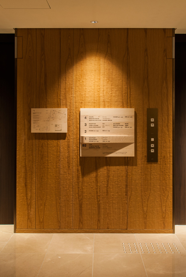
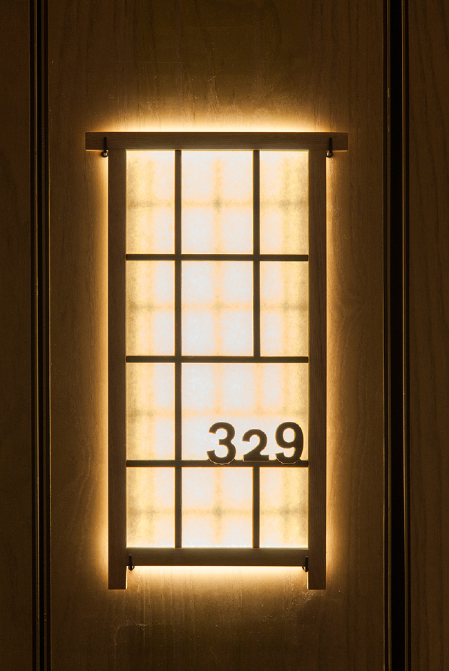
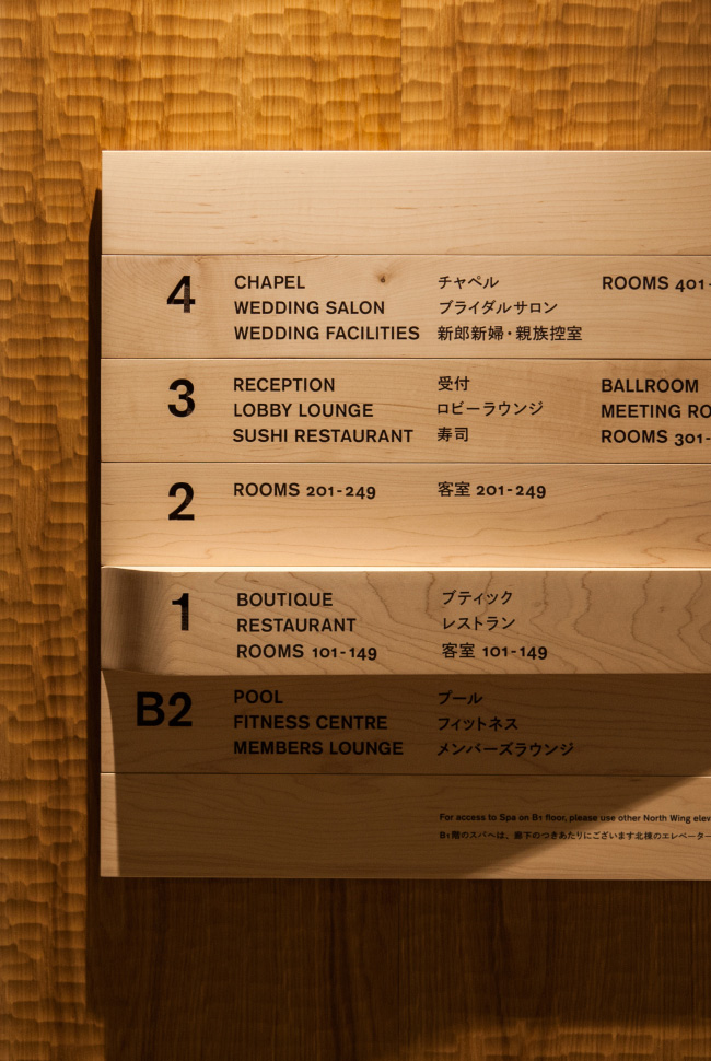
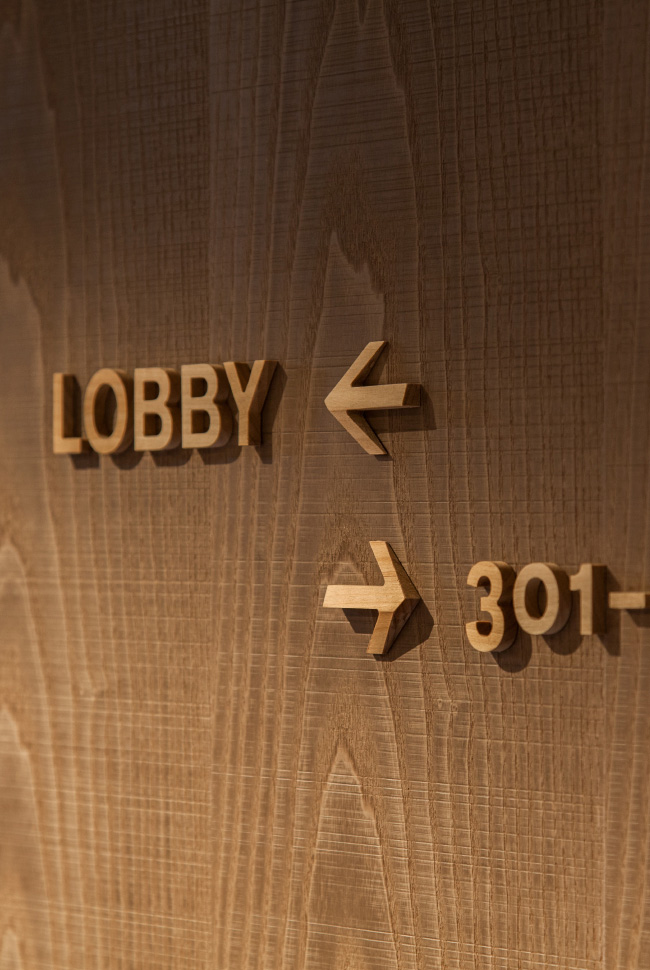
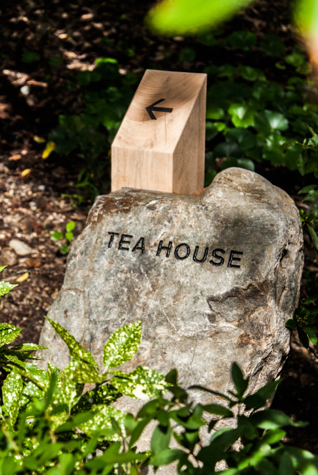
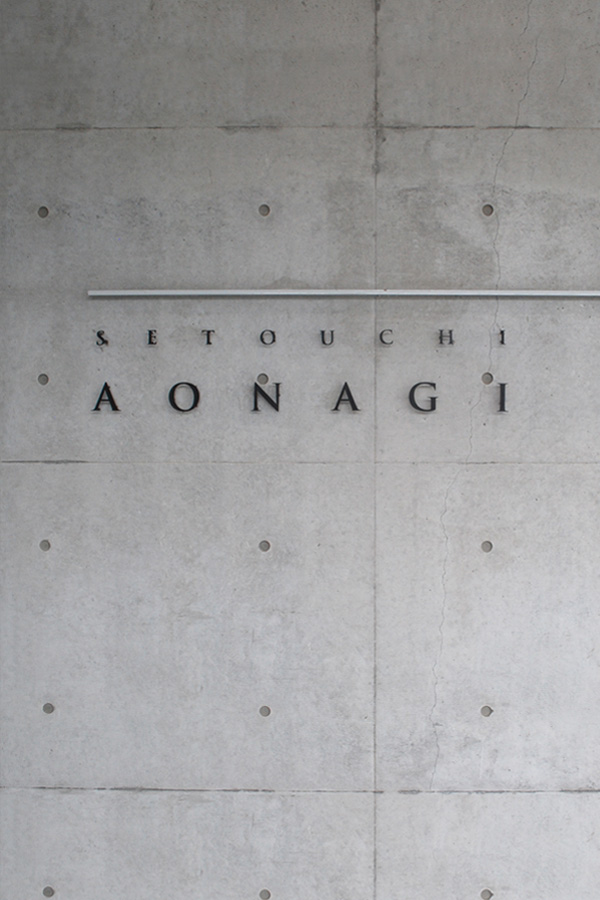
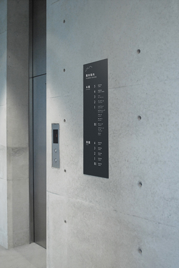
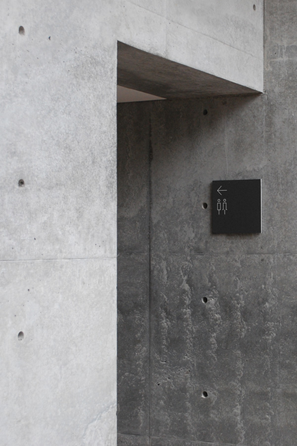
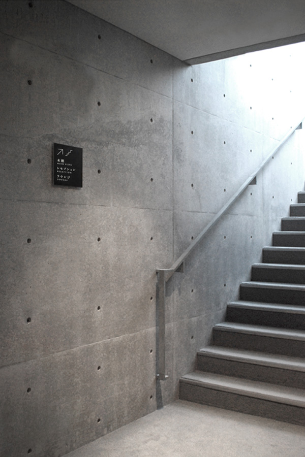
signage design
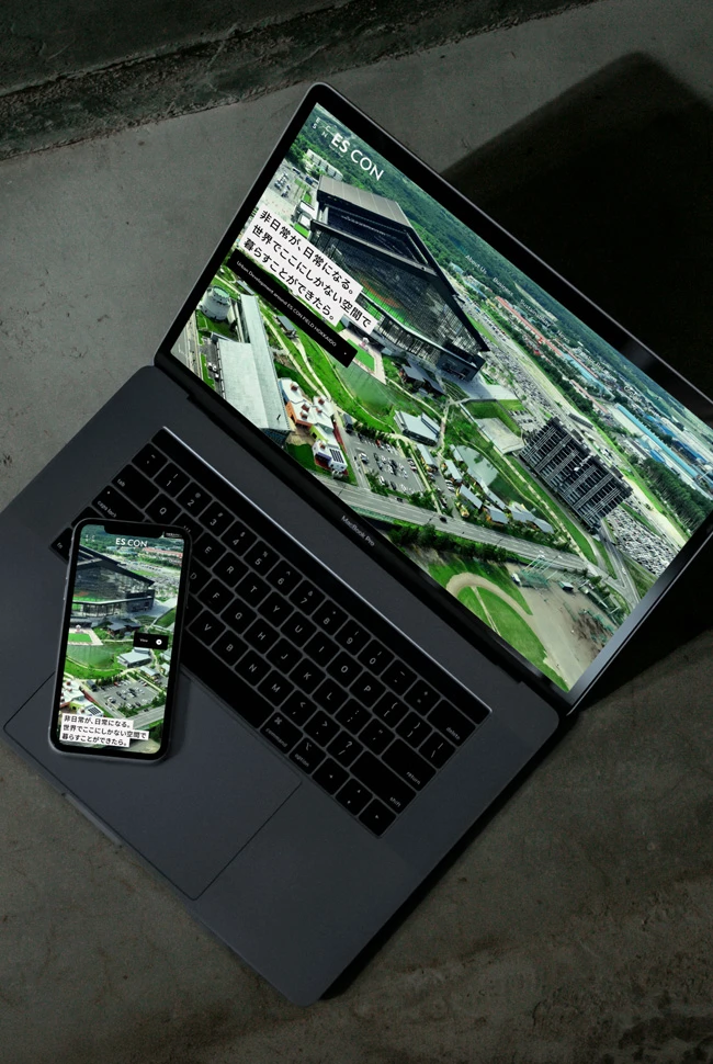
digital direction
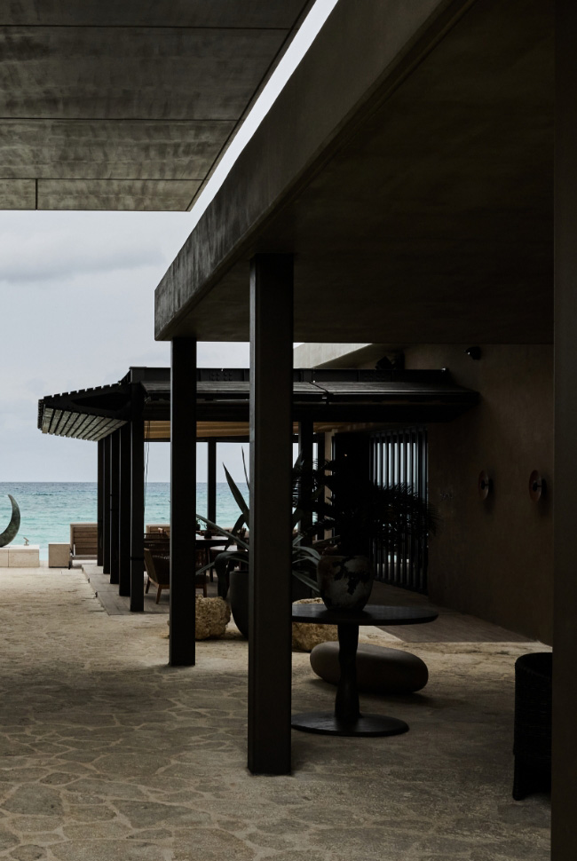
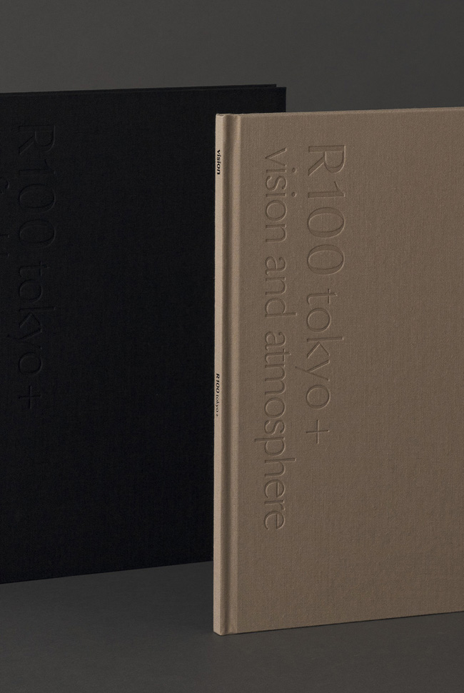
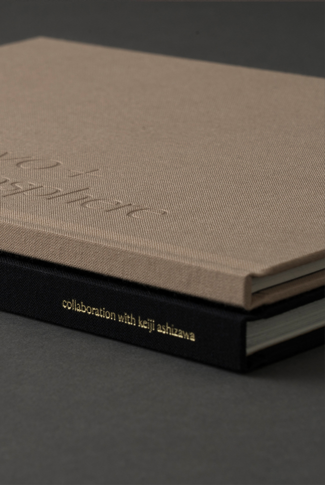
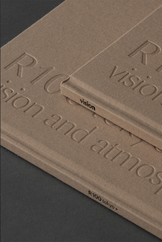
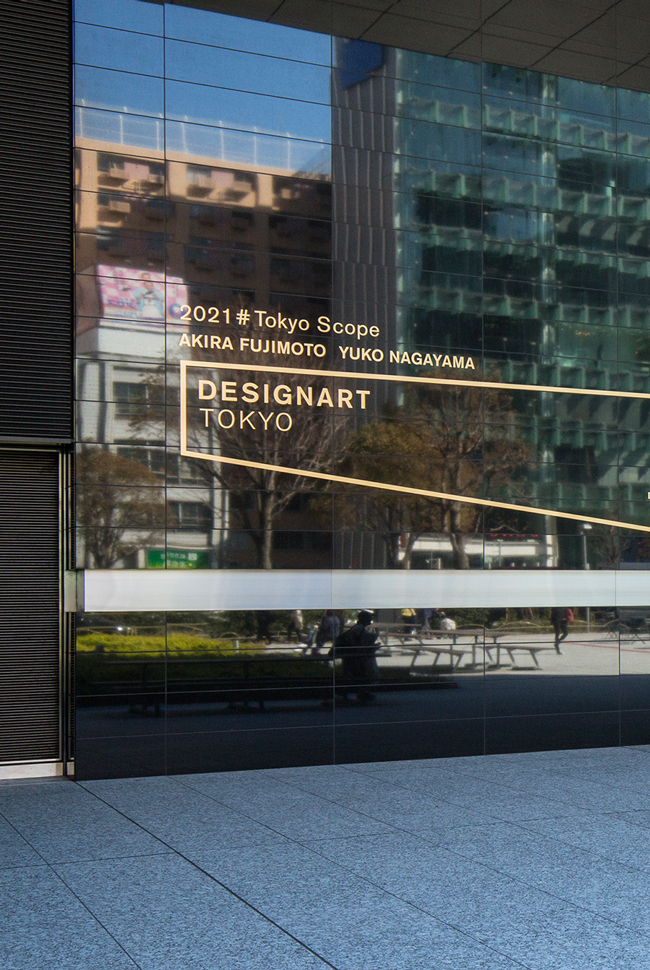
about project
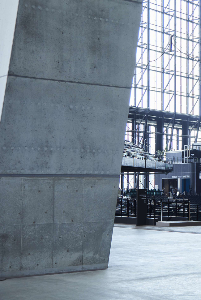
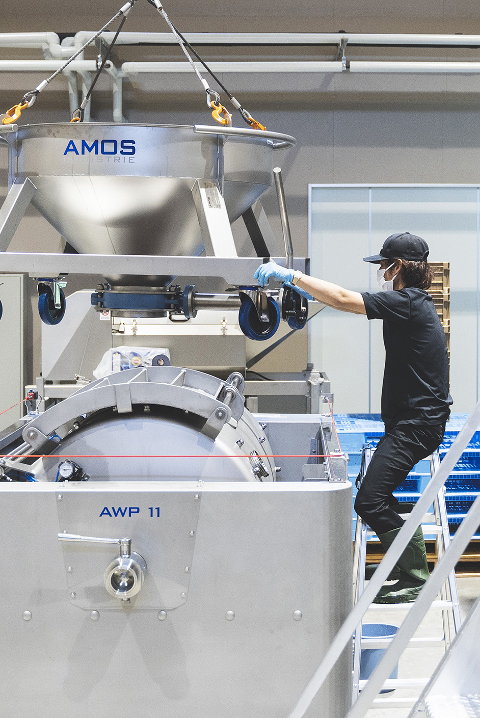
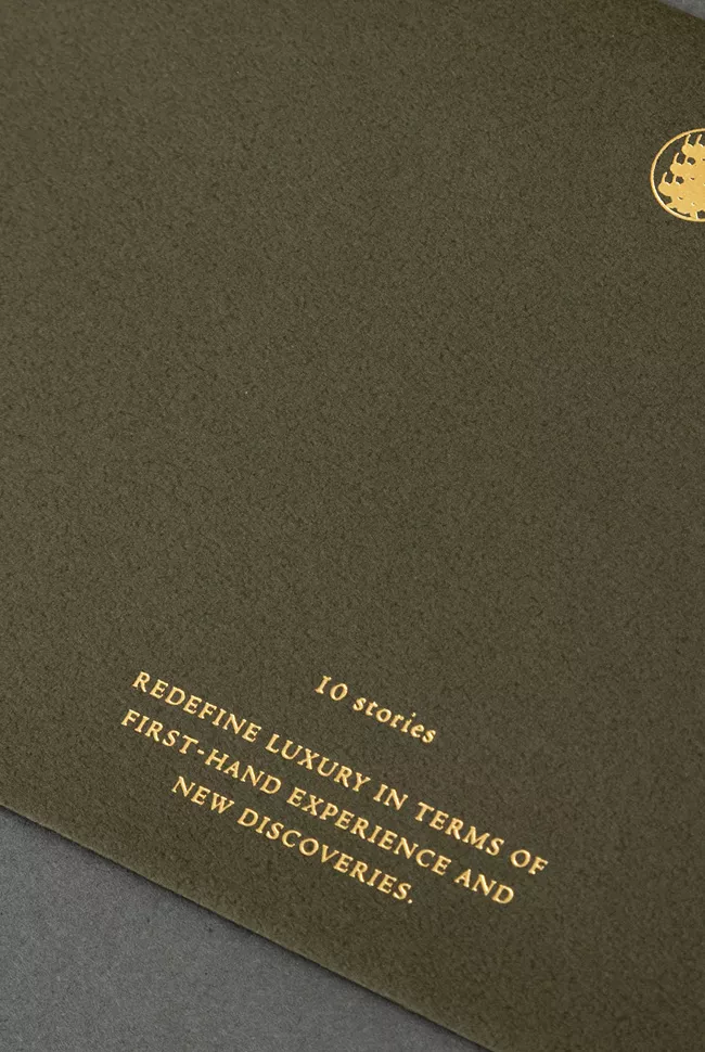
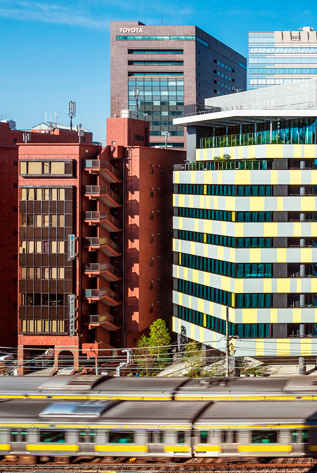
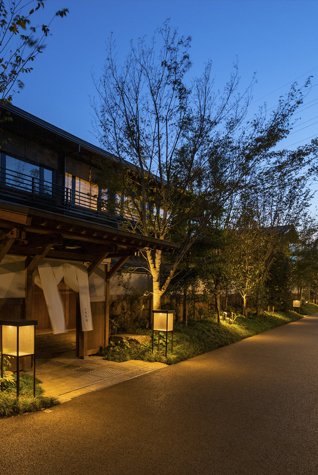
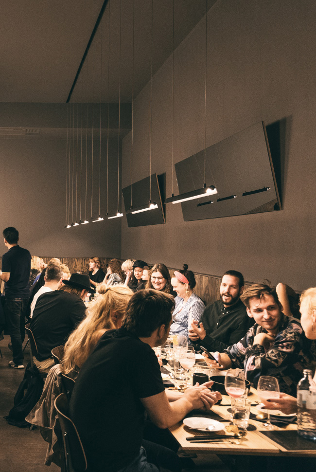
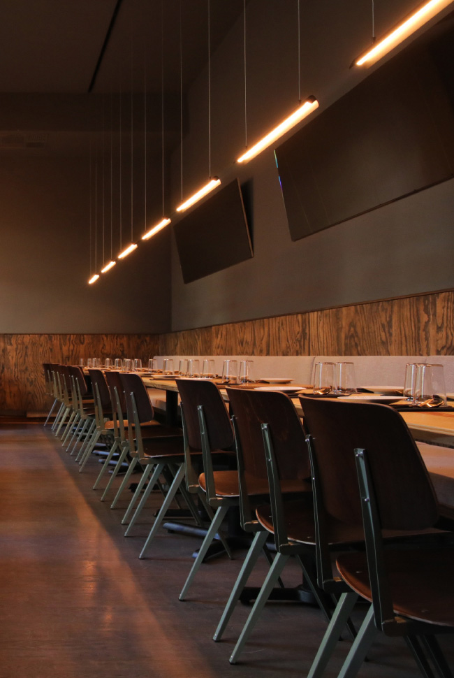
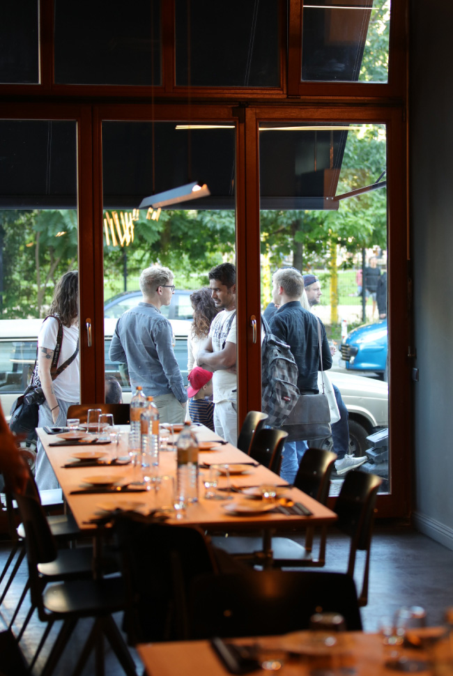
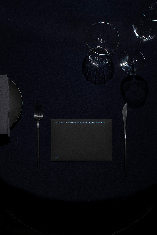
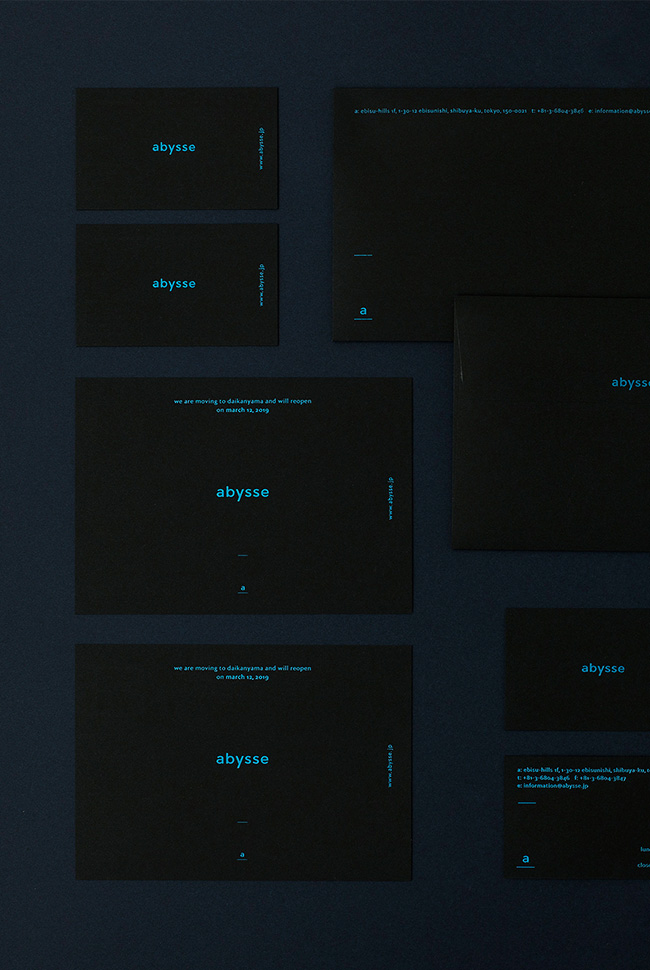
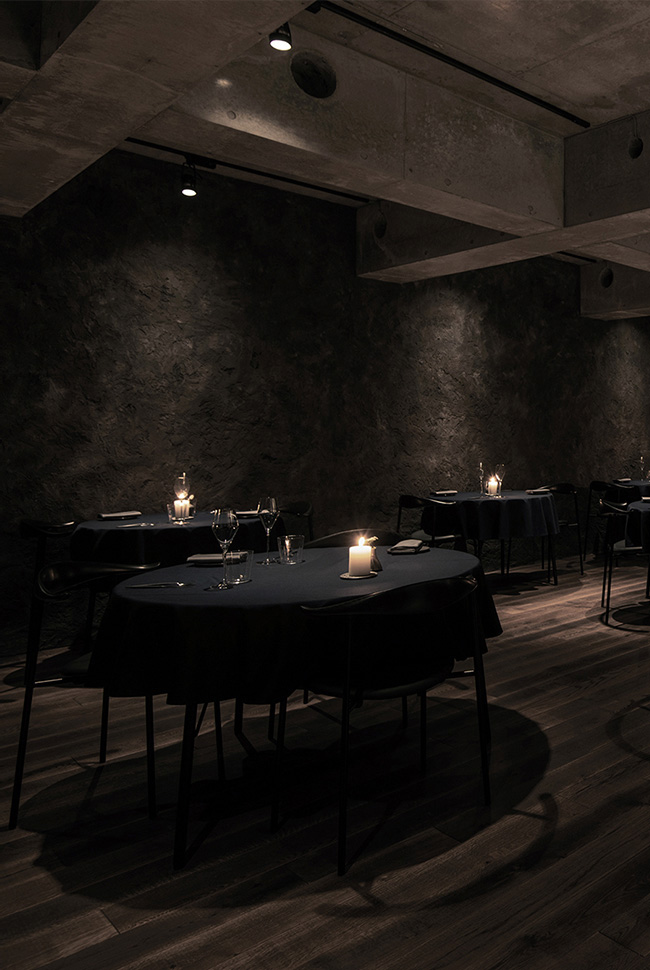
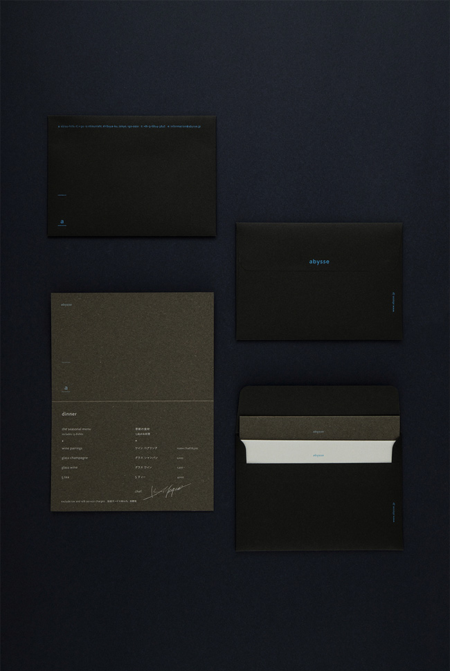
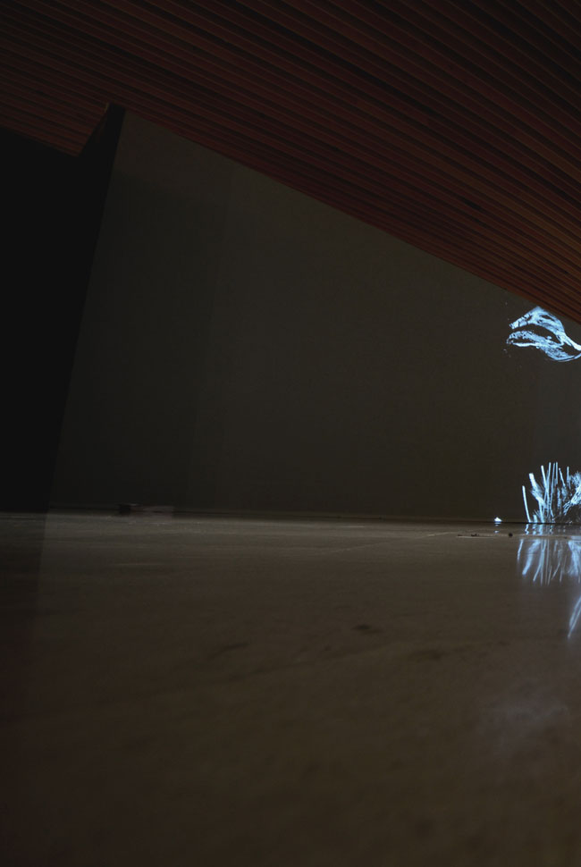
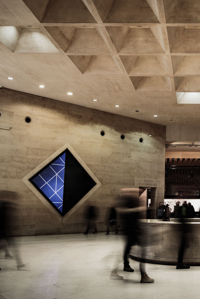
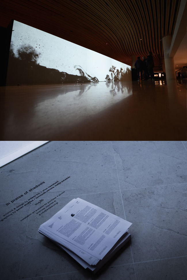
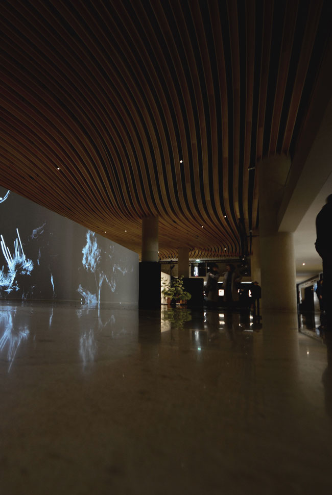
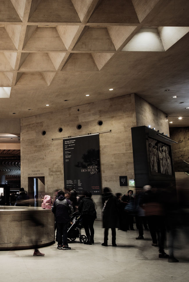
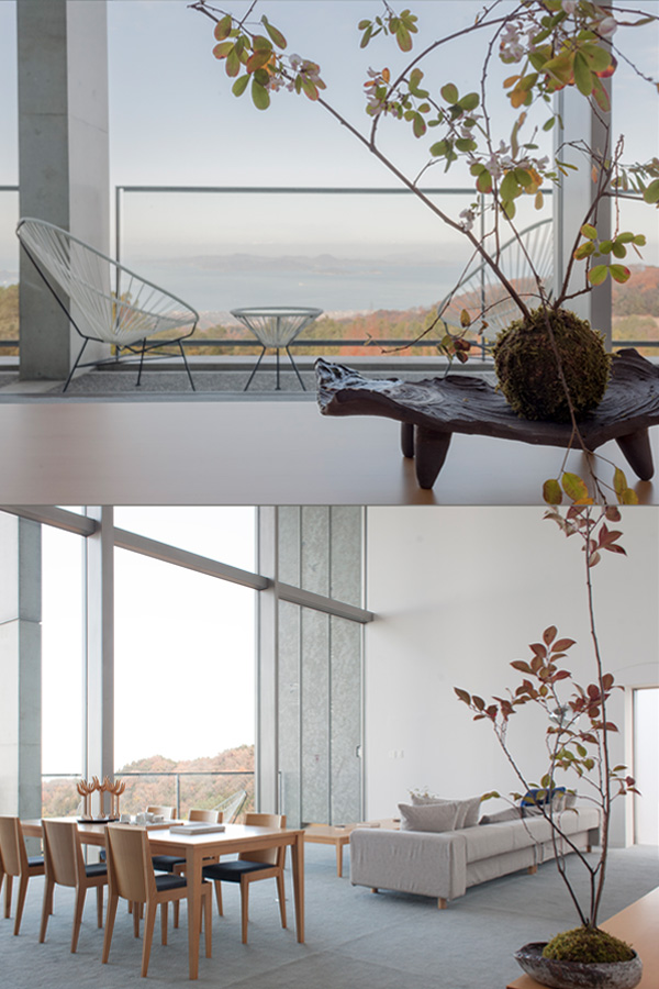
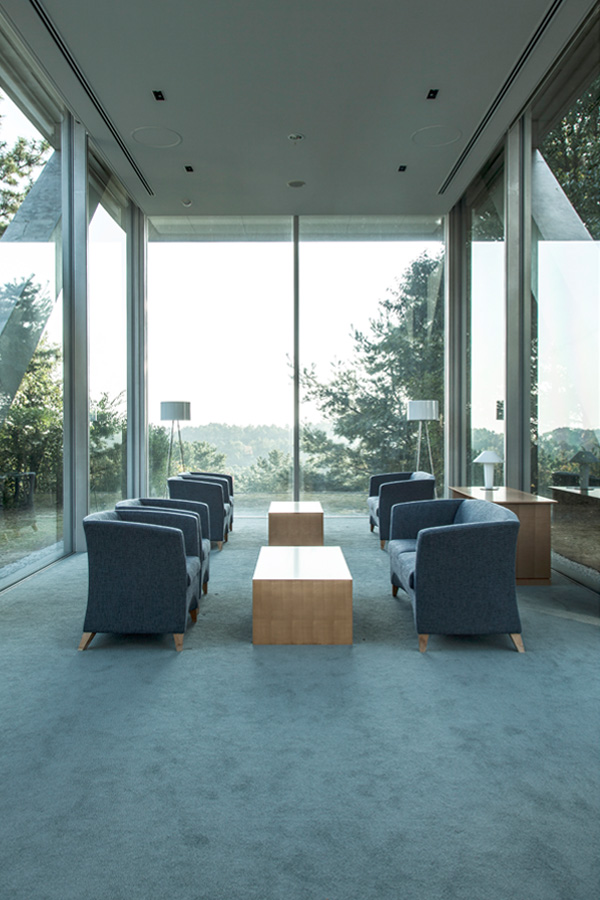
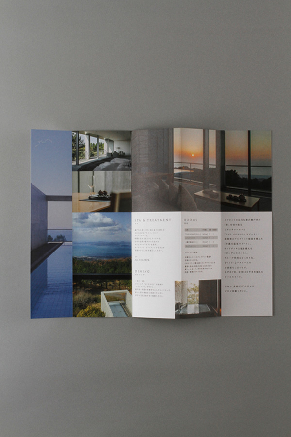
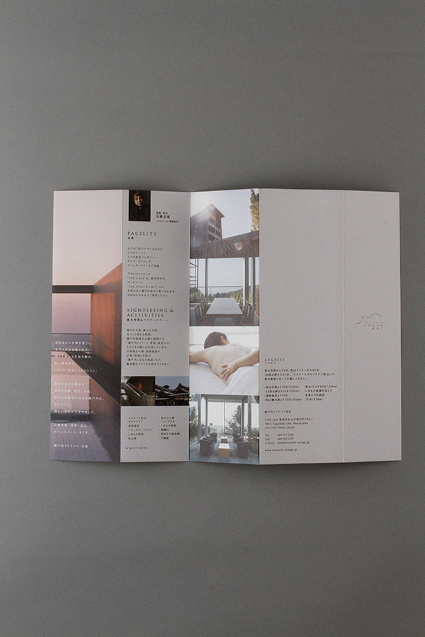
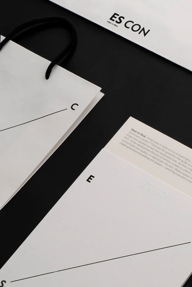
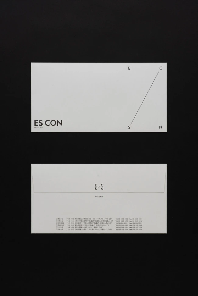
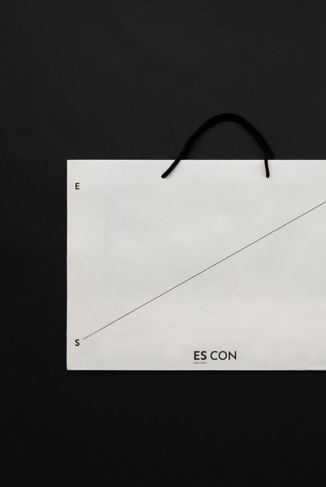
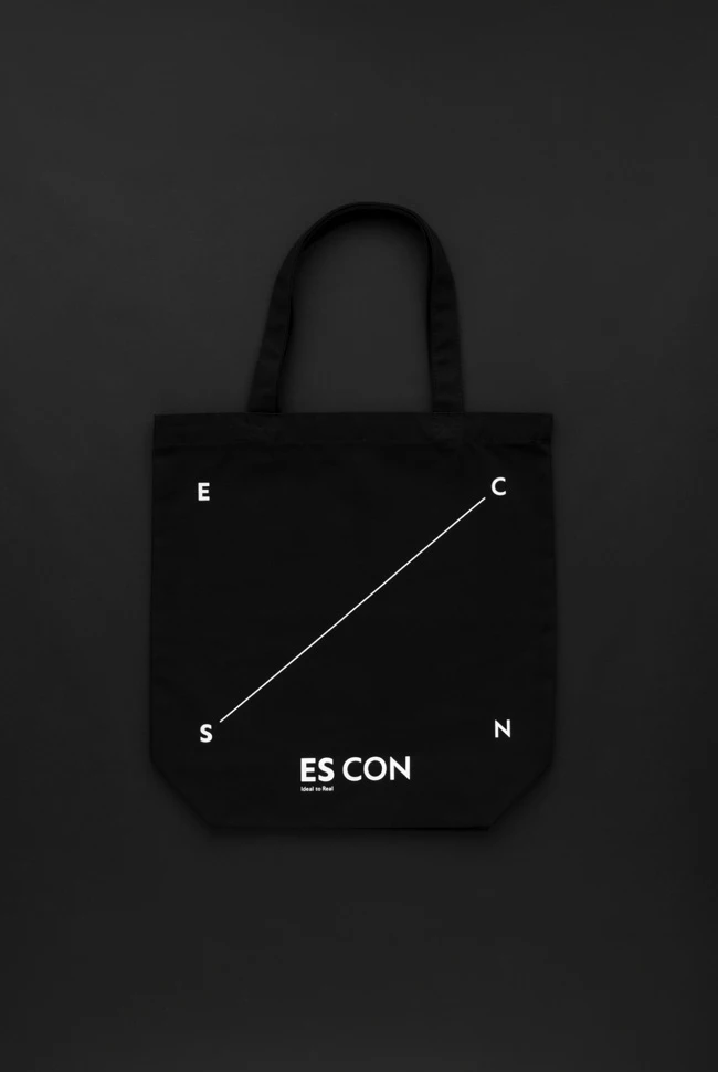
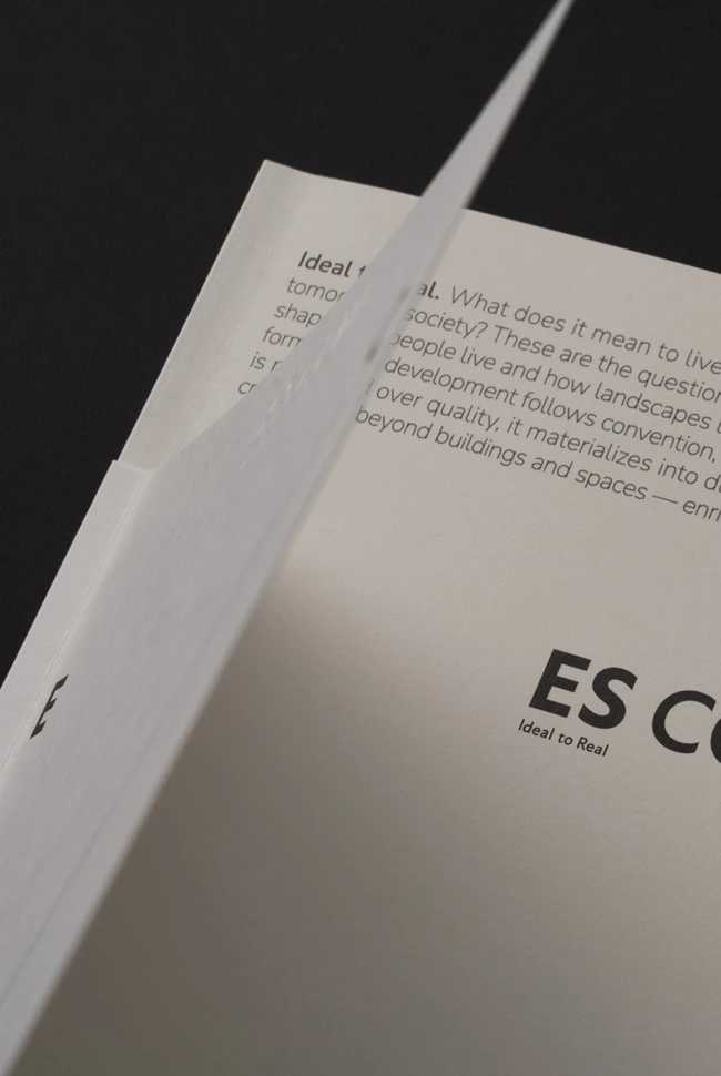
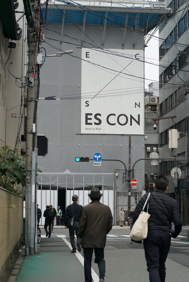
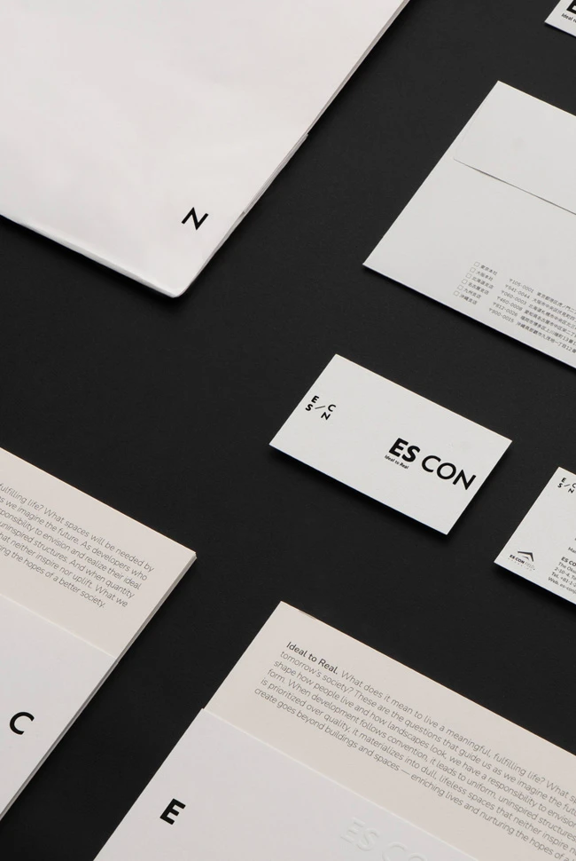
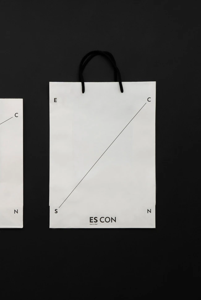
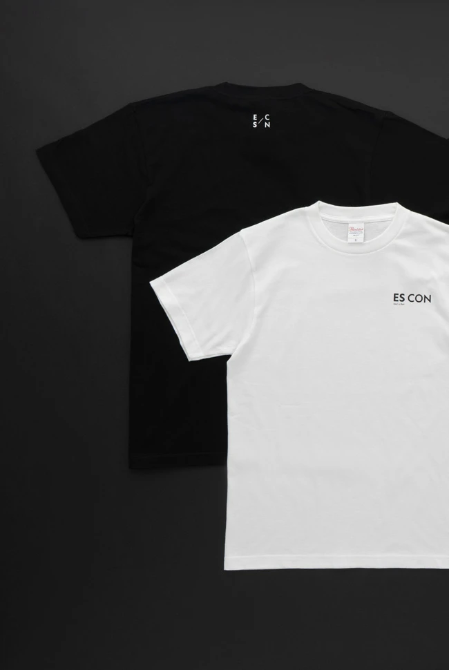
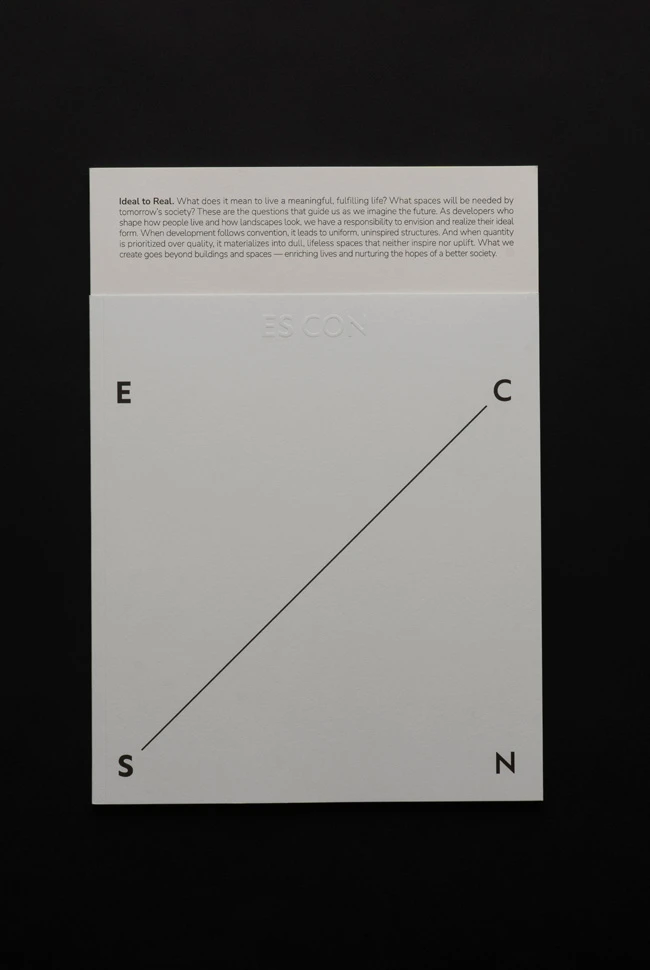
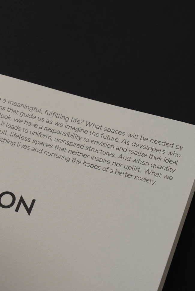
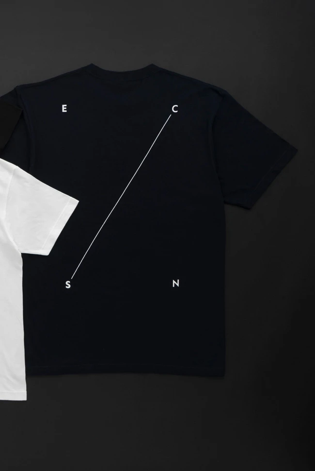
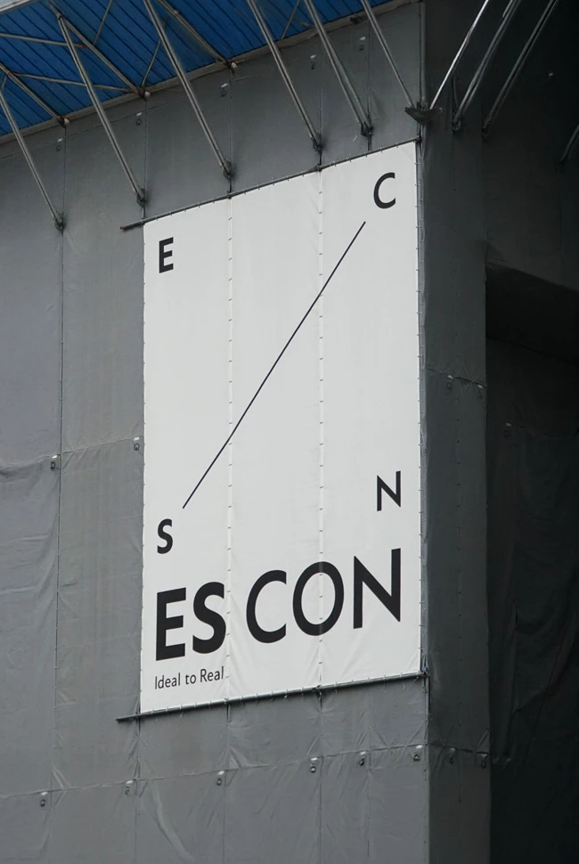
ES-CON JAPAN Ltd. is one of Japan’s leading integrated developers, operating across urban development, residential, commercial, and hospitality sectors. Following the company’s name change on July 1, 2025, artless Inc. led the brand consulting and creative direction to establish a new corporate identity. Beginning with the visual identity system, artless designed a cohesive brand experience across every touchpoint, including graphic design, digital media, and environmental signage.The name ES-CON is derived from Estate and Constellation. This project adopted the concept of the constellation as the central idea of the brand. A constellation gains meaning only when distant stars are connected to form a unified figure. This became a metaphor for the role of the developer: connecting cities, architecture, and people to create new value.
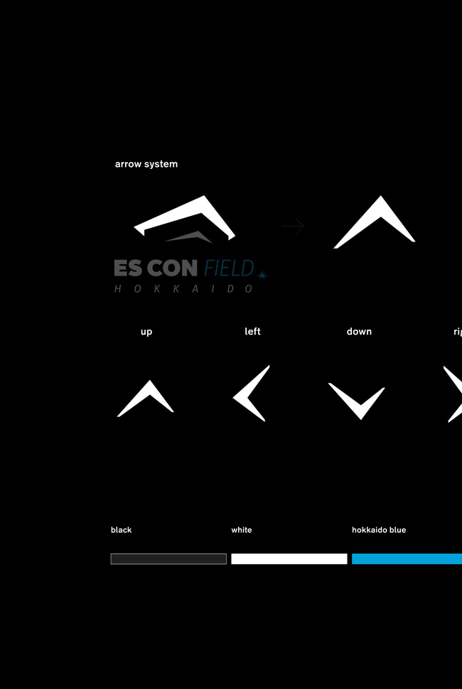
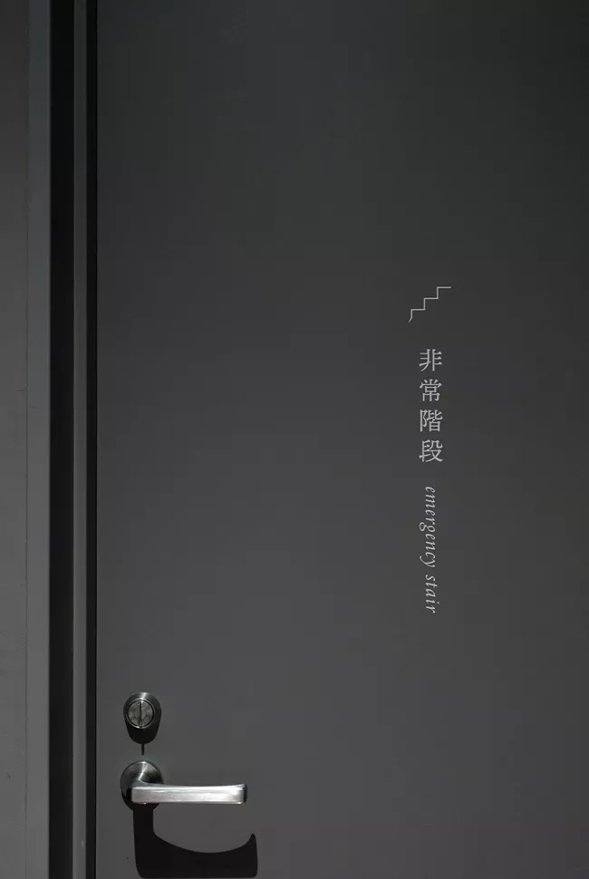
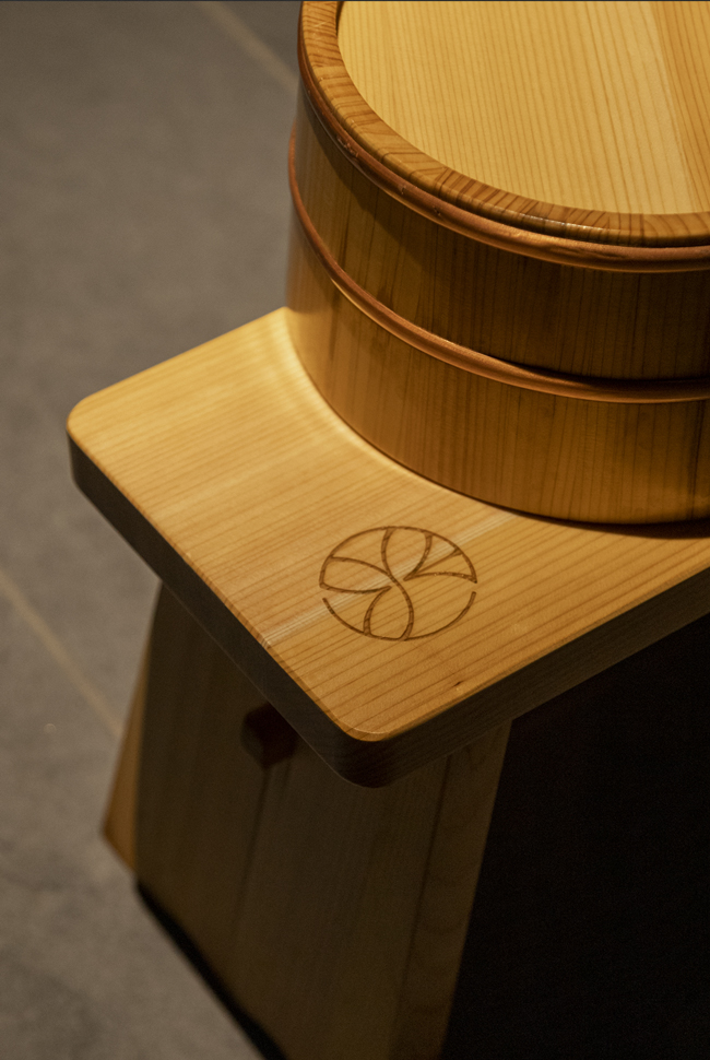
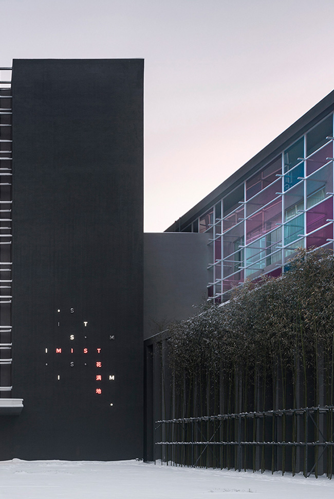
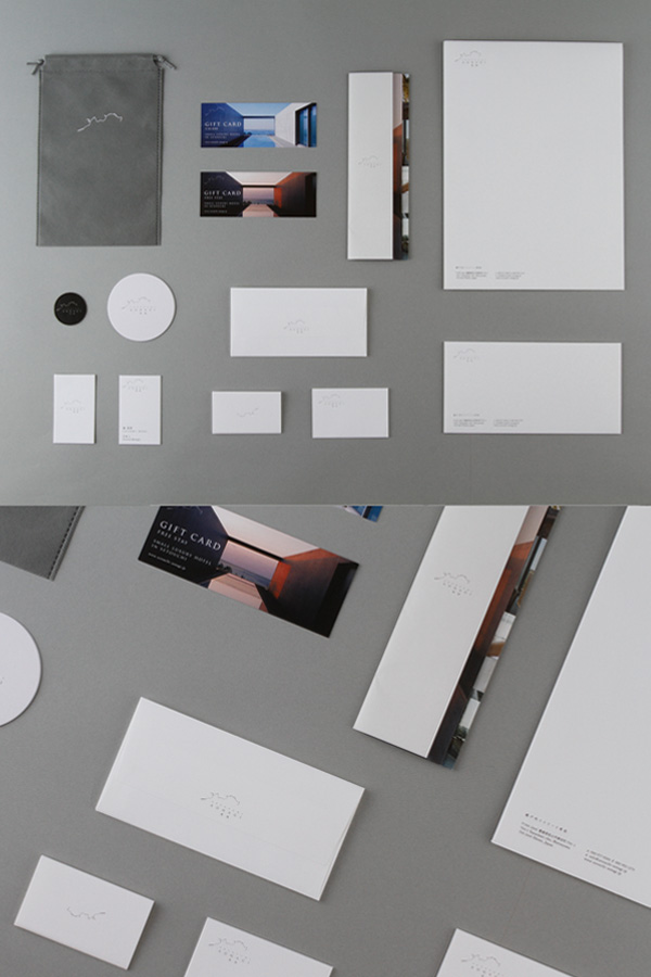
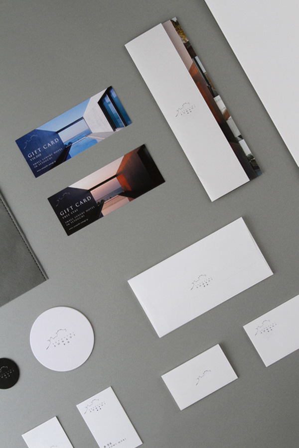
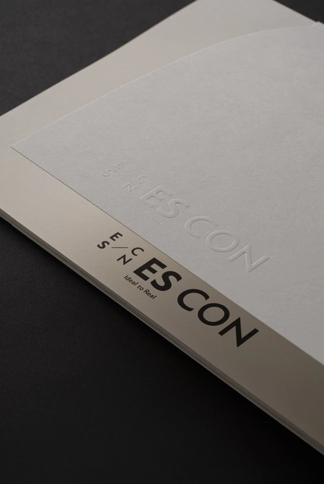
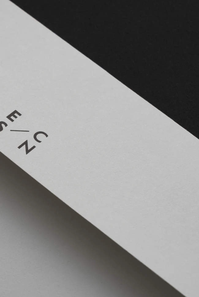
Rather than treating this concept as a narrative alone, it was translated into a comprehensive brand system. Inspired by the structure of constellations, the symbol mark was designed as a dynamic identity that adapts across different applications and environments. Rather than functioning as a fixed logo, it operates as a flexible visual system capable of evolving alongside the company’s growth and diverse business portfolio. This approach achieves both consistency and scalability across printed materials, digital platforms, and environmental signage.
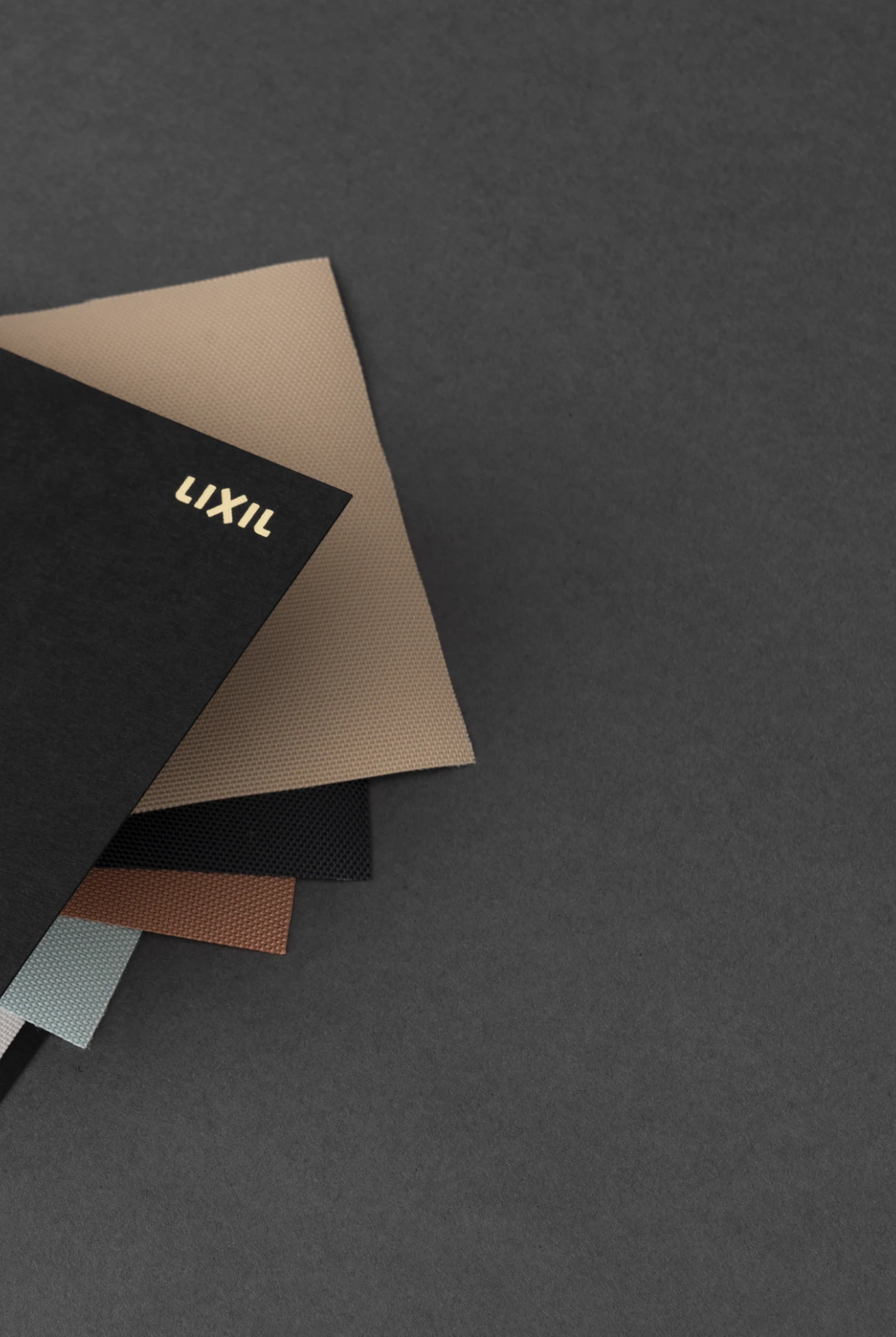
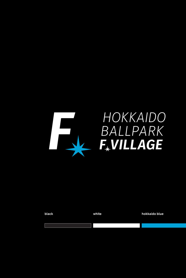
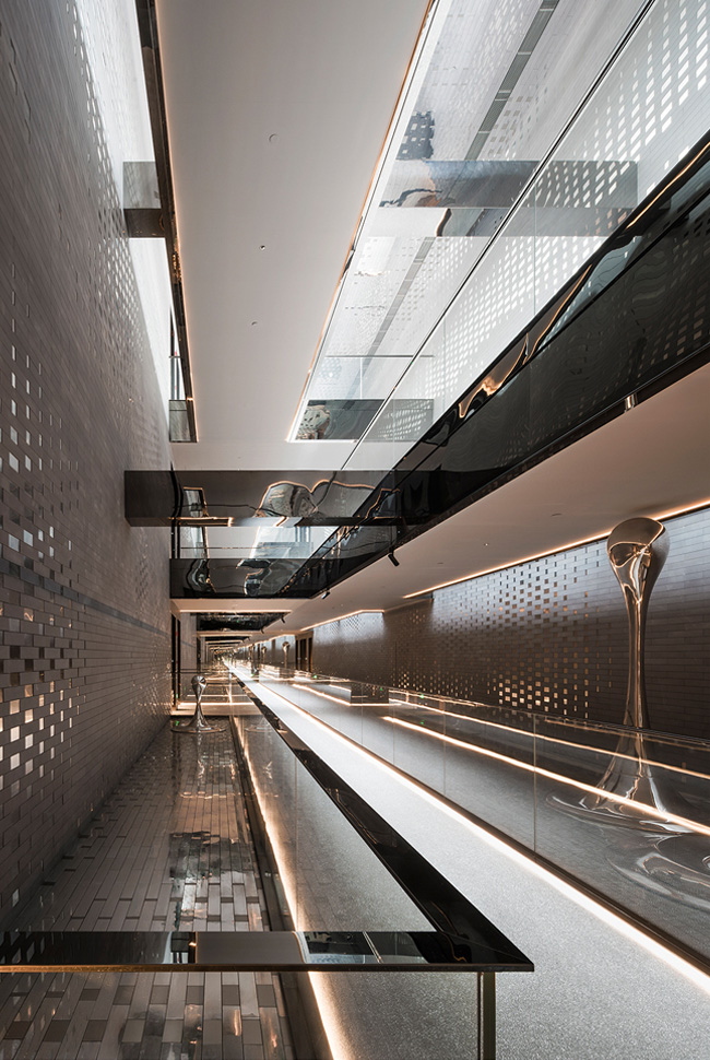
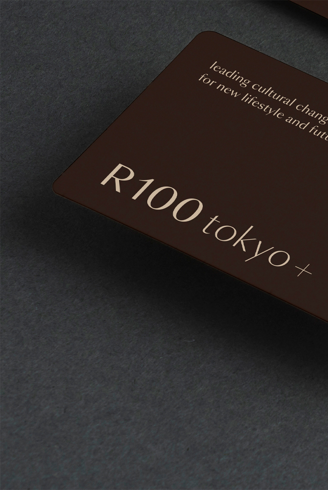
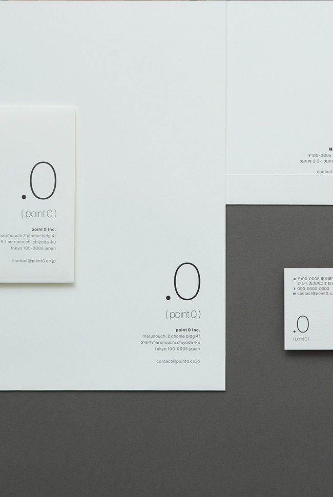
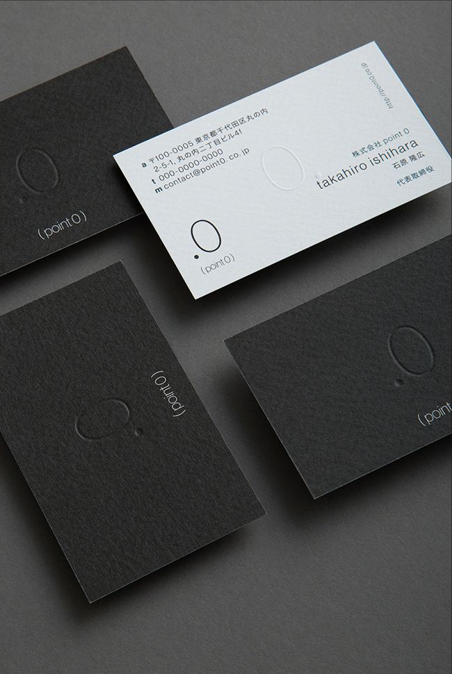
The color system is built around Black, representing the universe, and White, representing the sky, complemented by Dark Night, Moon Silver, and Sunset Gold. Together, these colors establish a visual language that expresses the brand concept of “the universe and the sky.”
This project redefined the philosophy embedded in the company’s name as the core value of the brand and translated it into a brand system that functions consistently across every touchpoint. By expressing the developer’s role of connecting cities, architecture, and people through a unified brand experience, the project presents a renewed corporate identity and a new vision of value for society.
--
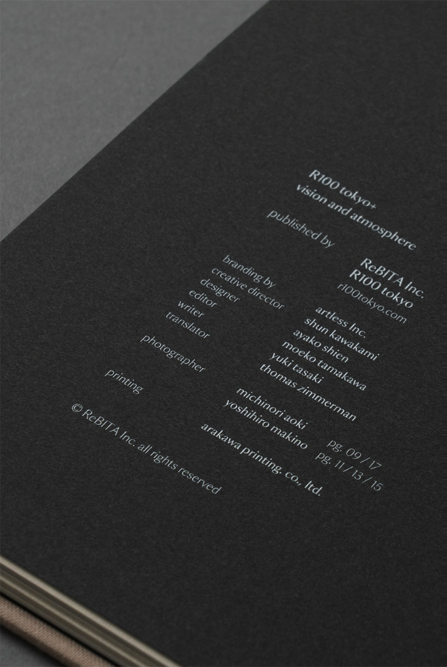
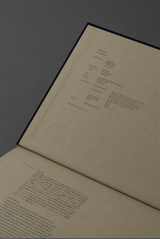
brand consulting & creative direction: artless Inc.
art direction: shun kawakami
graphic design: yuto ataka
assistant design: kota suganuma
project management: ken aoki
film: WOW inc.
web strategy, direction & copywriting: PARADOX Corp.
web design: STUDIO DETAILS Inc.
item photography: yuu kawakami
client: ES-CON JAPAN Ltd.
ES-CON JAPAN Ltd.は、都市開発、住宅、商業施設、ホテル事業を展開する日本の総合デベロッパーです。2025年7月1日の社名変更を契機に、artless Inc.はブランドコンサルティングおよびクリエイティブディレクションを担い、新たなコーポレートアイデンティティを構築しました。VIシステムを起点に、グラフィック、デジタル、環境サインに至るまで、ブランド体験全体を一貫して設計しています。
「ES-CON」は、Estate(不動産)とConstellation(星座)を語源としています。本プロジェクトでは、この「星座」という概念をブランドの中核に据えました。星座とは、離れた星々を結ぶことで初めて意味と形を持つ存在です。その構造は、都市、建築、人々の営みを結び、新たな価値を創出するデベロッパーの役割そのものを象徴しています。
私たちはこの思想を単なるストーリーに留めるのではなく、ブランドシステム全体へと展開しました。シンボルマークは星座をモチーフとしながら、用途や環境に応じて柔軟に変化するダイナミックなアイデンティティとして設計しています。固定的なロゴではなく、企業の成長や多様な事業領域を受け止める可変的なブランドシステムとして機能し、印刷物、デジタルメディア、環境サインなど、あらゆるタッチポイントにおいて一貫性と拡張性を両立しています。
カラーシステムは、宇宙を象徴するBlackと空を象徴するWhiteを基軸とし、Dark Night、Moon Silver、Sunset Goldを加えることで、「宇宙と空」というブランドコンセプトを視覚言語として体系化しました。
本プロジェクトは、企業名に込められた思想をブランドの中核価値として再定義し、その哲学をあらゆる接点で機能するブランドシステムへと転換した取り組みです。都市、建築、人をつなぐデベロッパーとしての役割を一貫したブランド体験として可視化し、新たな企業価値を社会へ提示しました。